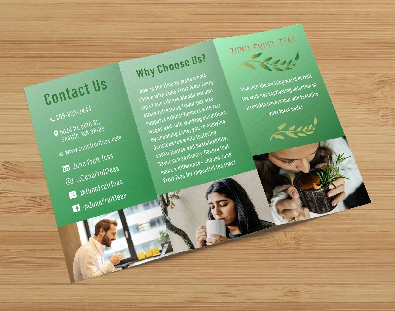
Zuno Fruit Teas Company
Zuno Fruit Teas is a concept for a tea company targeted towards a younger, modern demographic. At the core of its mission and values is a movement for their younger, contemporary audience seeking a better way to enjoy their beverages. Their teas are crafted from ethically sourced, organic ingredients, reflecting their unwavering commitment to fair trade practices and eco-friendly packaging. With Zuno Fruit Teas, you can indulge in a delicious cup of tea that nourishes both your body and the planet.
The company believes that young people deserve to enjoy tea without compromising their values or the environment. The brand champions the idea that everyone should have access to a remarkable cup of tea that makes them feel good inside and out. Immerse yourself in their enchanting aromas and vibrant flavors, and uncover your new favorite blend today.
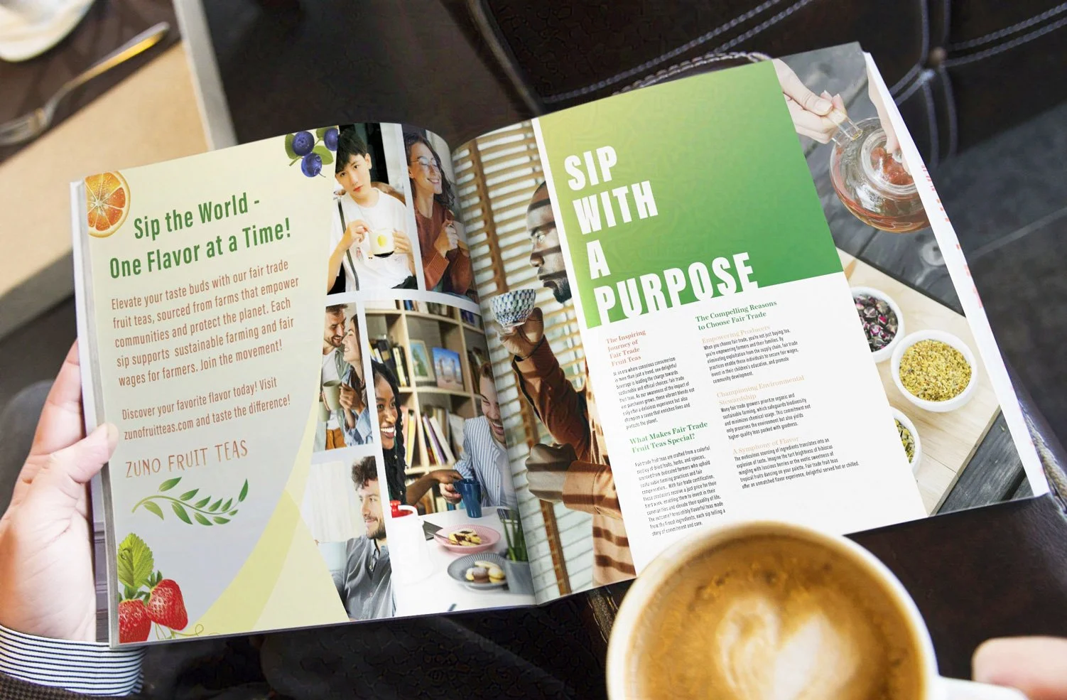
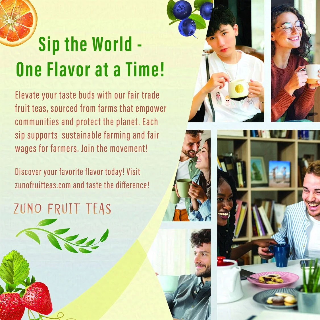
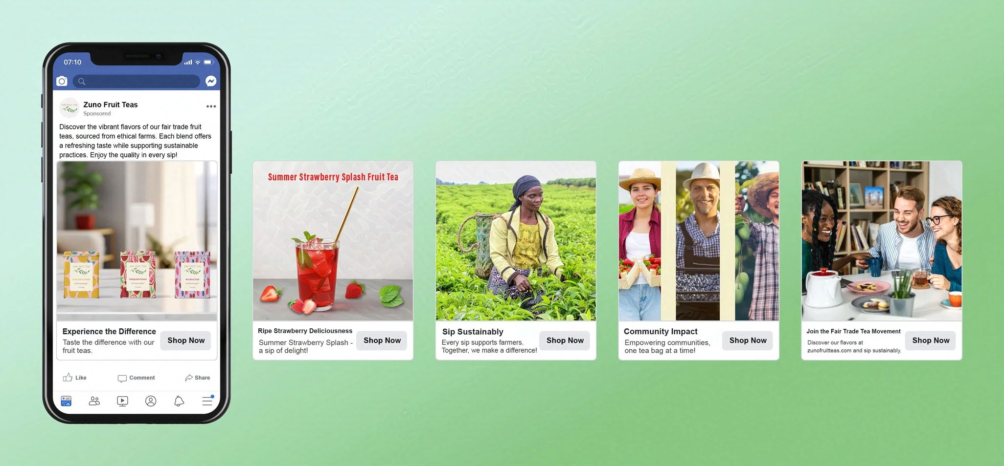
Deliverables include logos, branding identity, business cards, packaging, product design, print and social media ads, and ephemera.
Logos and Brand Identity
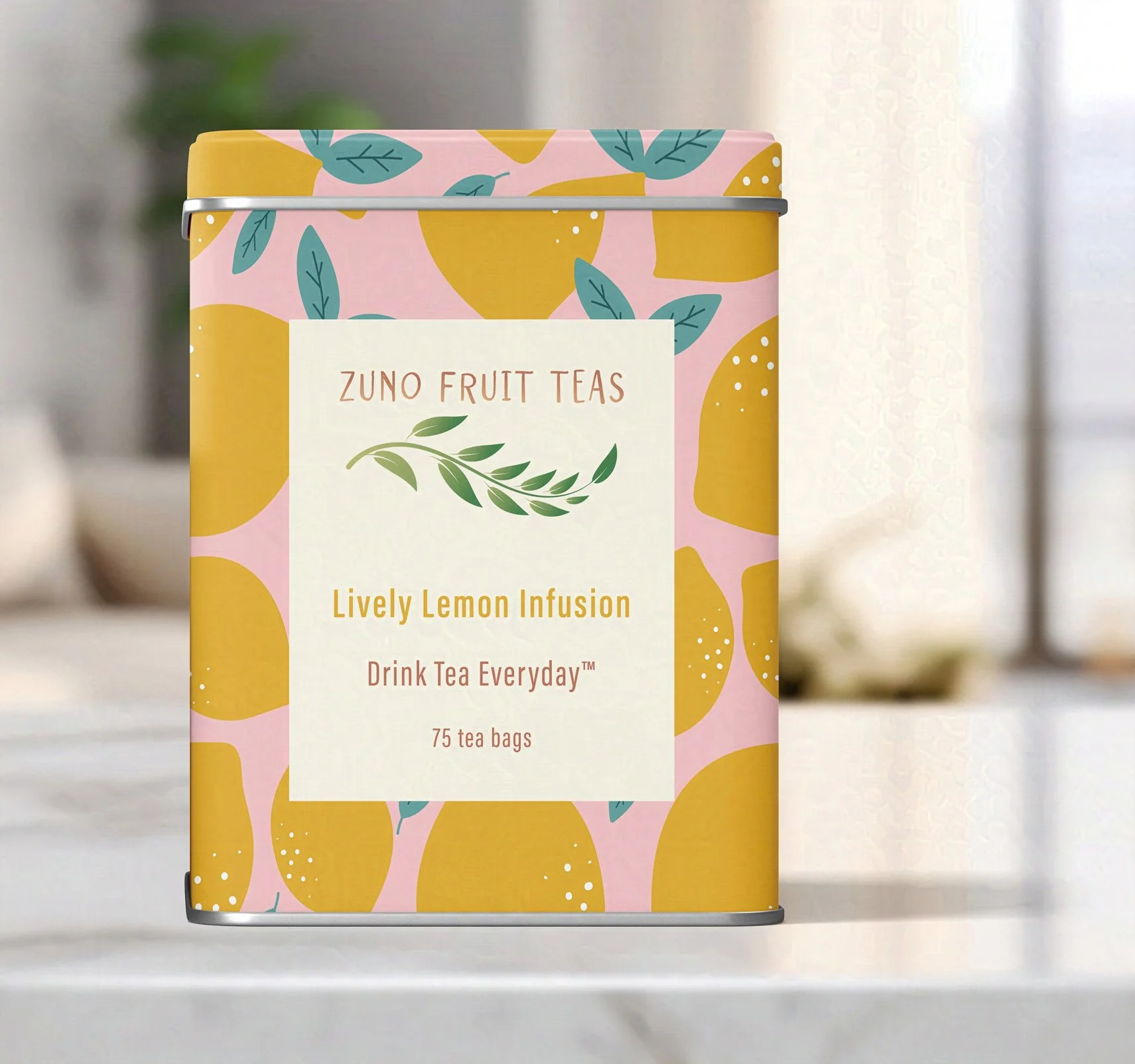
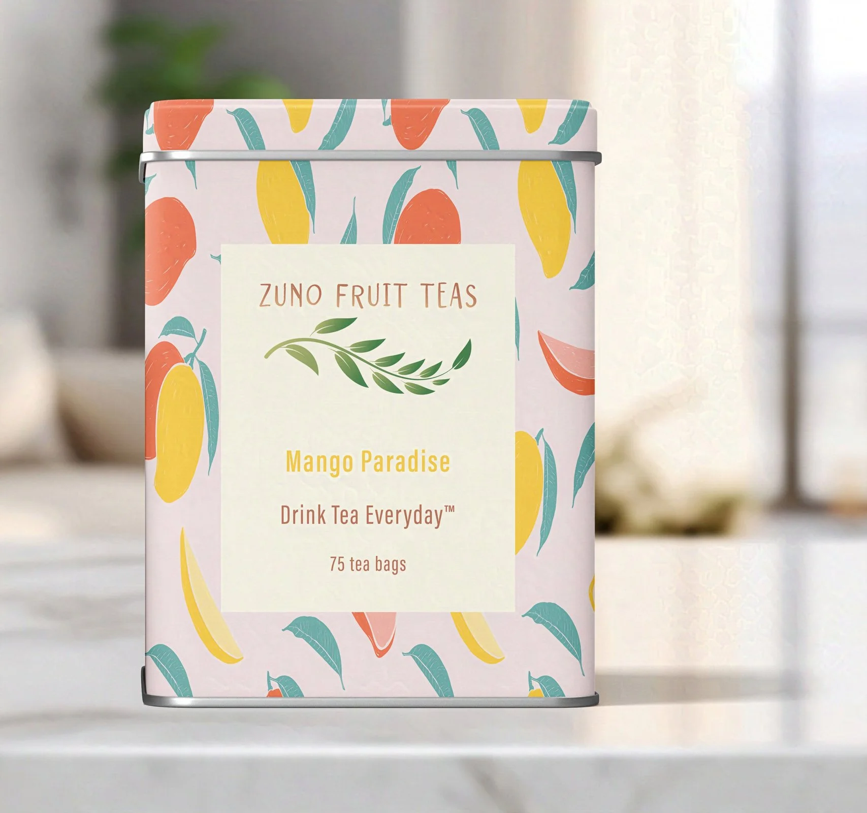
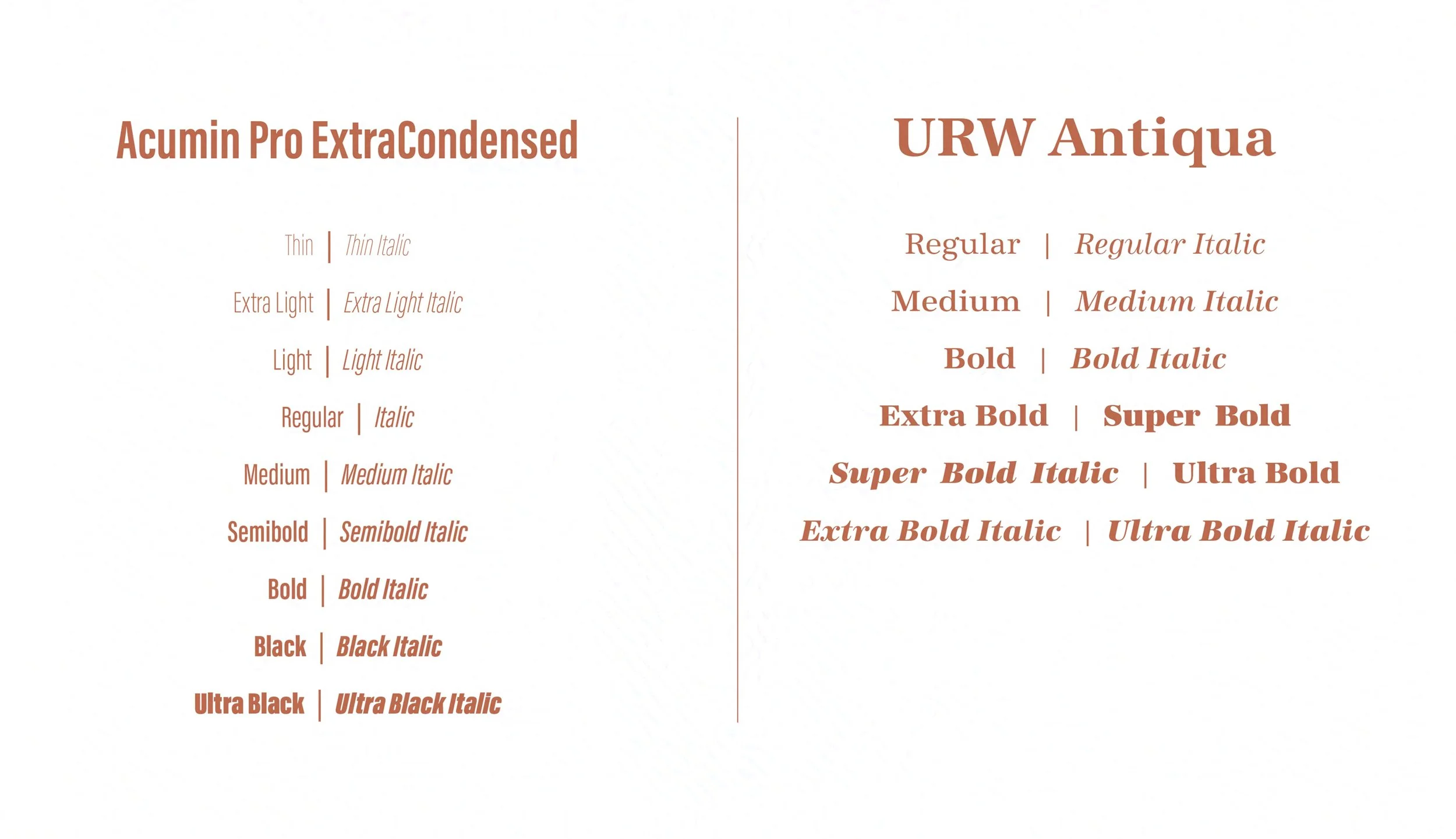
In designing the logo for Zuno Fruit Teas, I sought to capture a perfect harmony between nature’s organic beauty and a vibrant, contemporary spirit. To instill a sense of playful modernity, I selected the striking typeface Pictum for the company name. The central image—a branch adorned with leaves reminiscent of tea—powerfully symbolizes the company’s unwavering commitment to using only the highest-quality ingredients in its products. This design not only reflects our mission but also resonates with customers, inviting them to experience the essence of Zuno Fruit Teas.
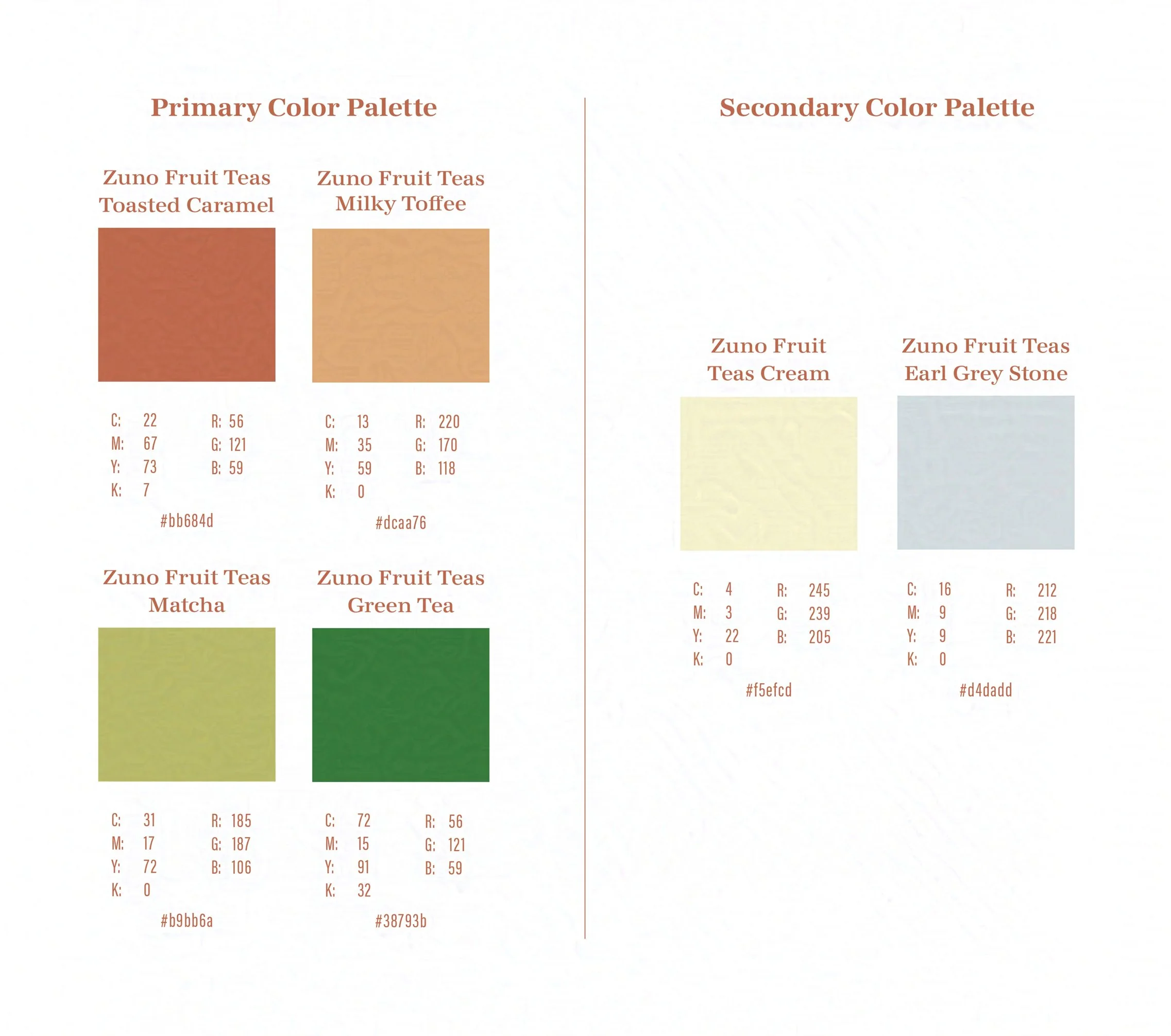
The carefully curated color palette evokes the rich experience of drinking tea, transporting you to serene tea gardens and cozy moments of reflection. The greens represent the lush, vibrant leaves of tea plants, while the earthy browns reflect the grounding essence of nature. Delicate accents of light cream and gray symbolize the soothing qualities of a warm cup, enhancing the overall sense of calm and tranquility. Together, these colors not only capture the essence of tea but also invite you to immerse yourself in its comforting ritual with every glance. Coupled with the powerful tagline "Drink Tea Everyday," this combination forms a solid foundation for an unforgettable and distinctive brand identity.
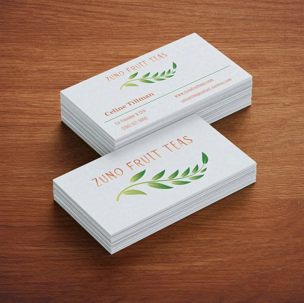
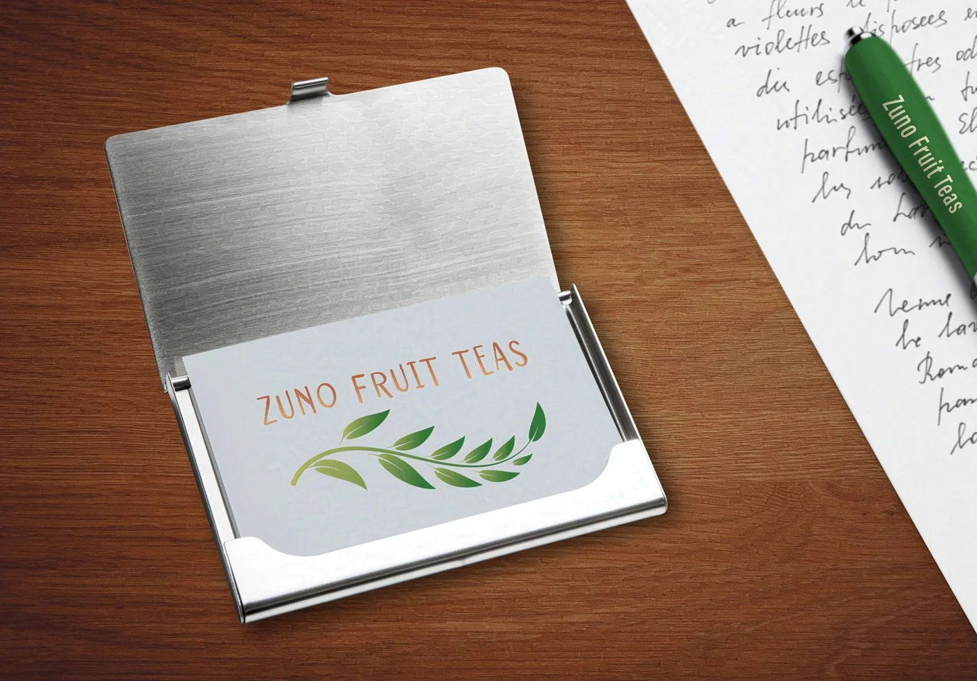
Business Cards
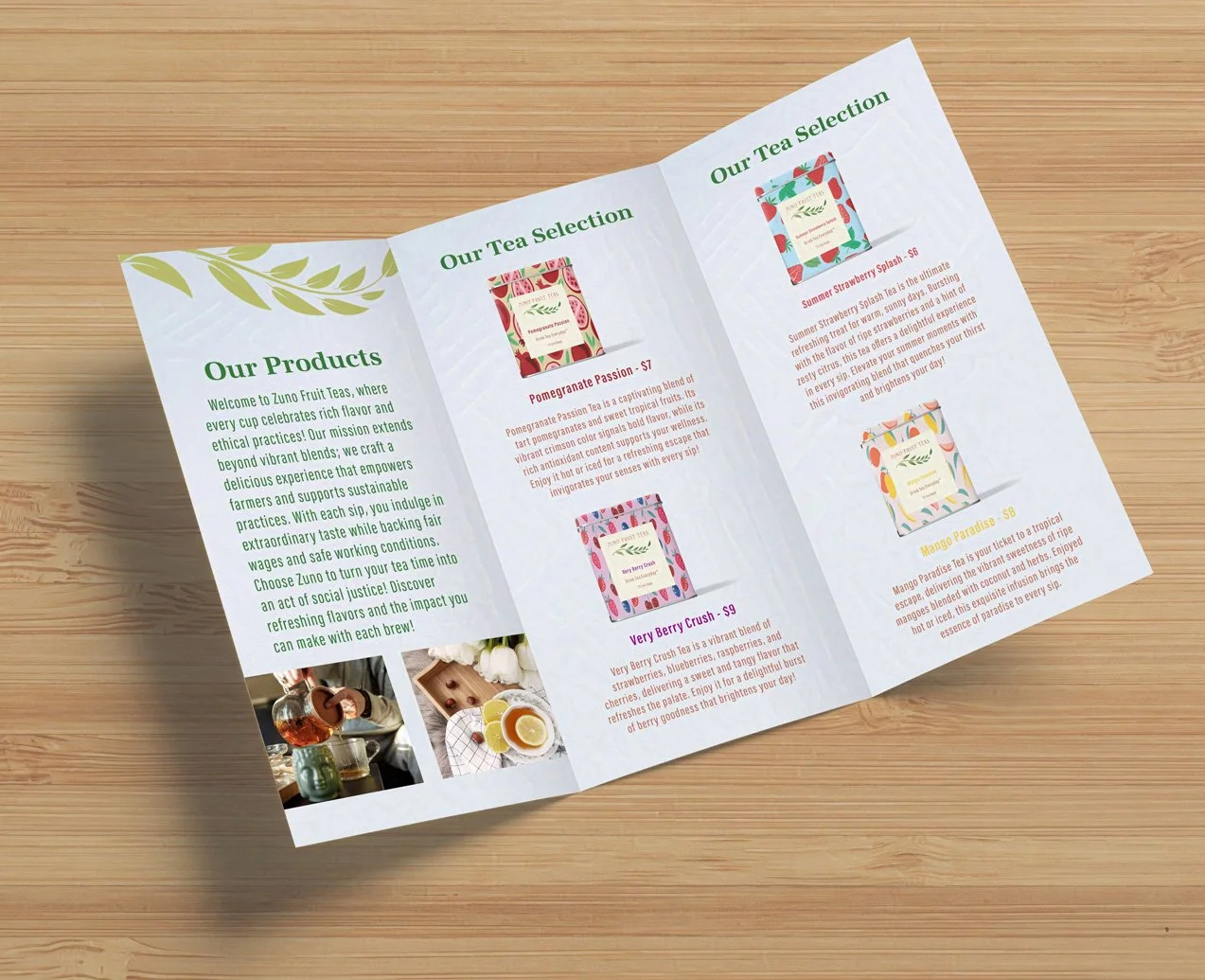
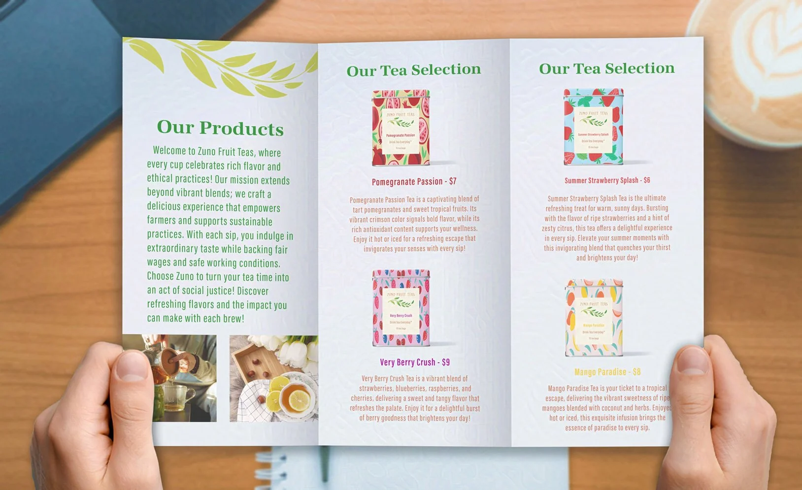
Tea Packaging and Product Design
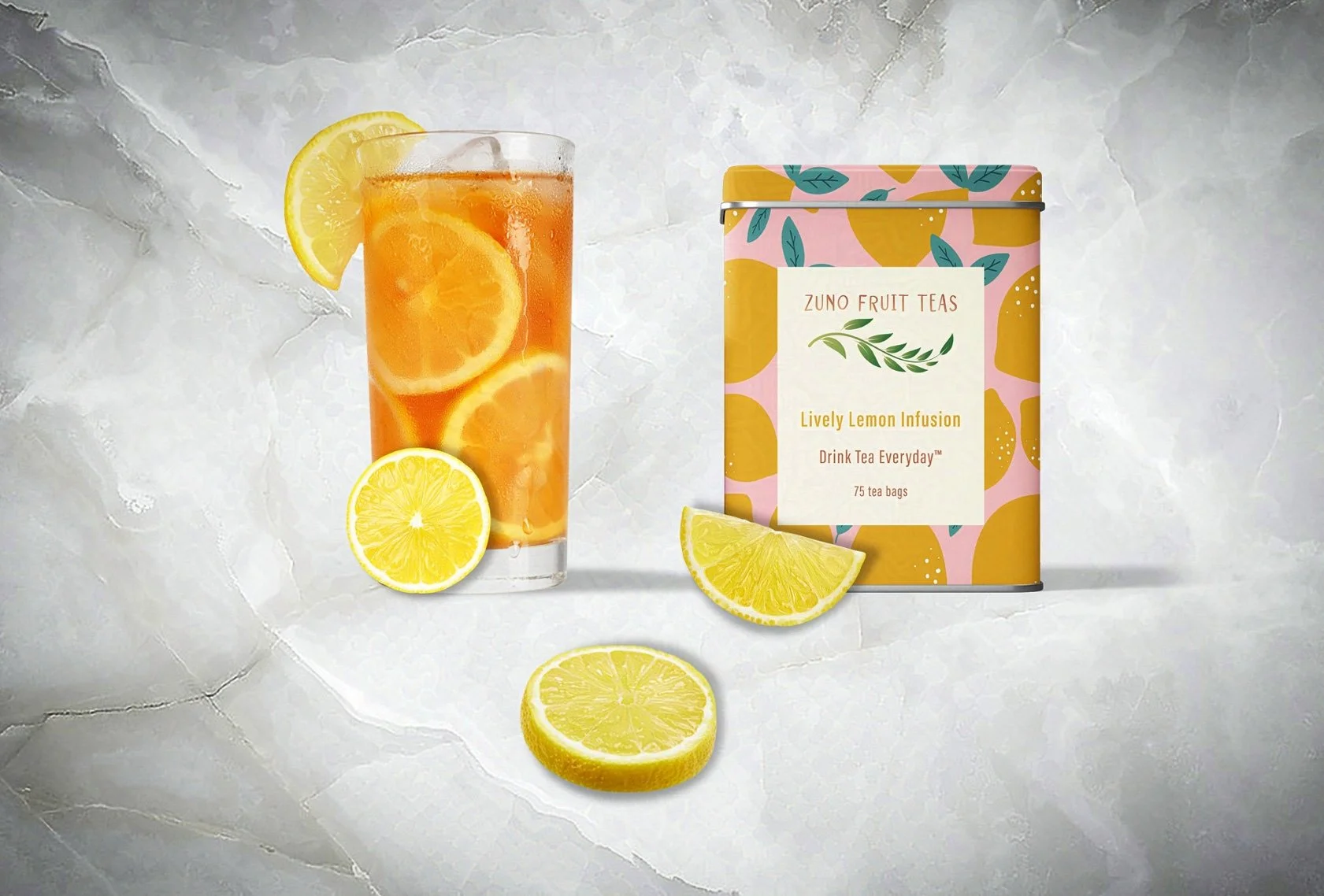
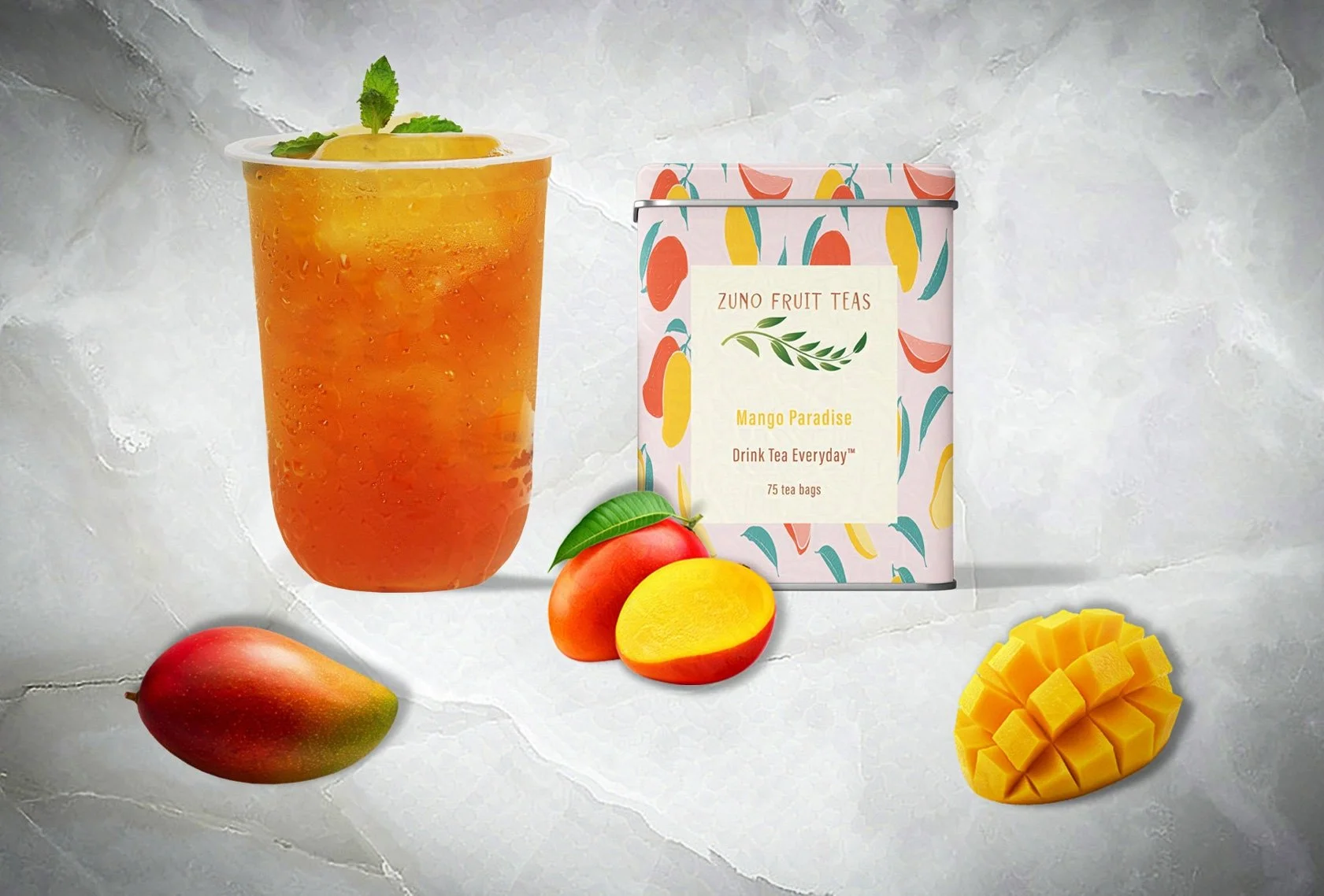
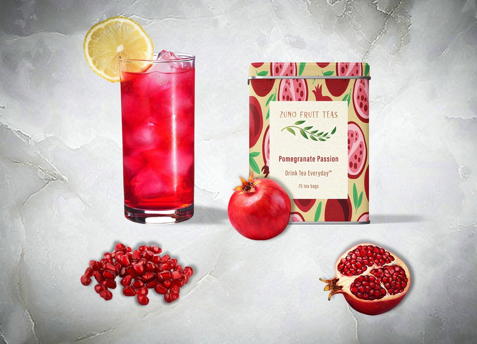
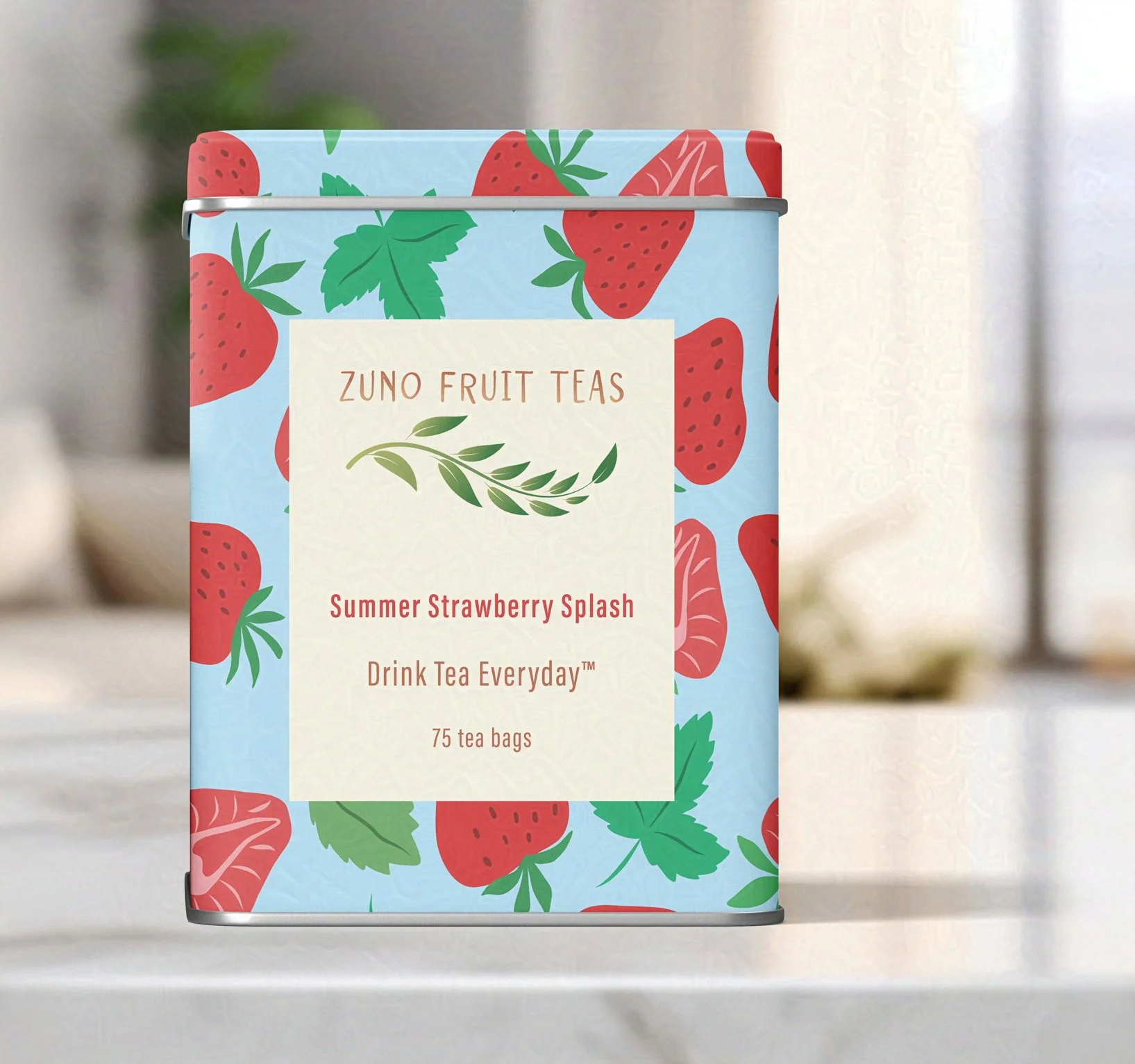
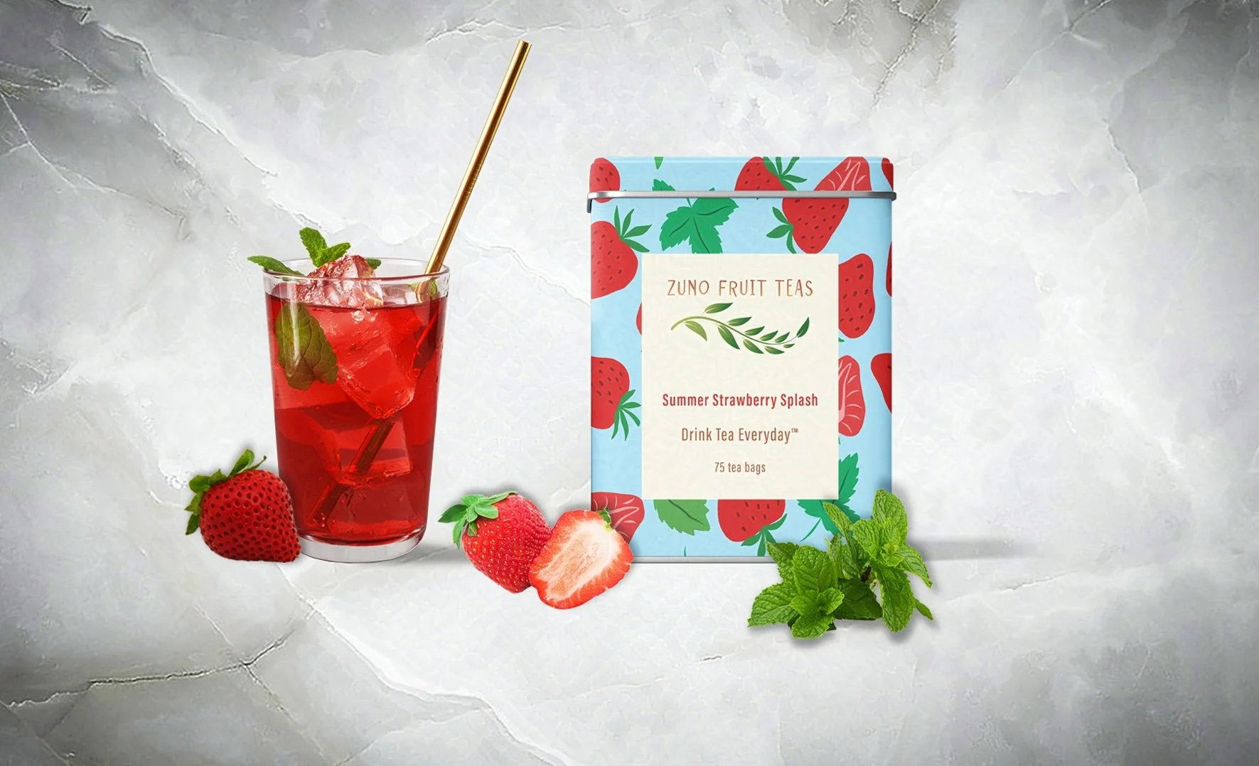
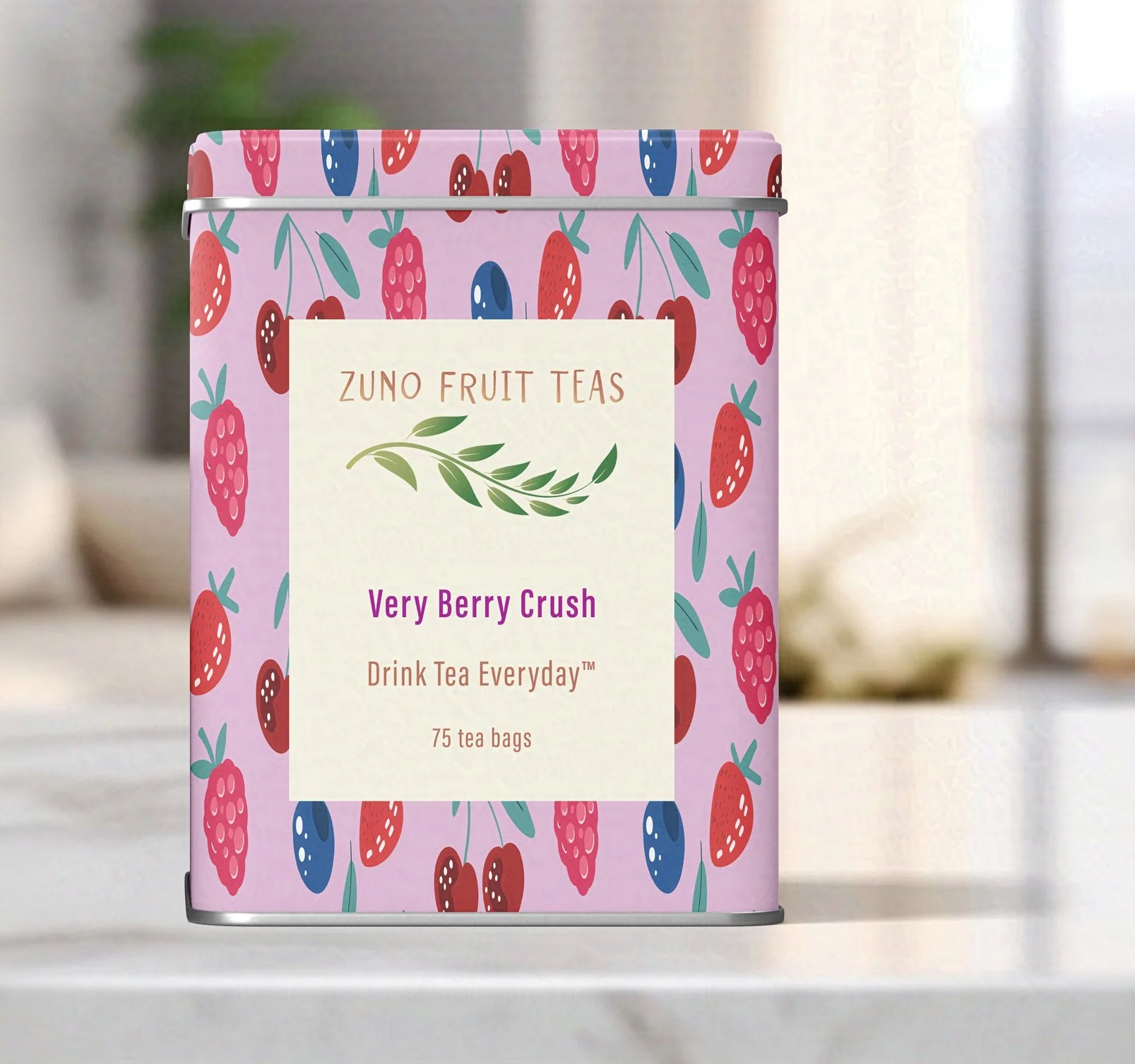
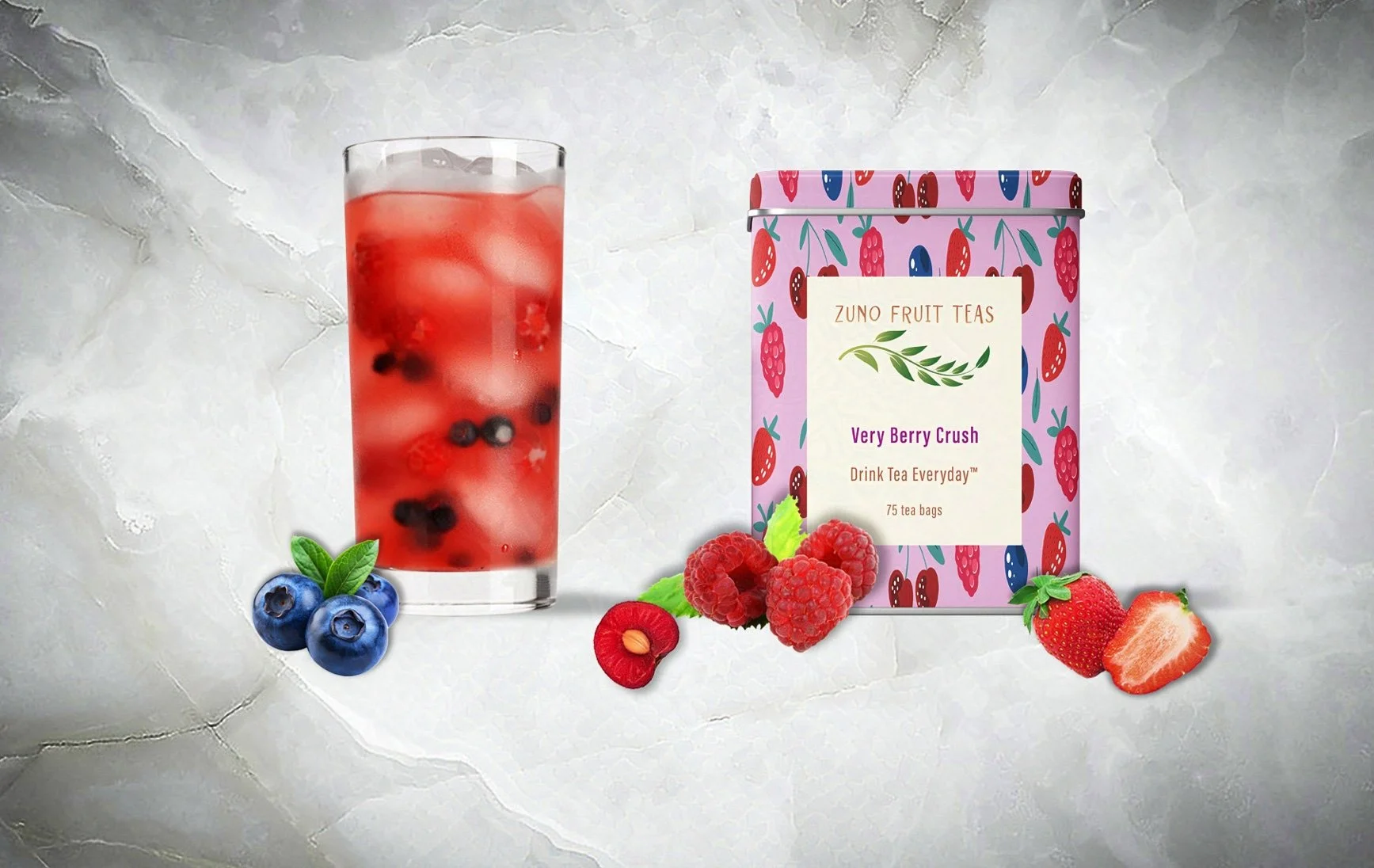
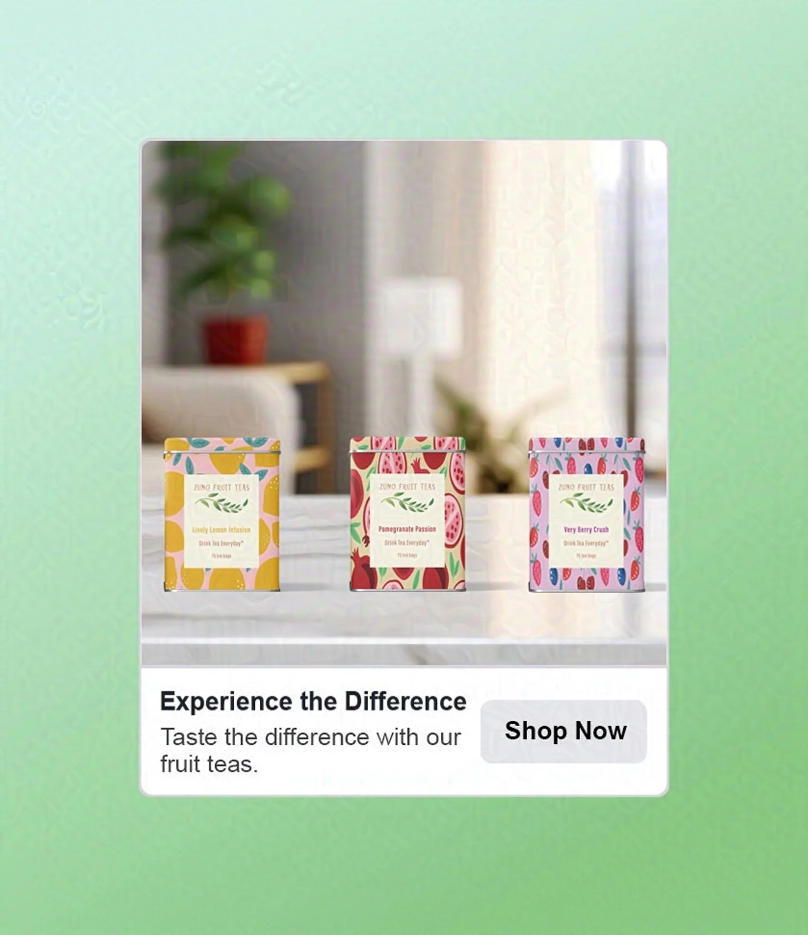
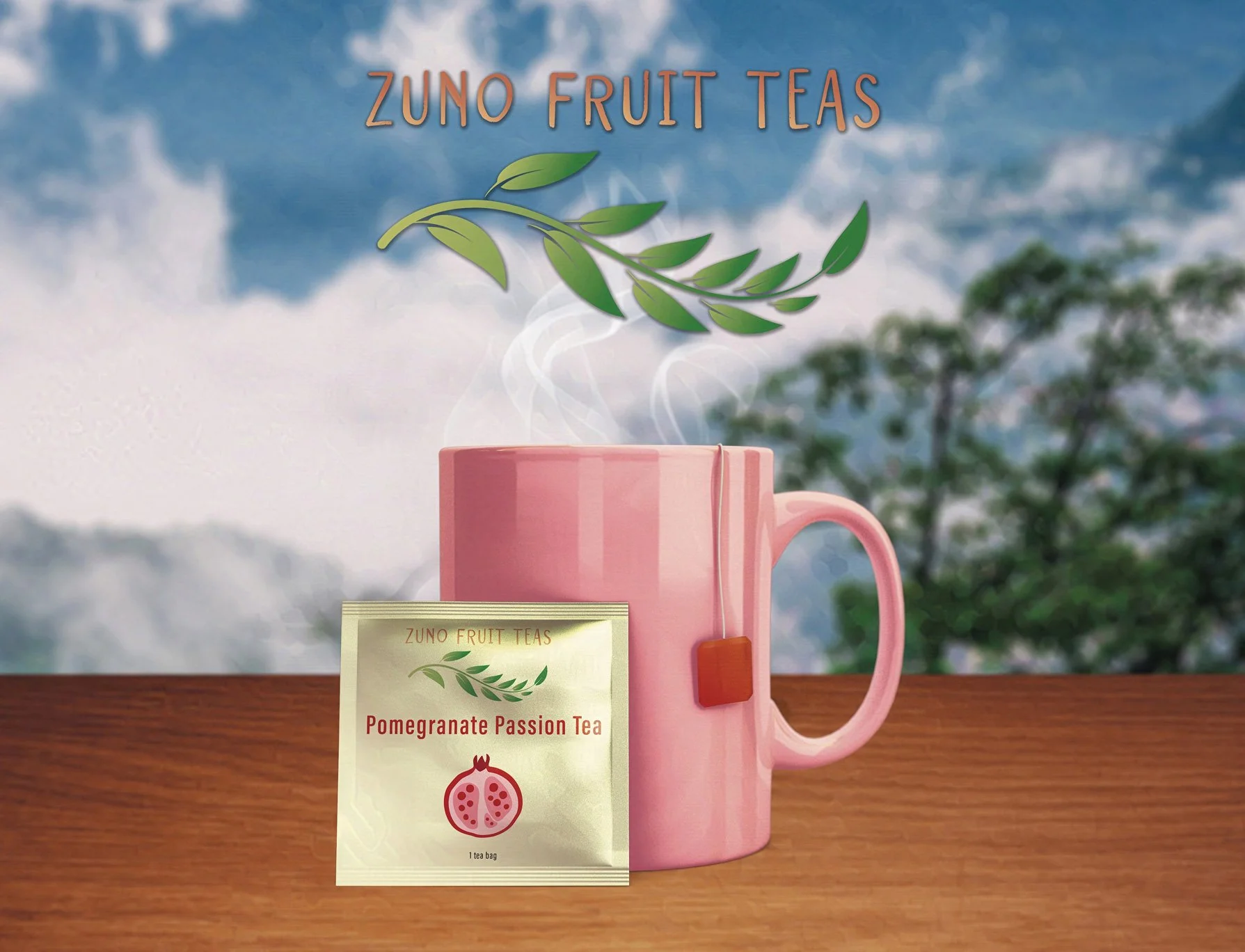
For my tea packaging, I intentionally drew inspiration from vibrant, hand-drawn illustrations that are both striking and inviting. Each metal tea tin proudly showcases the key ingredient through captivating and colorful vector artwork that irresistibly draws consumers in. The label is deliberately impactful yet straightforward, featuring the logo, the tea name, an enticing slogan, and the number of tea bags per tin. This thoughtful and engaging design not only emphasizes the tea's premium quality but also elevates the overall customer experience, making every purchase feel special.
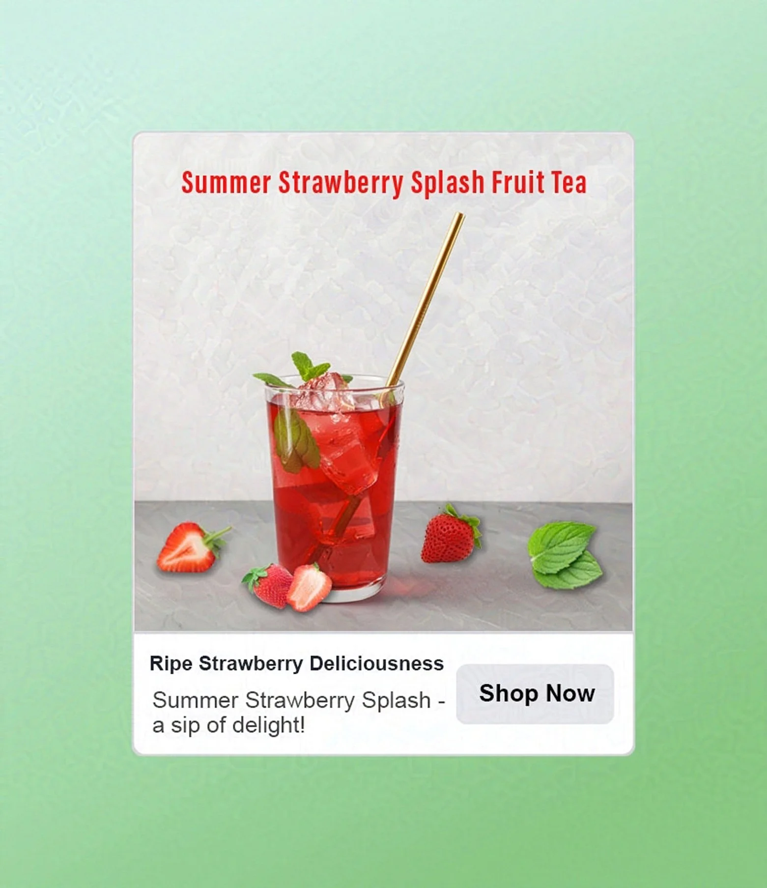
I designed a captivating series of product images to promote each tea variety, perfectly coordinating with the packaging. Each image not only highlights the exquisite tea tins but also showcases an inviting iced glass of each tea, emphasizing the premium ingredients inside. These striking visuals create a compelling allure that draws in both loyal customers and curious newcomers, inviting them to indulge in the delightful experience that our teas offer.