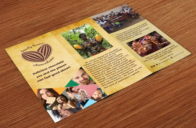
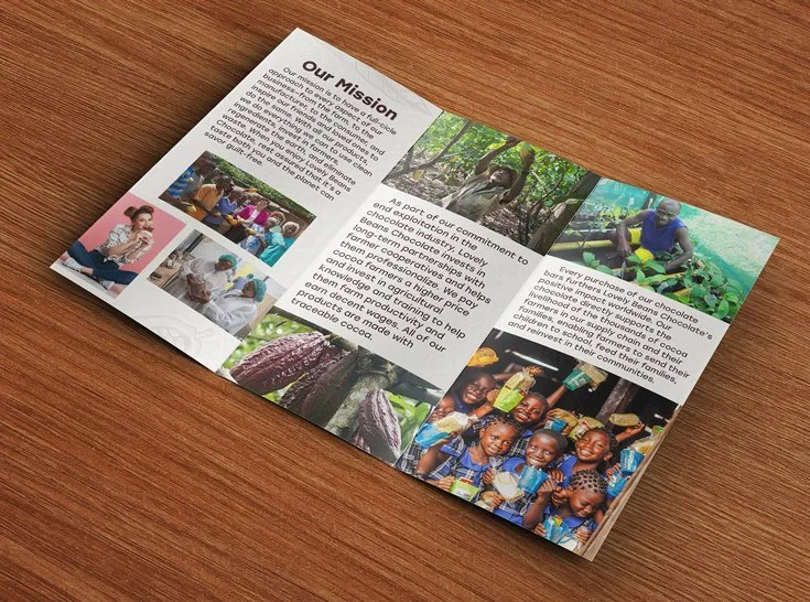
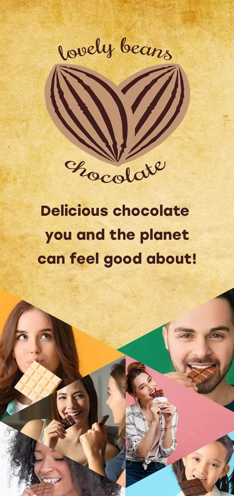
Lovely Beans Chocolate Company
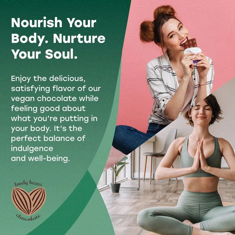
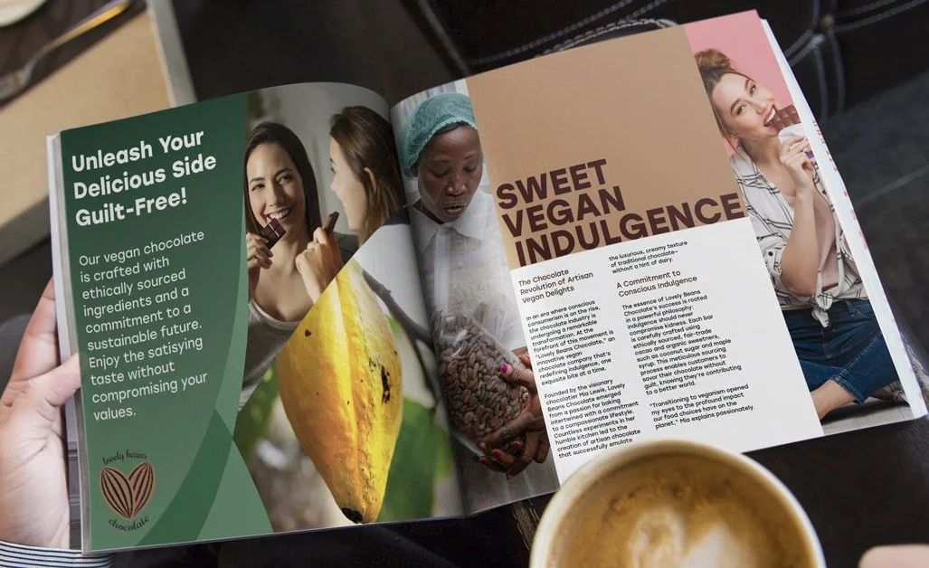
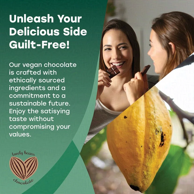
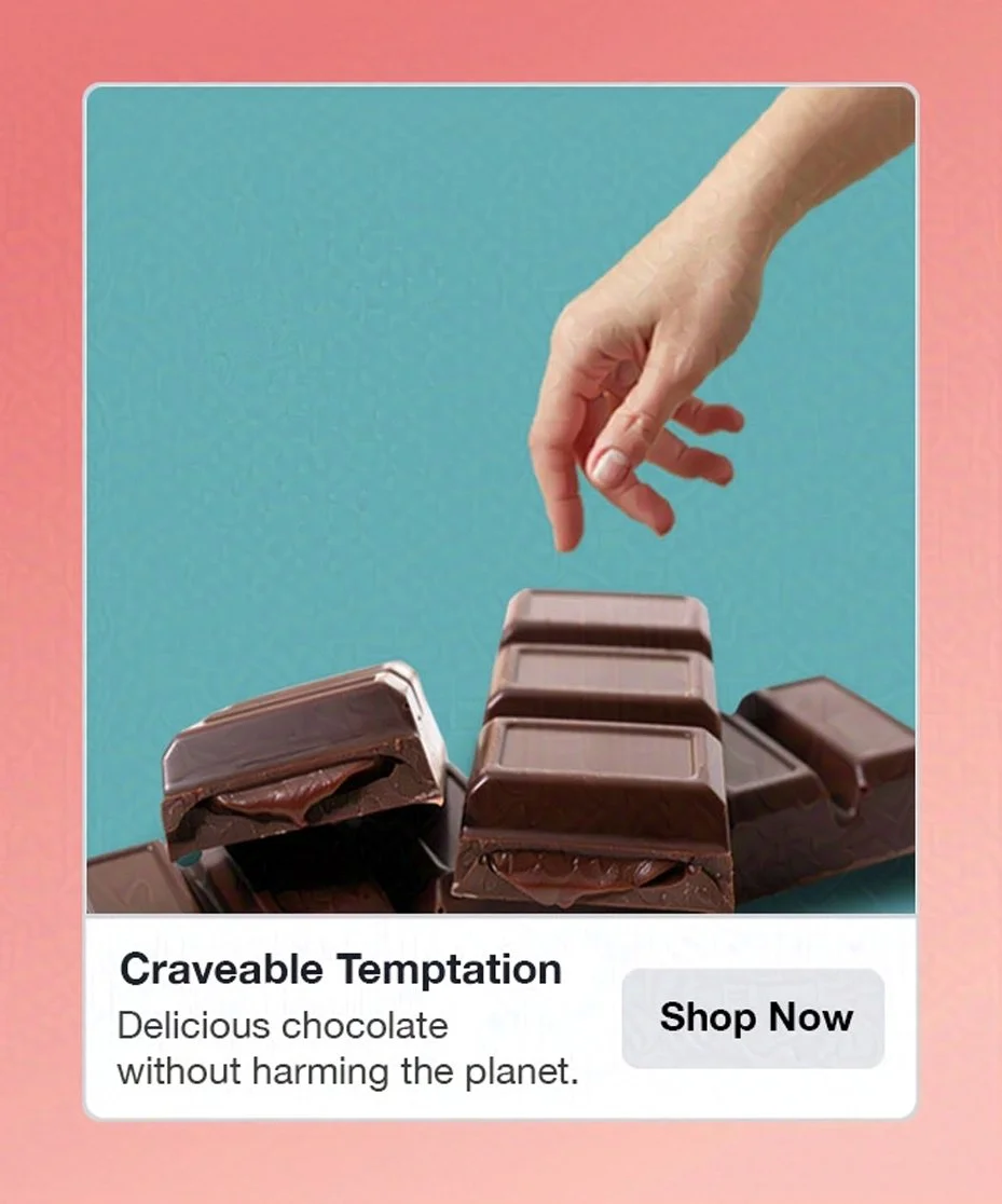
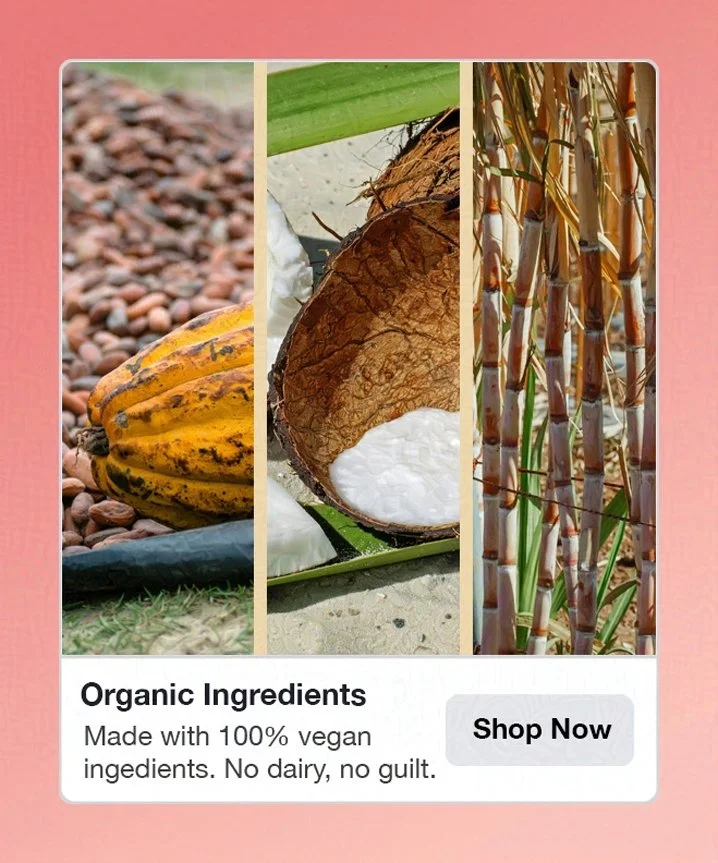
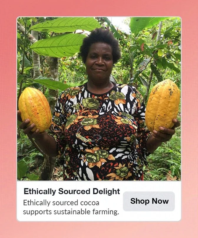
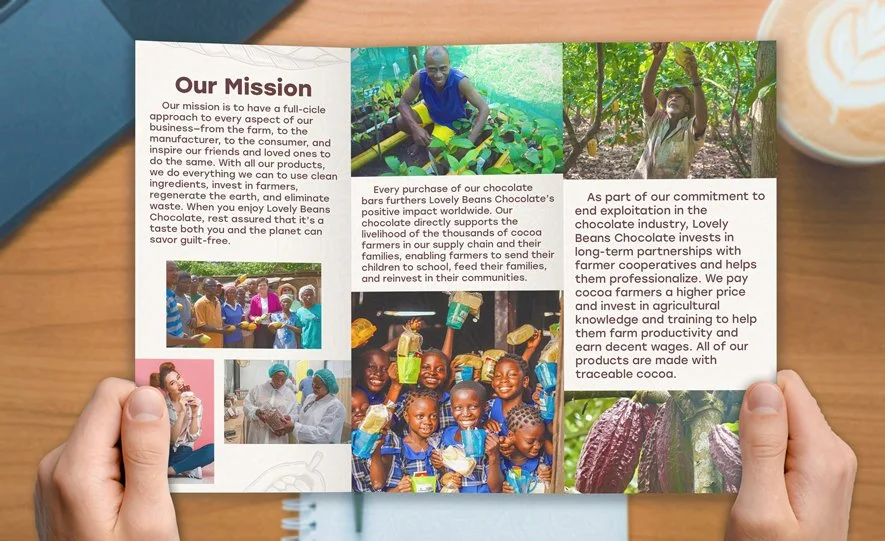
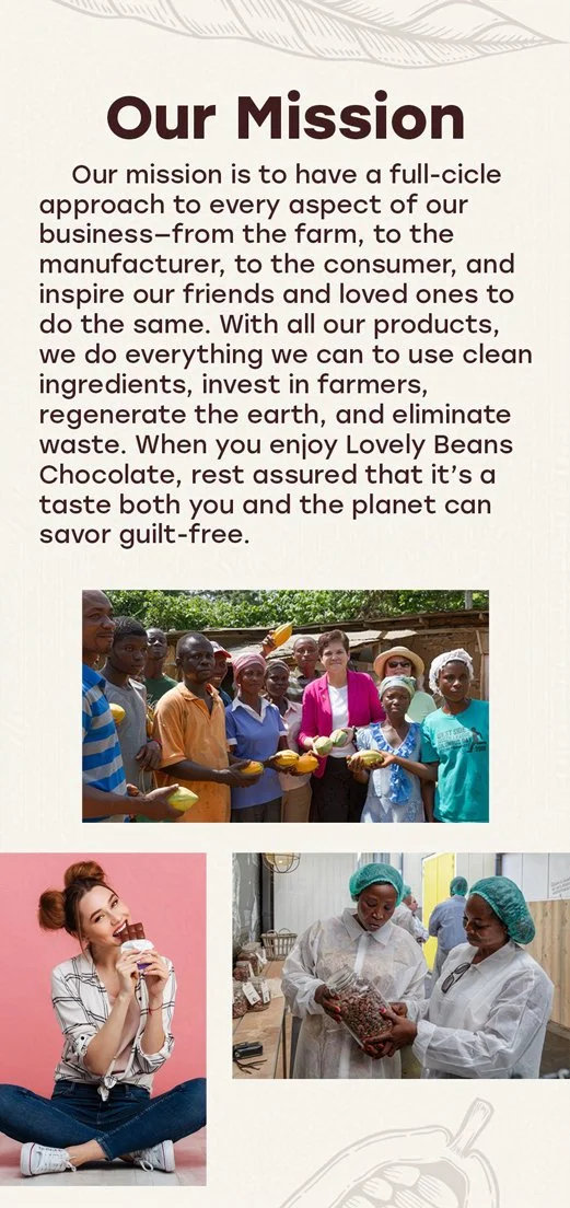
Lovely Beans Chocolate is a concept for a vegan chocolate company. Made with delightful, ethically sourced, and organic ingredients, Lovely Beans Chocolate promises that its delicious chocolate bars don’t have to harm the planet.
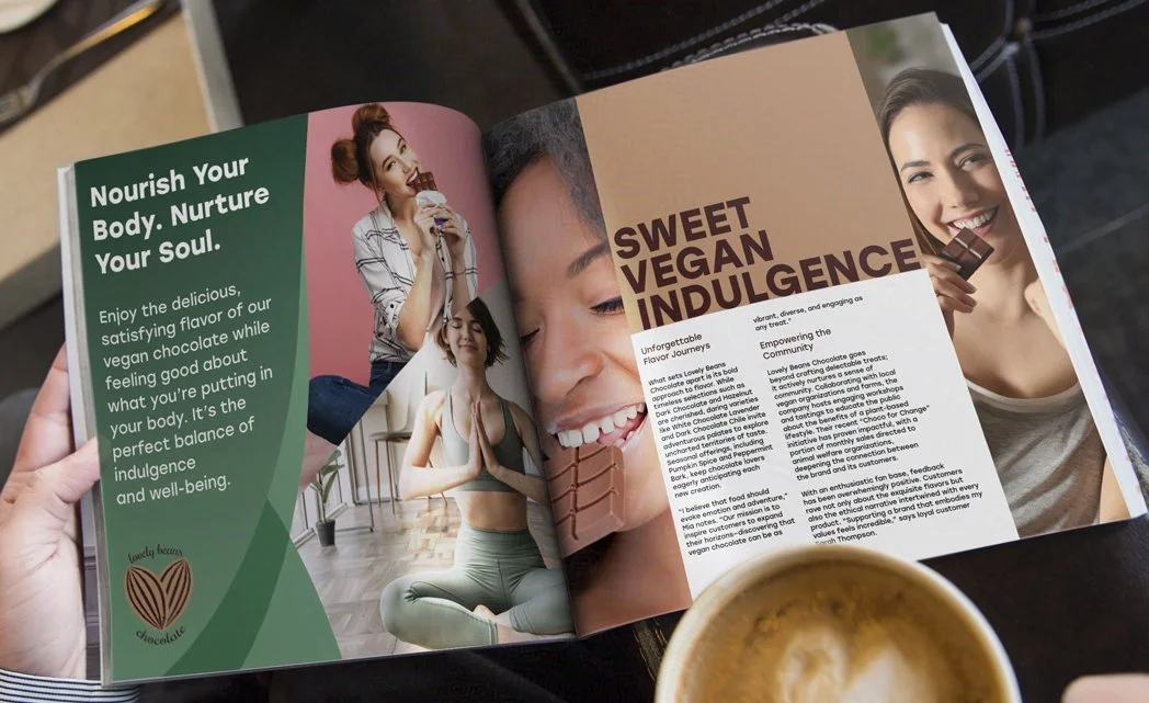
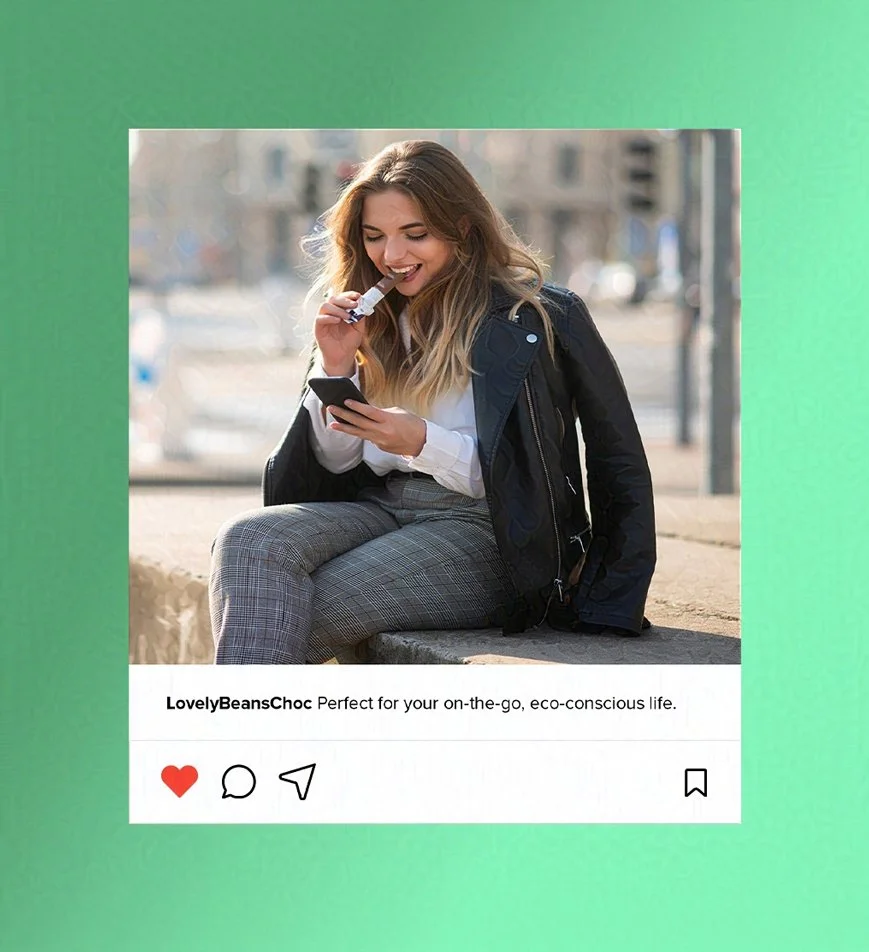
Lovely Beans Chocolate wants to remind us that delicious chocolate doesn’t have to involve exploitation. It emphasizes that we are all connected along the journey of life. Immerse yourself in the fantastic flavors of the company’s chocolate bars and let your taste buds embark on a new adventure.
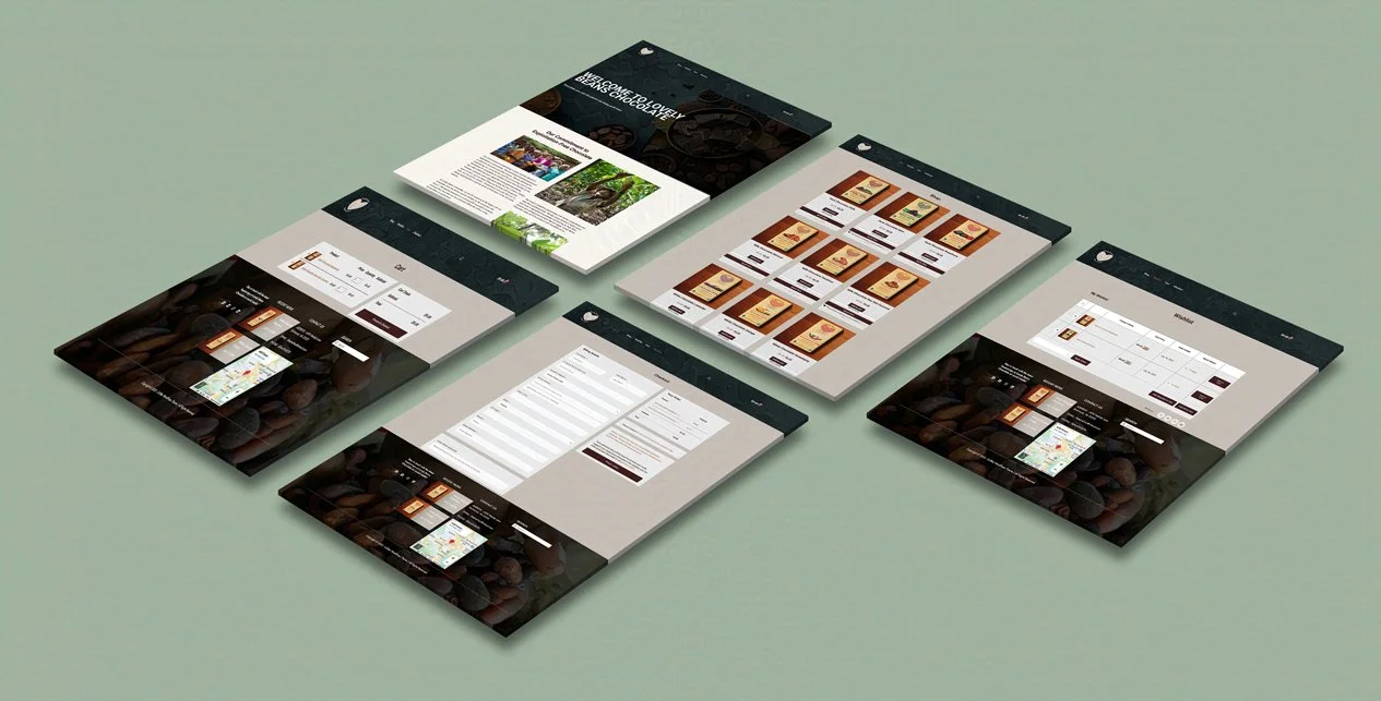
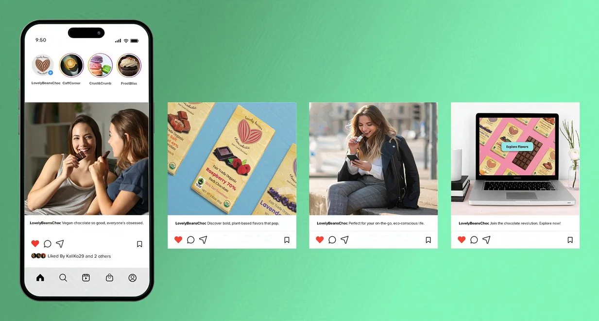
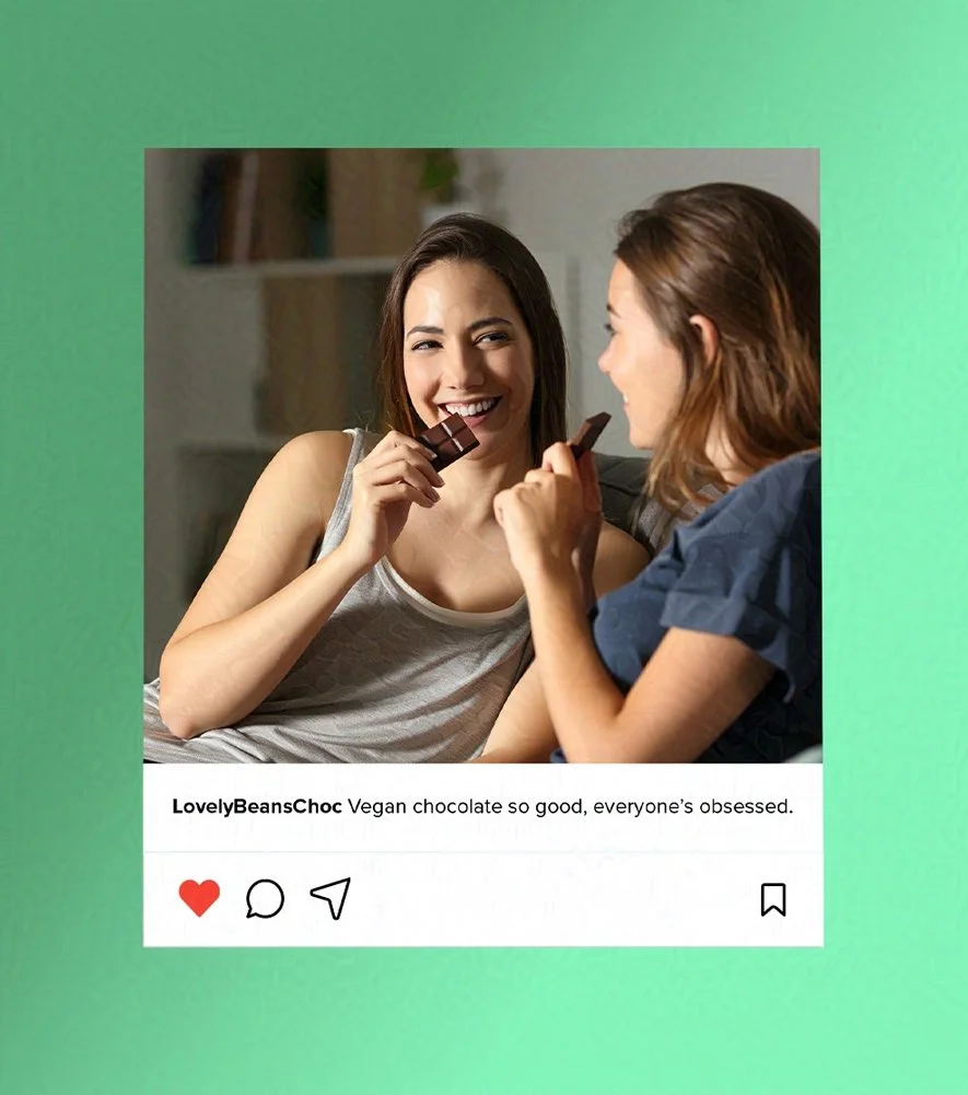
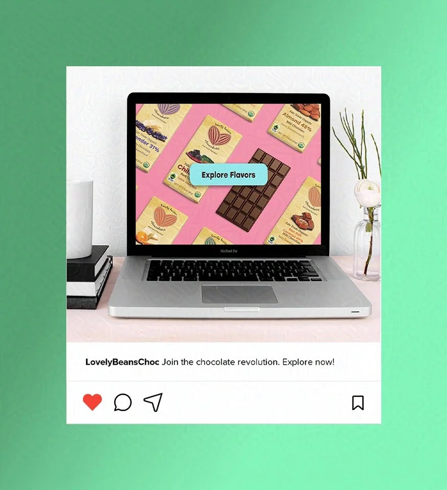
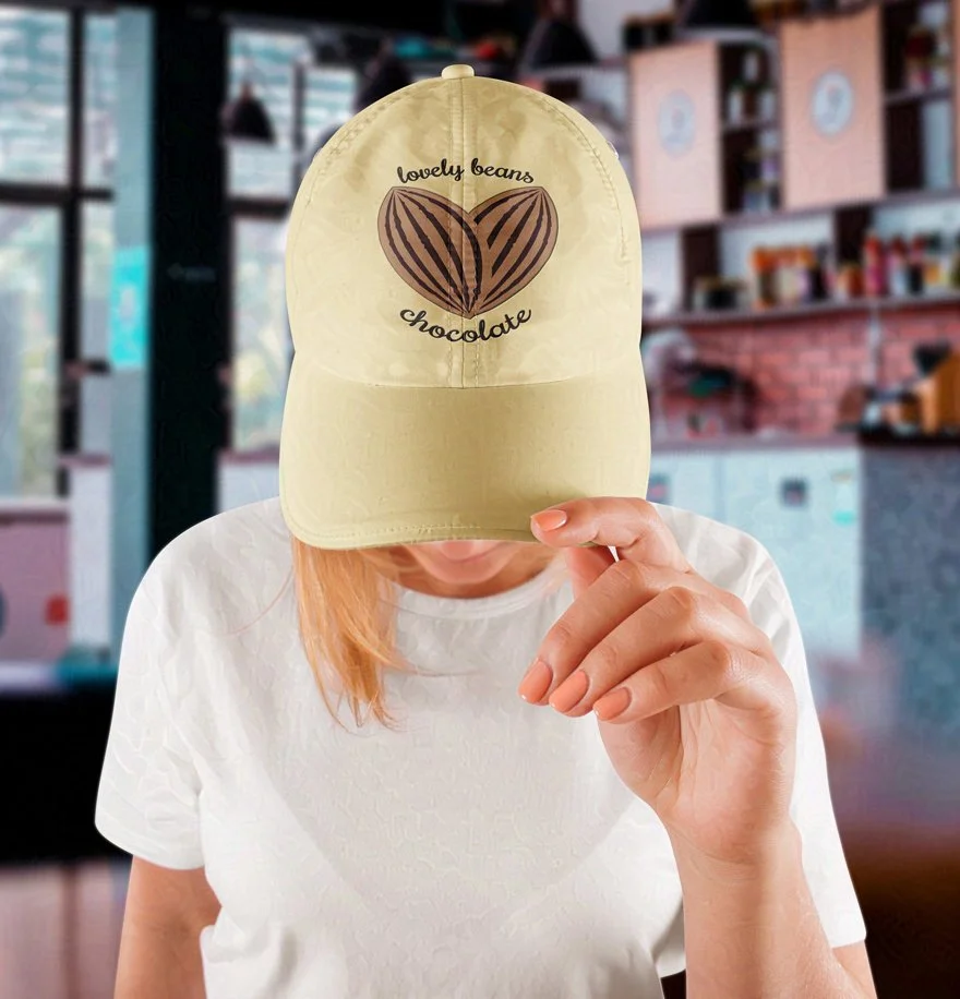
Deliverables include logos, branding identity, packaging, product design, print ads, website, social media posts, ephemera, apparel, and exterior signage.
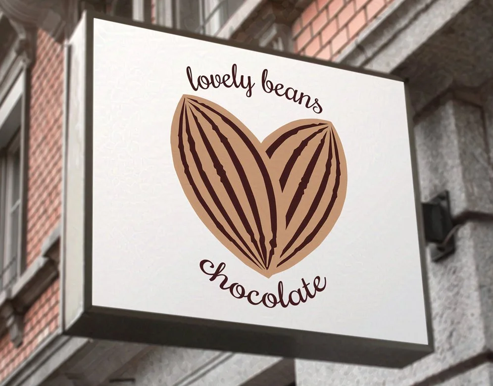
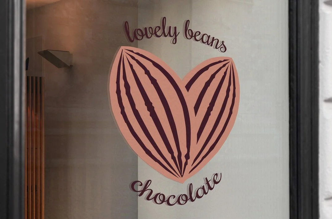
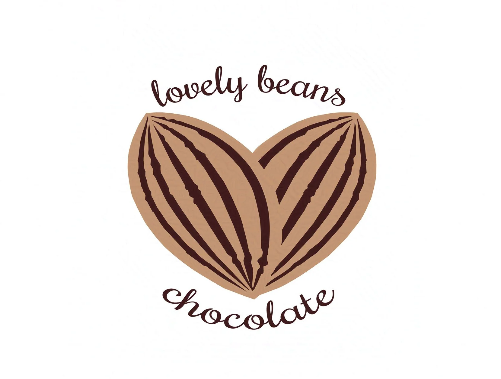
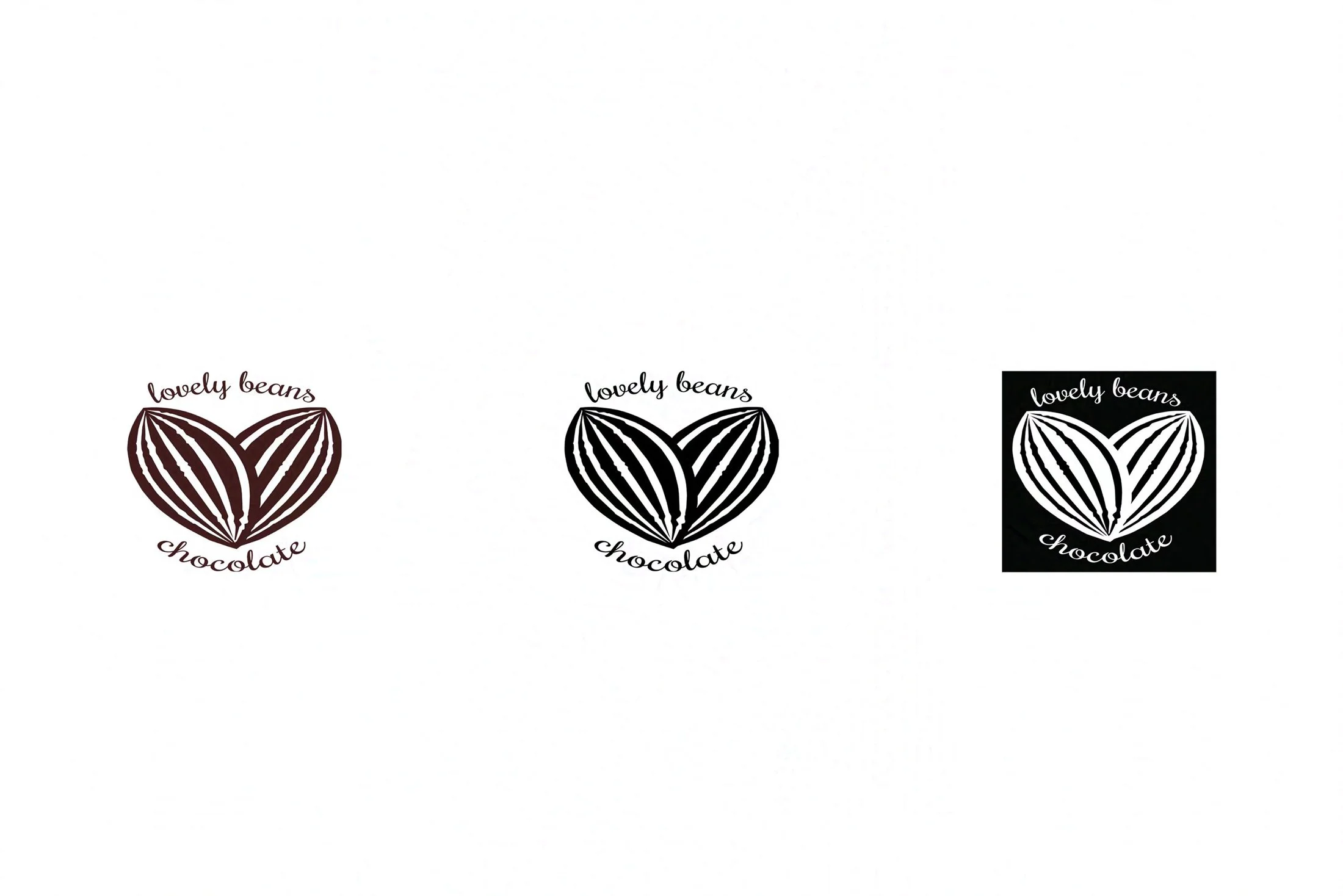
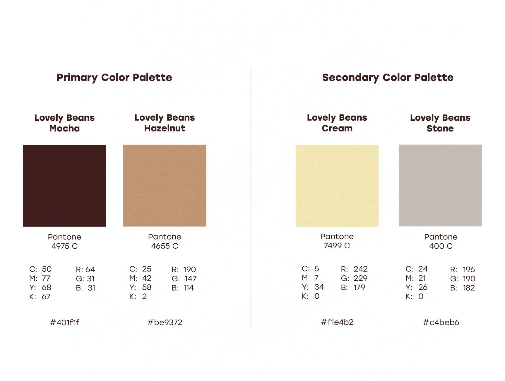
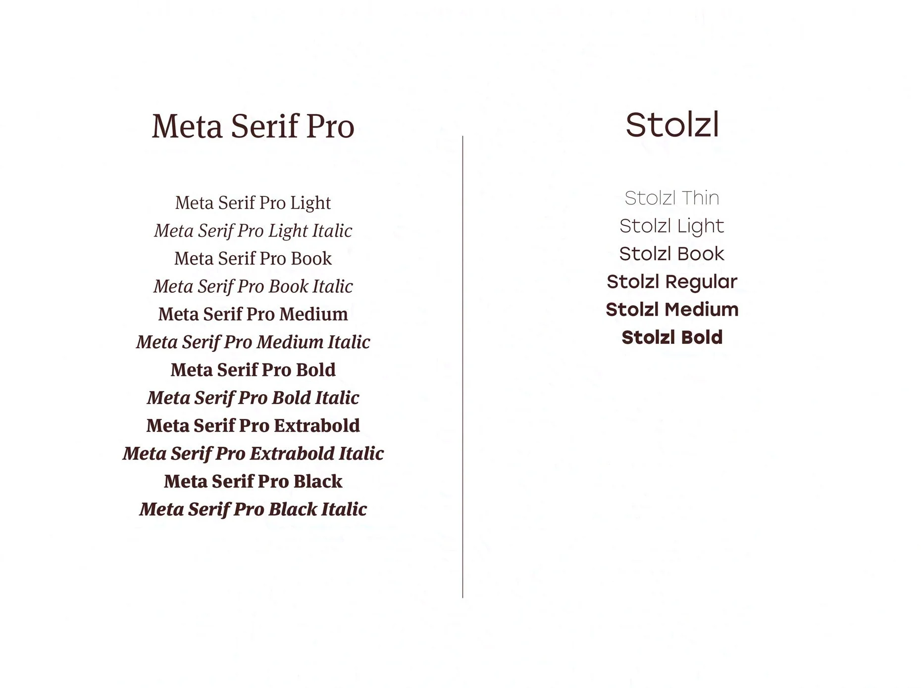
Logos and Brand Identity
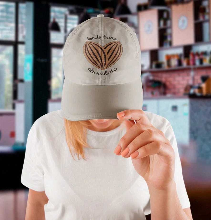
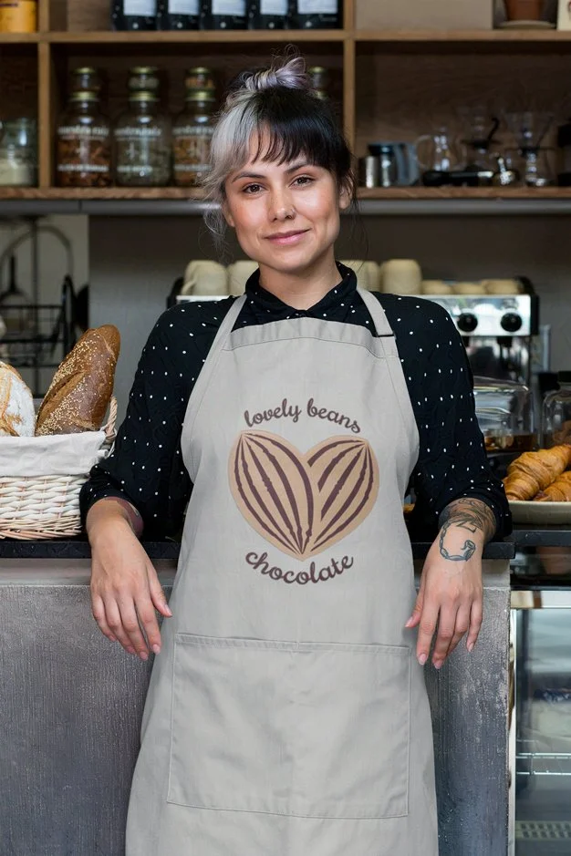
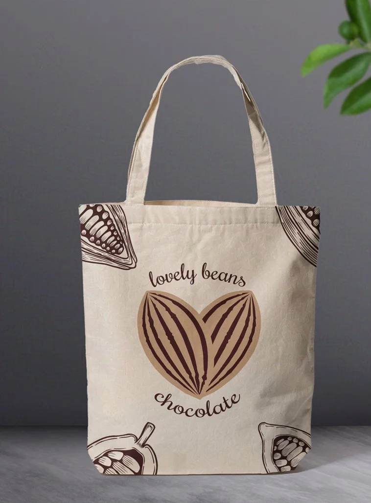
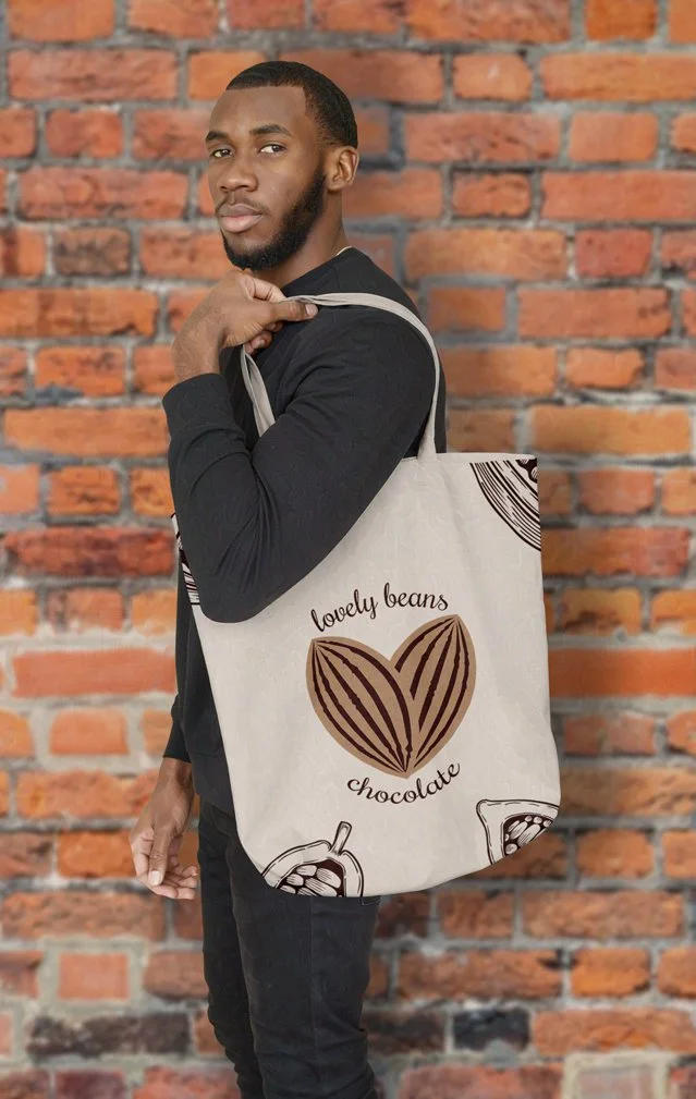
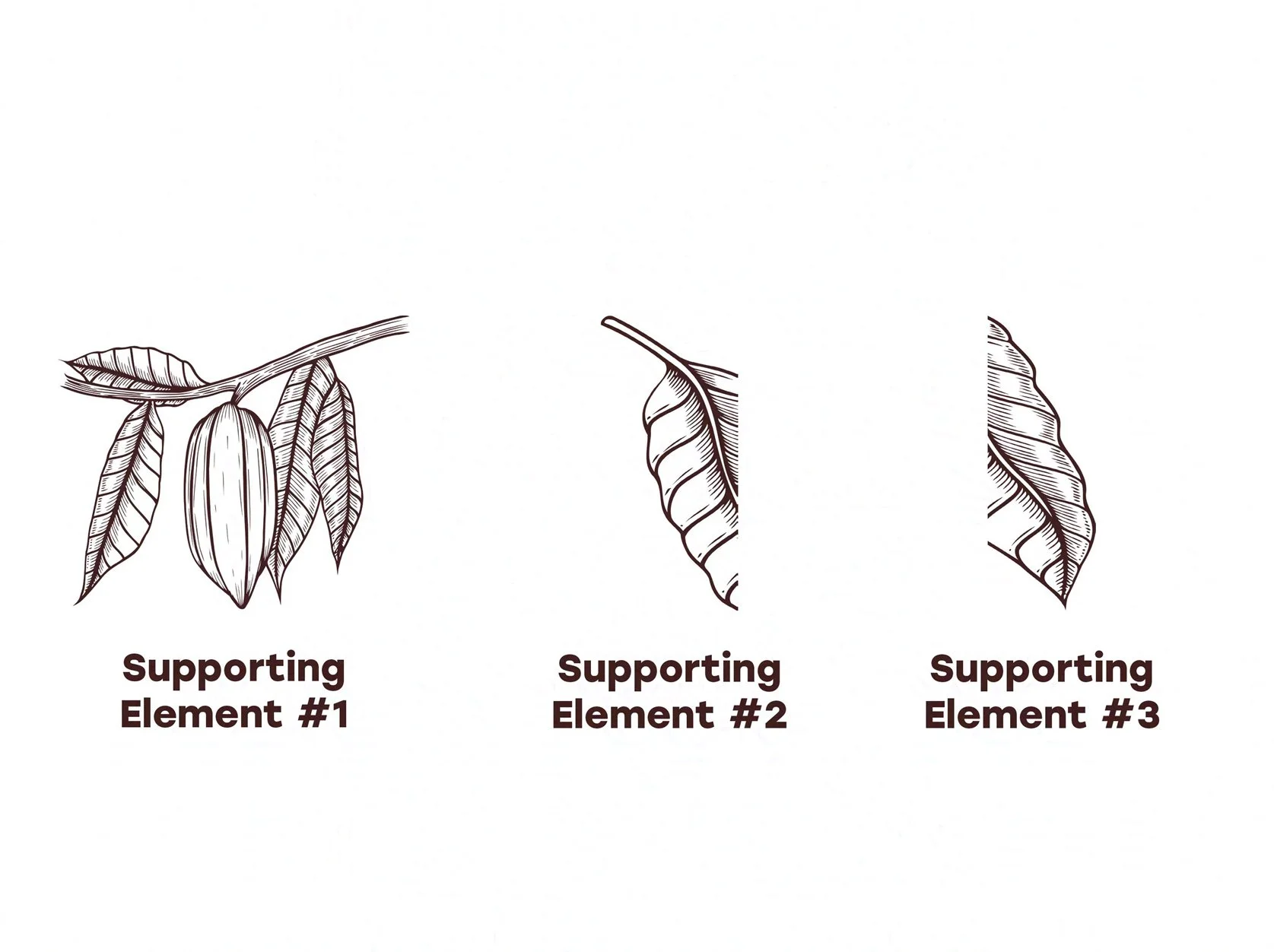
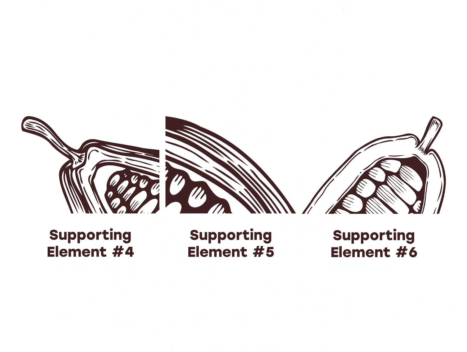
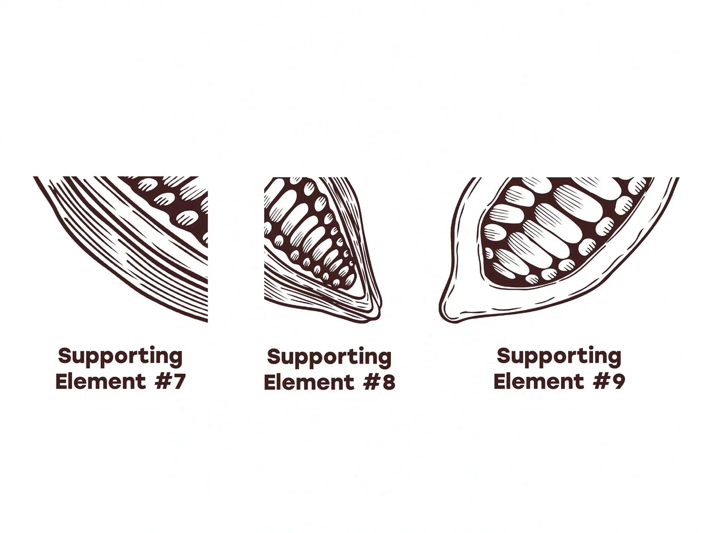
For my branding guidelines, I envisioned a clean and all-natural aesthetic that aligns with the company’s vegan brand image. In the primary logo, I used a color palette of complementary shades of brown to evoke the image of the delicious chocolate offered by the company. The secondary color scheme, consisting of a creamy yellow and a warm grayish-brown, was chosen for its complementary attributes related to the primary colors and the main logo. To help promote the brand identity and reinforce the company’s products in the minds of consumers, I also created a collection of secondary illustration elements, consisting of stylized depictions of cocoa beans and cocoa plants, to add visual interest to the various branding materials. These elements work together to ensure that the Lovely Beans Chocolate brand identity is strong and unified.
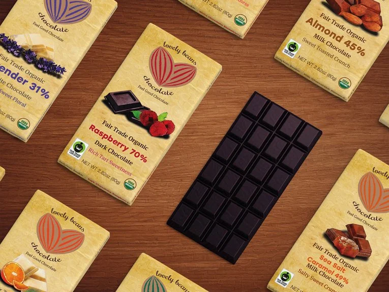
Packaging and Product Design
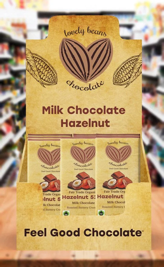
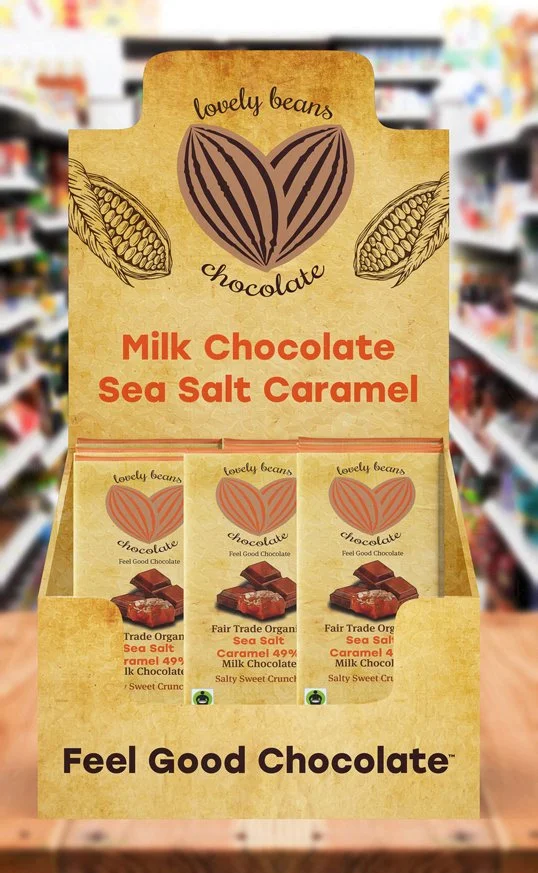
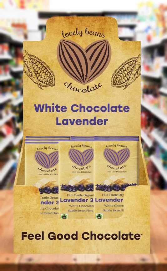
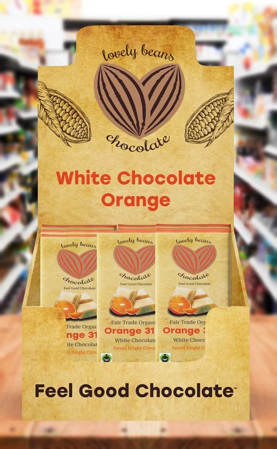
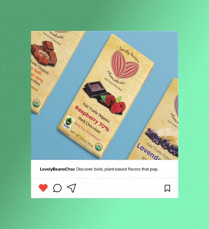
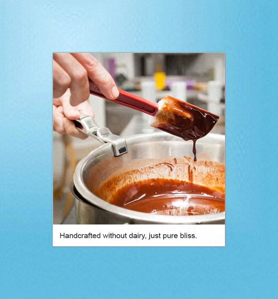
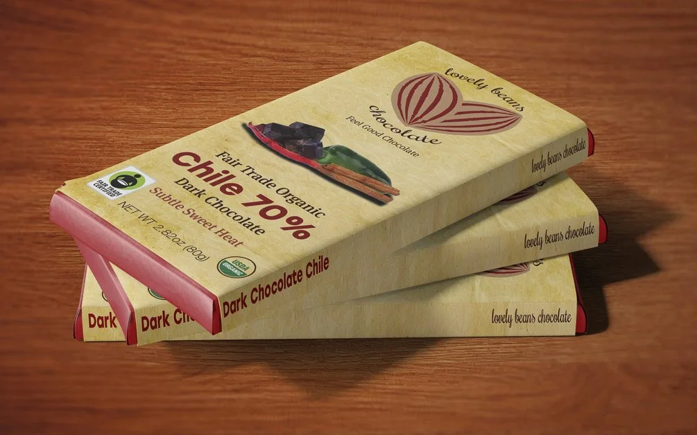
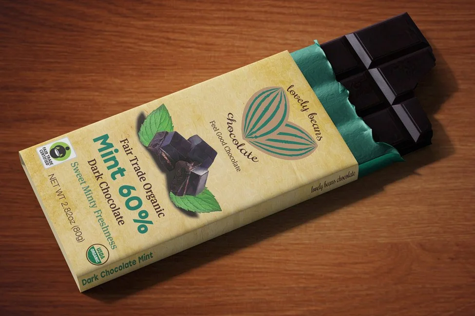
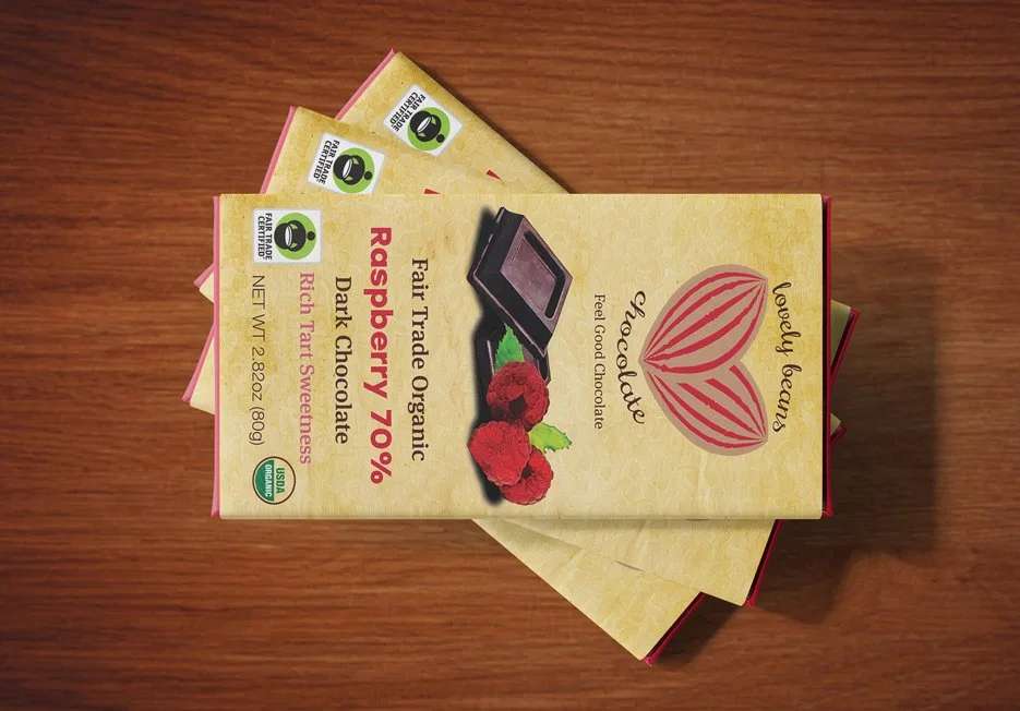
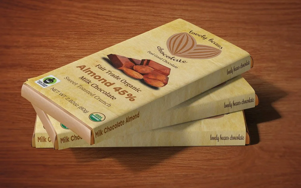
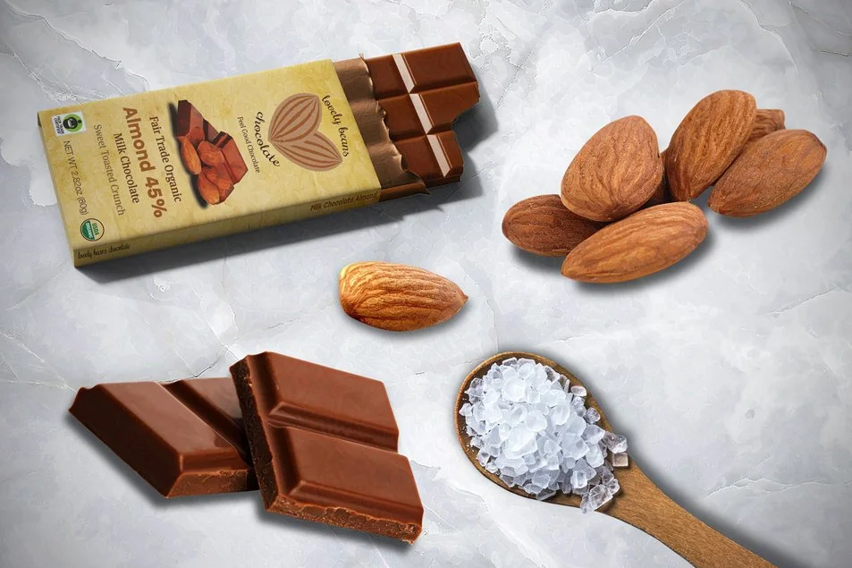
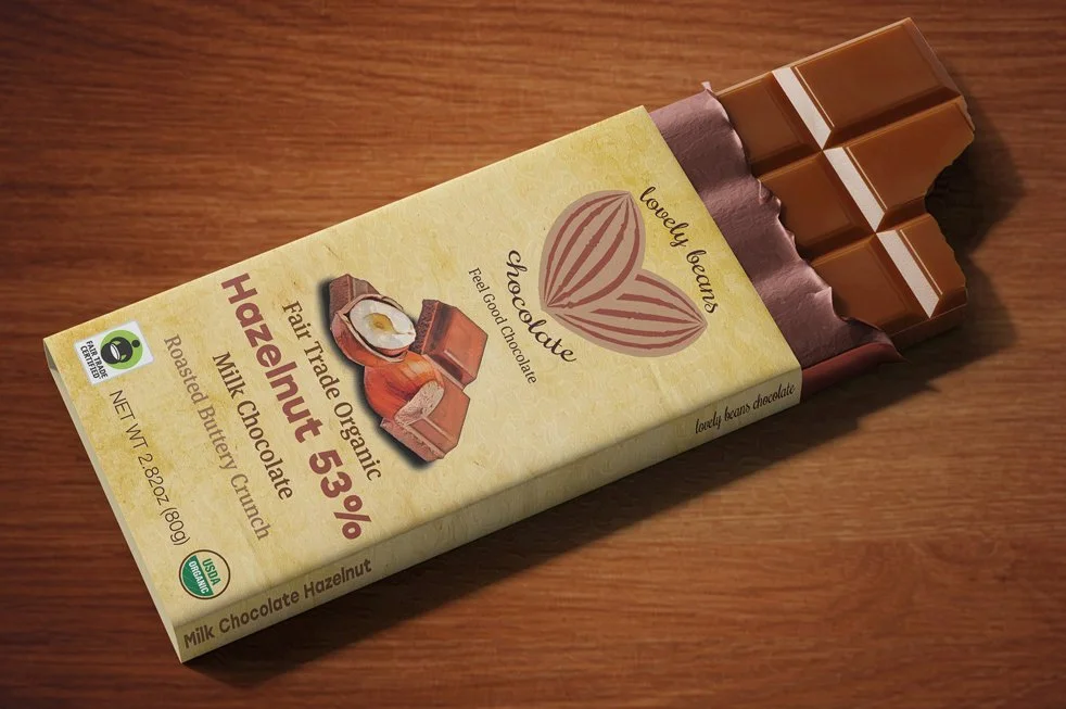
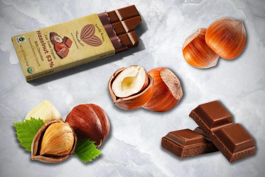
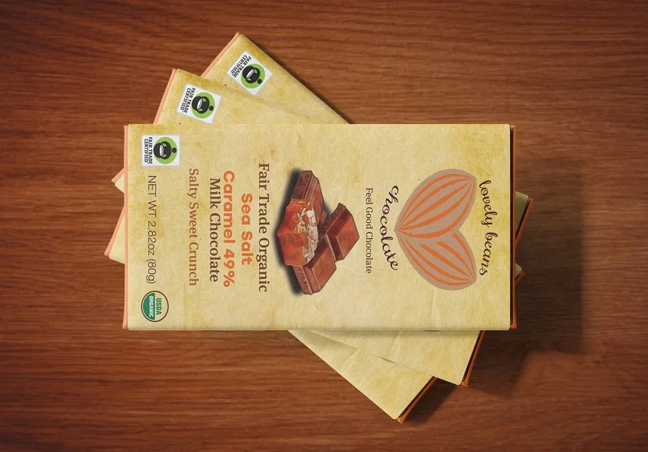
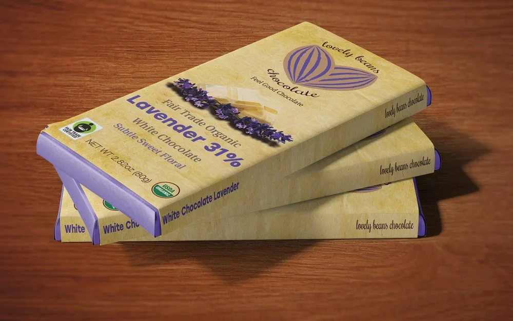
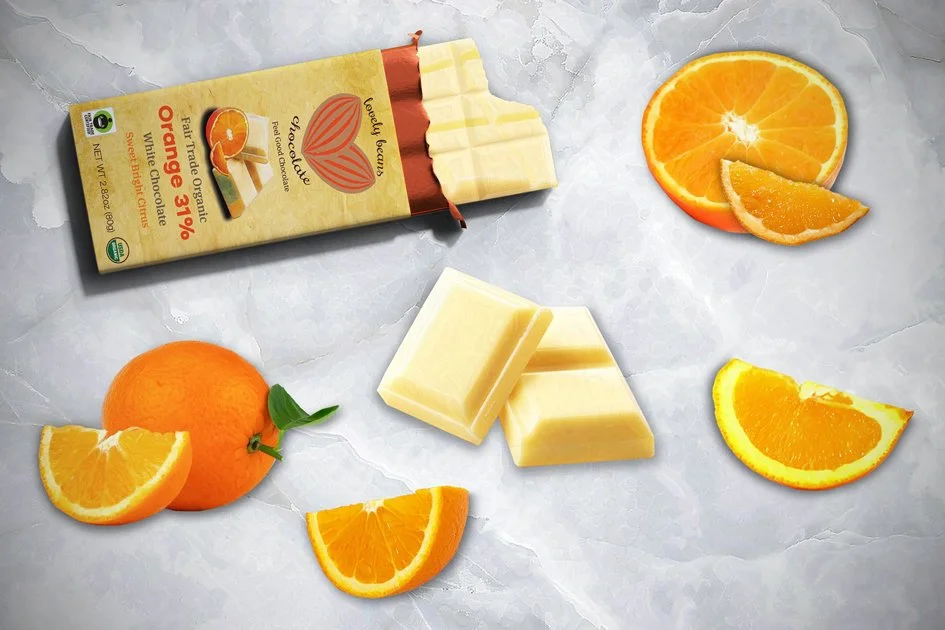
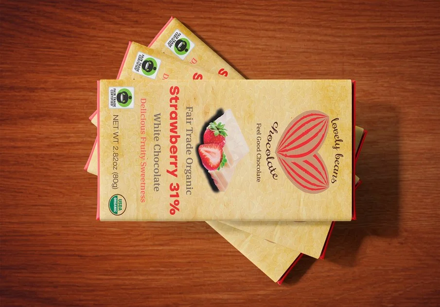
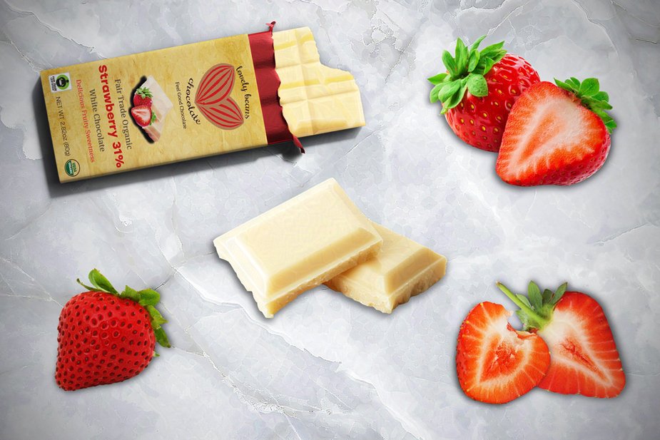
For my packaging concept, I drew inspiration from watercolor designs. The soft yet vibrant watercolor aesthetic perfectly complements Lovely Beans Chocolate’s vegan and organic brand image. I strove to strike the right balance between incorporating colorful illustrations and maintaining a product that aligned with the established organic brand image in my packaging designs. I returned to the myriad of flavors I had discovered through my research, both familiar and exotic, such as raspberry, orange, and lavender. Once I narrowed down my preferences for each chocolate variety, I focused on emphasizing the vibrant colors of the ingredients, such as deep fiery red, cool green, and rich purple. I chose a parchment background and constructed the wrappers from recycled cardboard, further reinforcing the organic brand identity.
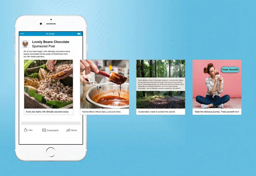
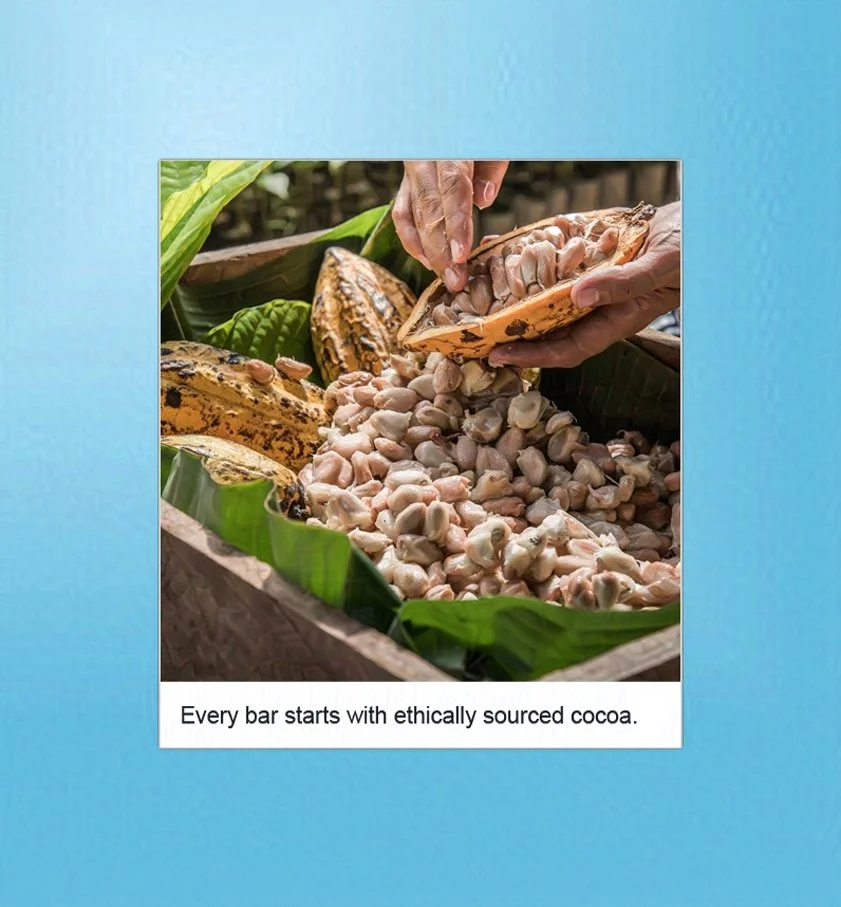
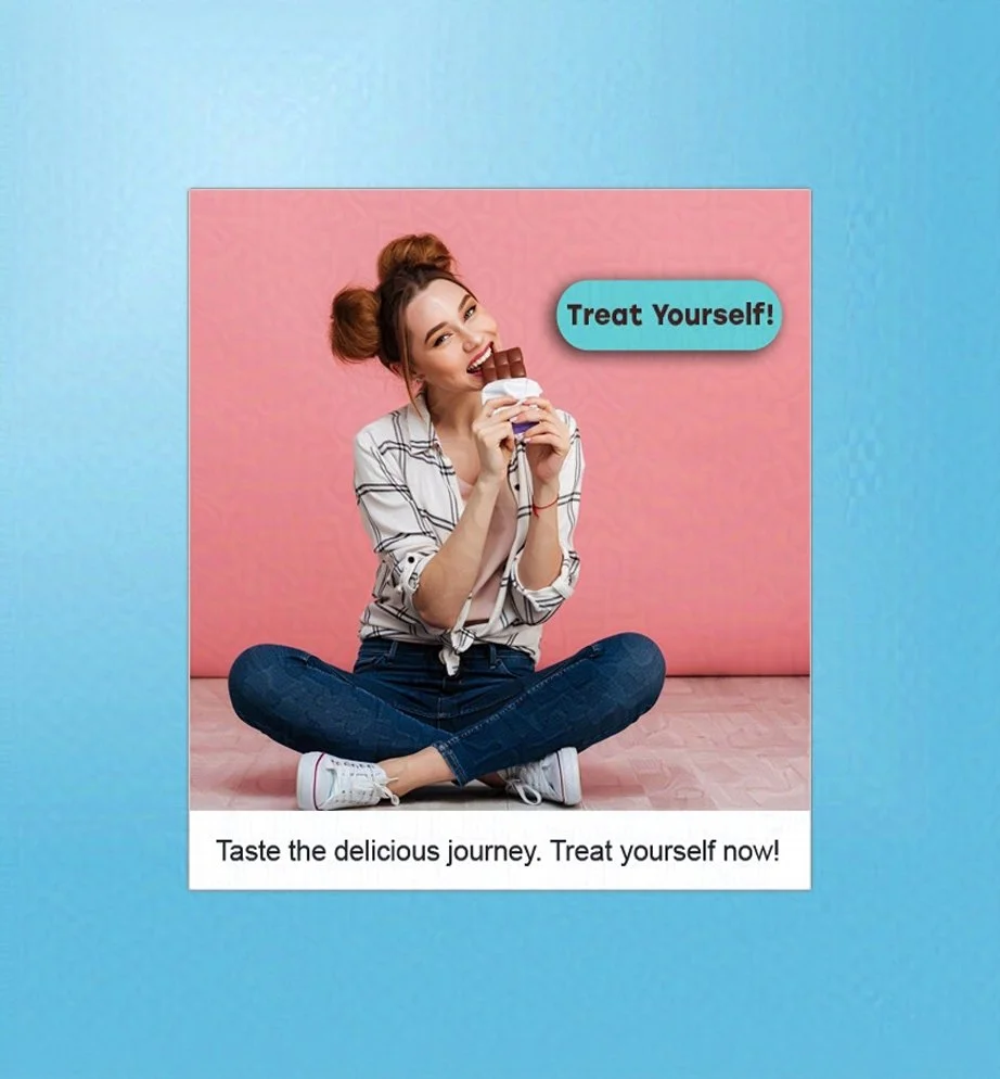
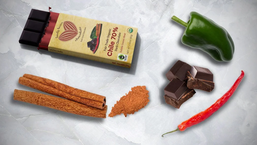
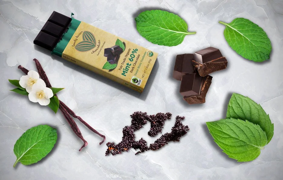
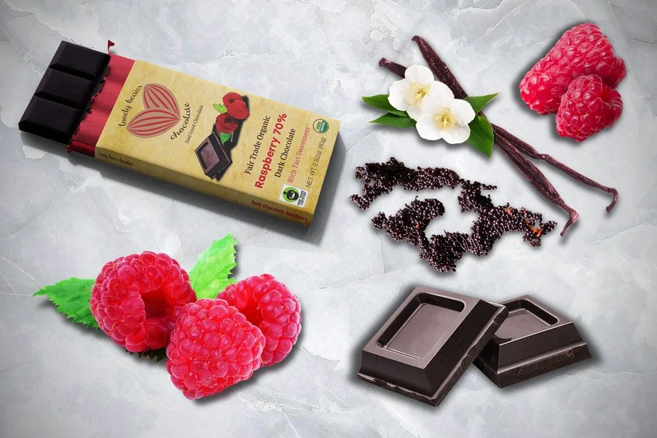
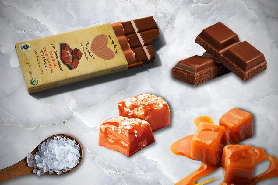
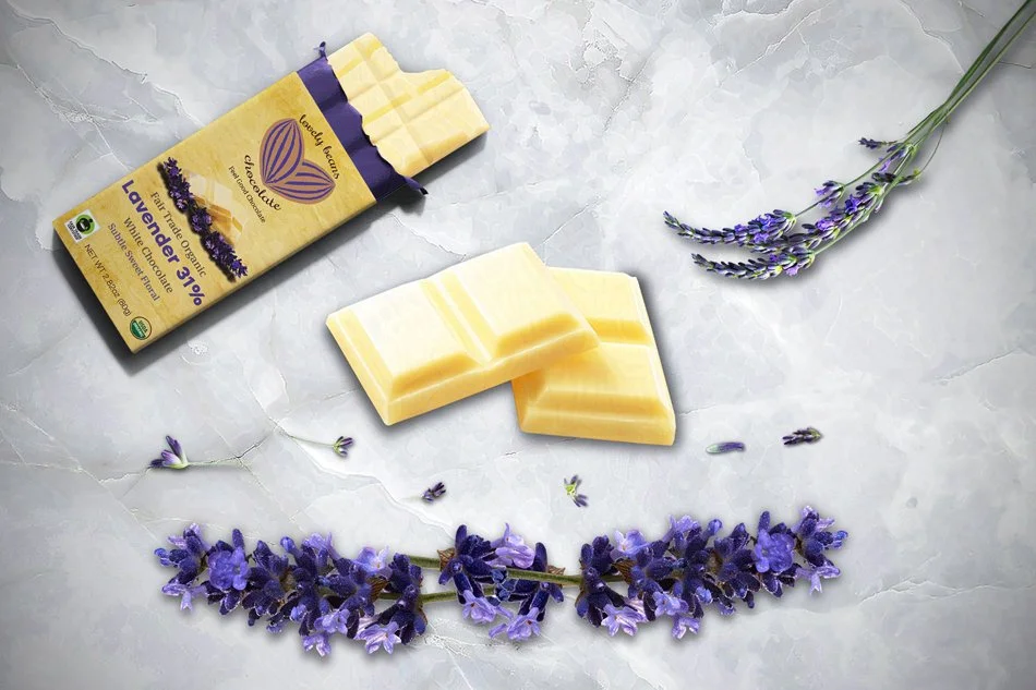
I also designed a series of eye-catching product images to promote each chocolate bar variety, ensuring they aligned perfectly with the packaging. Each image not only highlights the delicious chocolate but also features its enticing ingredients, creating a compelling appeal that draws in both loyal customers and new chocolate enthusiasts to indulge.

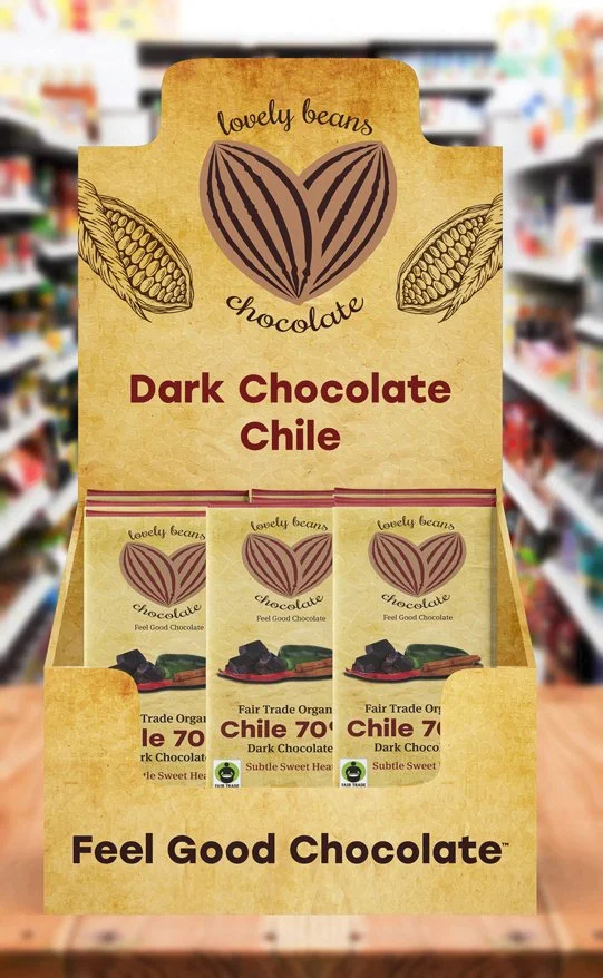
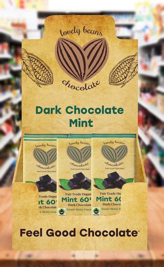
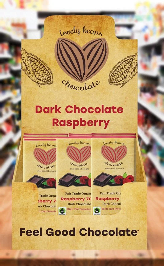
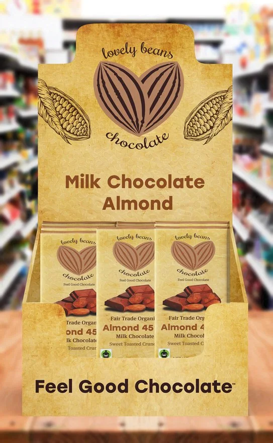
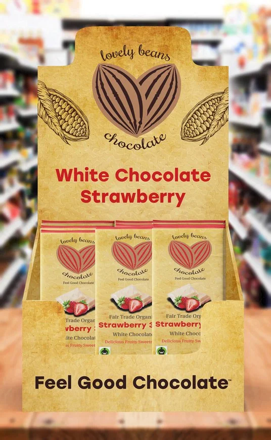
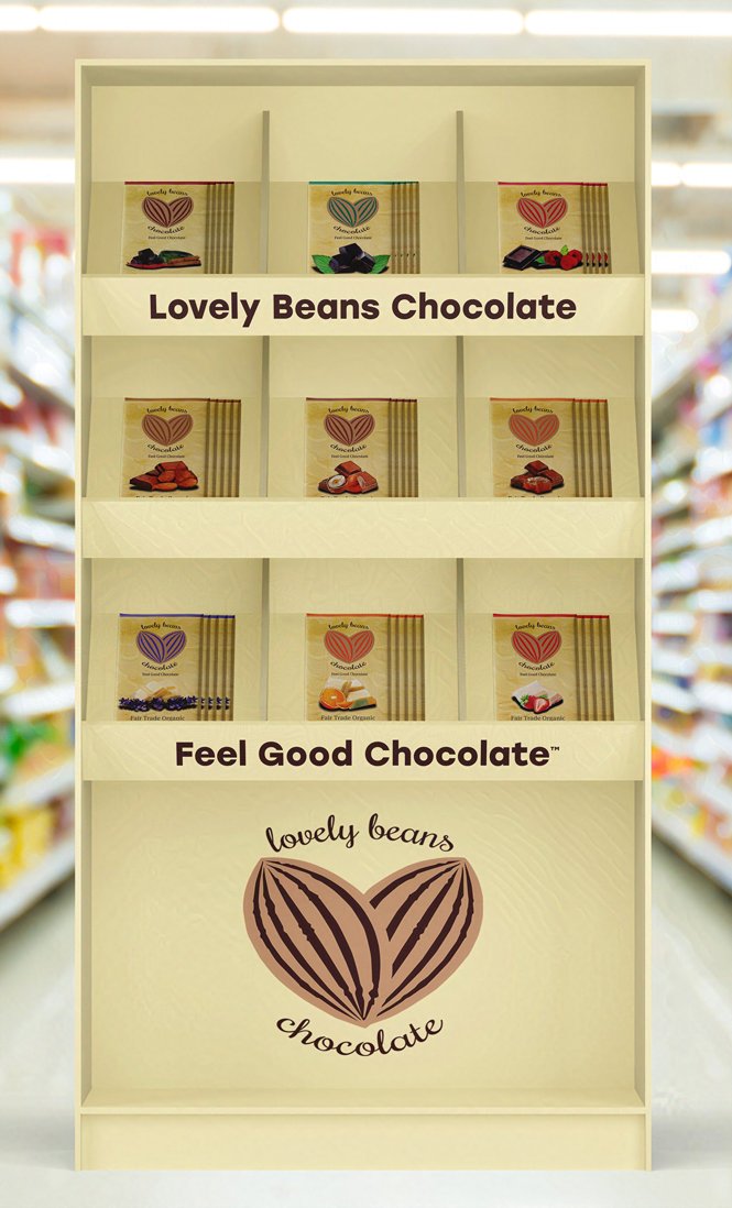
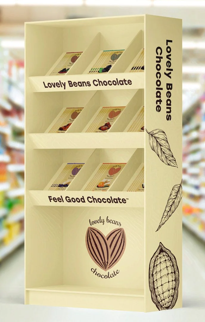
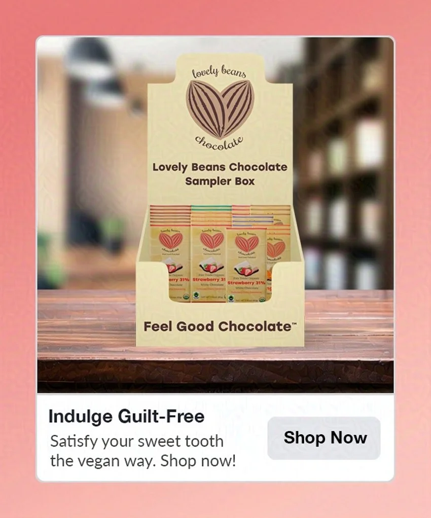
Packaging and Product Design
As another part of my packaging concept for Lovely Beans Chocolate, I created several point-of-sale displays to advertise how the packaging might look in grocery stores. These point-of-sale displays included smaller countertop displays for each chocolate flavor, as well as a larger display showcasing all the chocolate bars together. I included two photos of the larger point-of-sale shelf showing it from two different angles.