Aromatic Ashes Candles and Incense Company
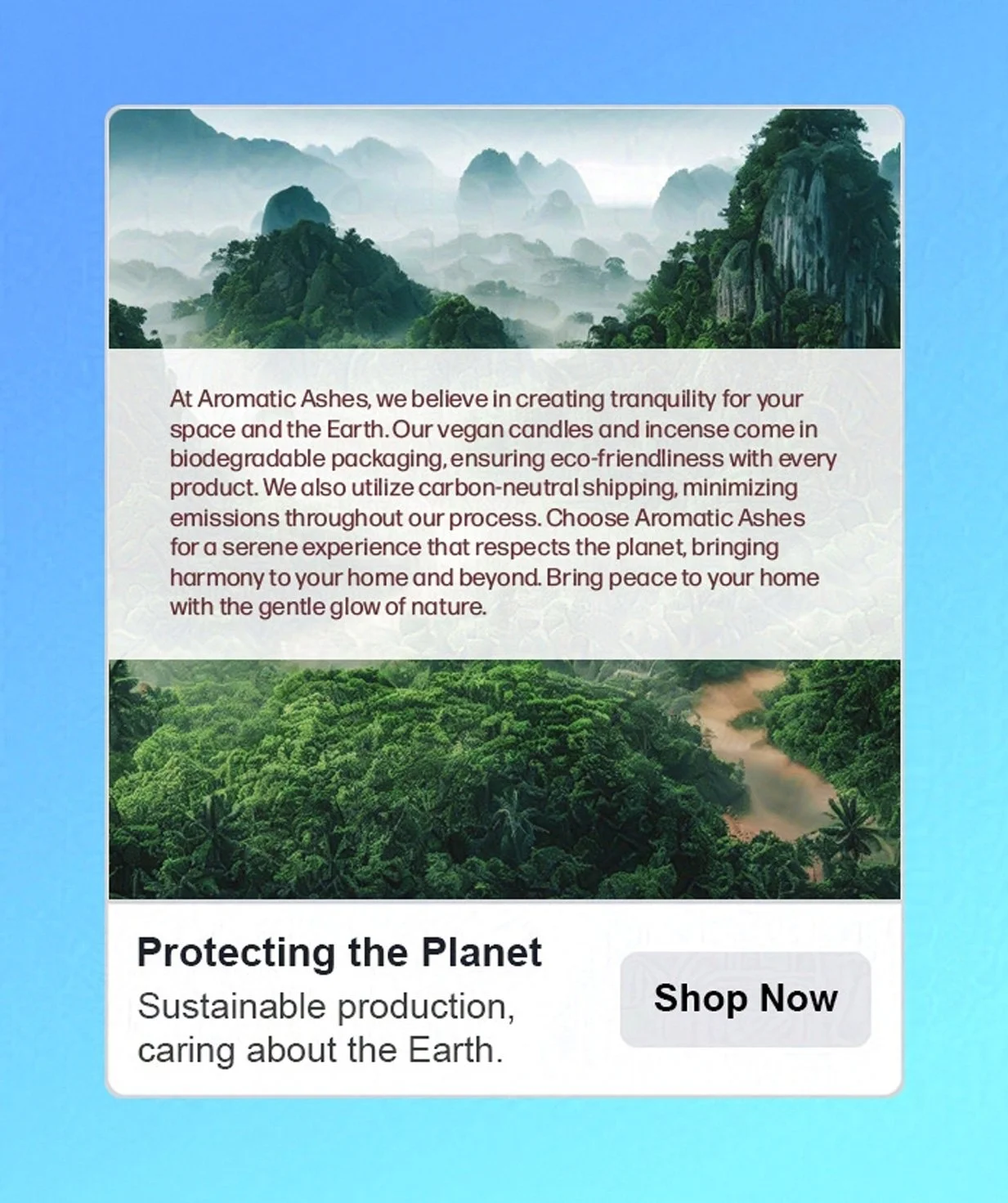
Aromatic Ashes is a concept for a vegan candle and incense company. Made with ethically sourced and organic ingredients, a commitment to fair trade practices, and eco-friendly packaging, Aromatic Ashes promises that its sensuous candles and incense sticks do not endanger the planet.
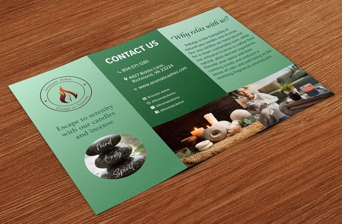
Aromatic Ashes wants to remind us that enjoying a lovely-smelling product doesn’t have to involve exploitation. It emphasizes that everyone deserves a pleasant-scented environment. Immerse yourself in delightful aromas and find your new favorite candle or incense.
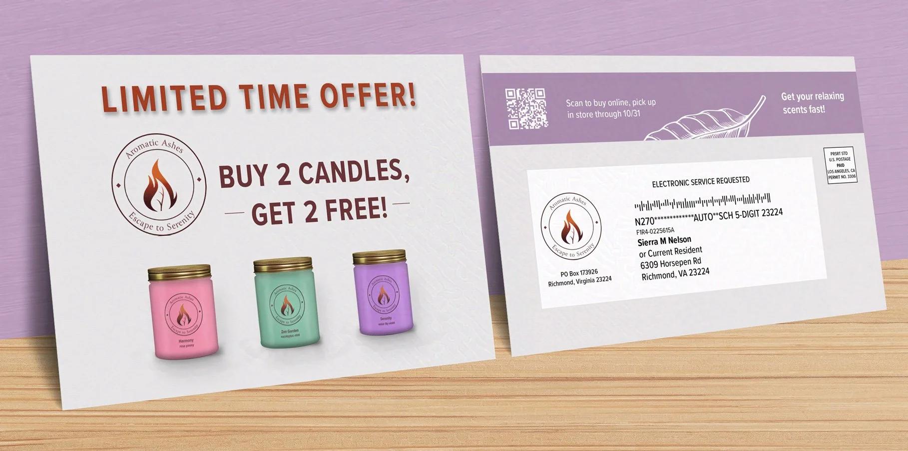
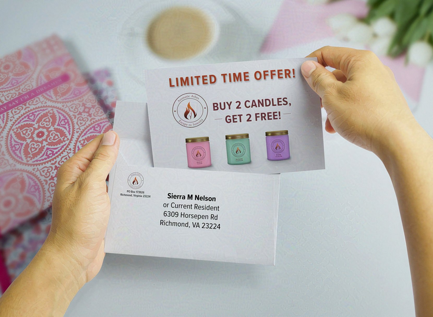
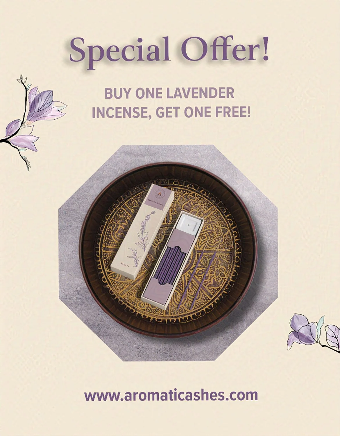
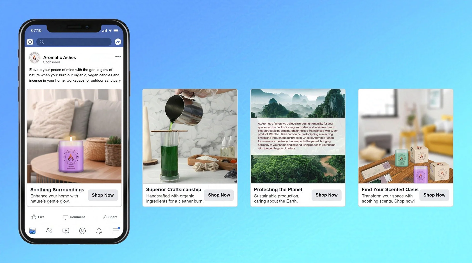
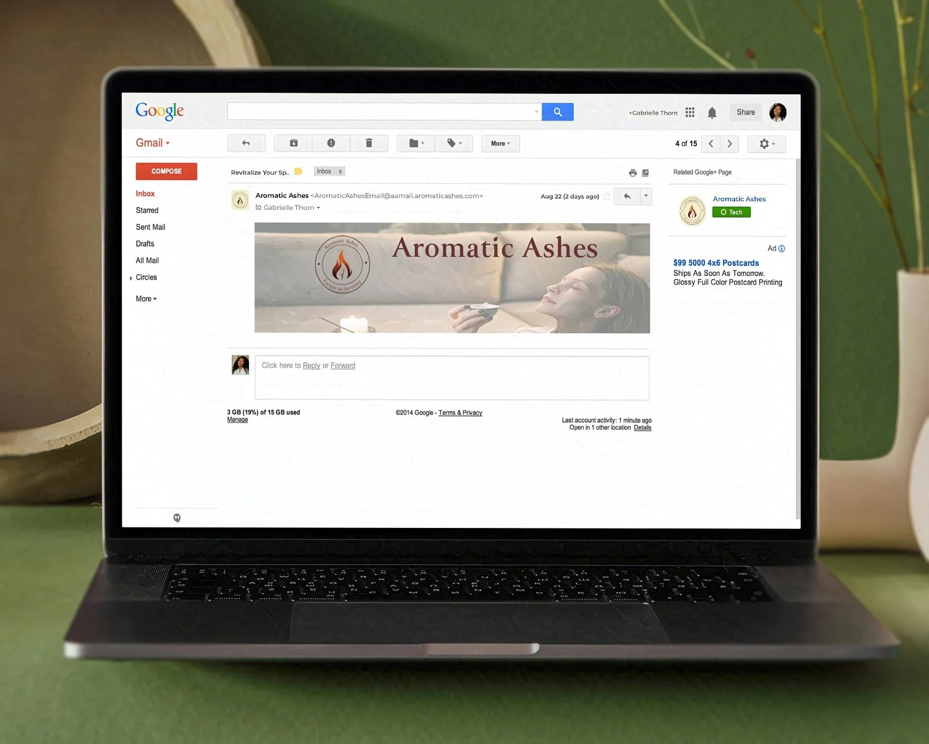
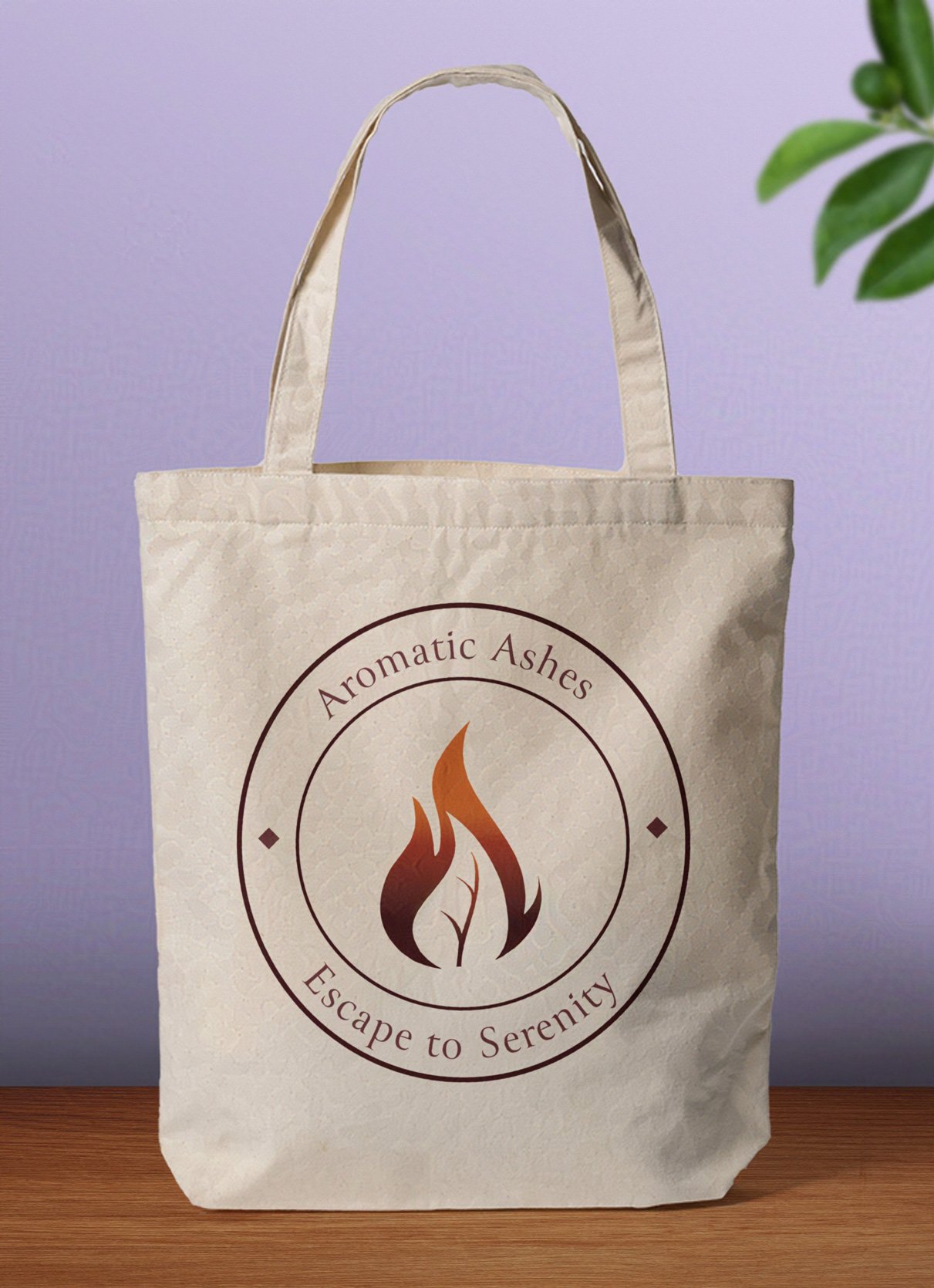
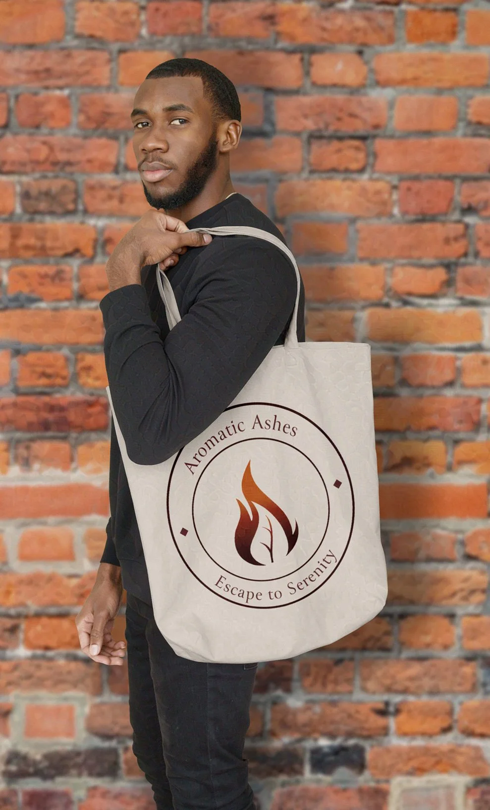
Deliverables include logos, branding identity, packaging, product design, print and social media ads, an email newsletter, ephemera, and apparel.
Logos and Brand Identity
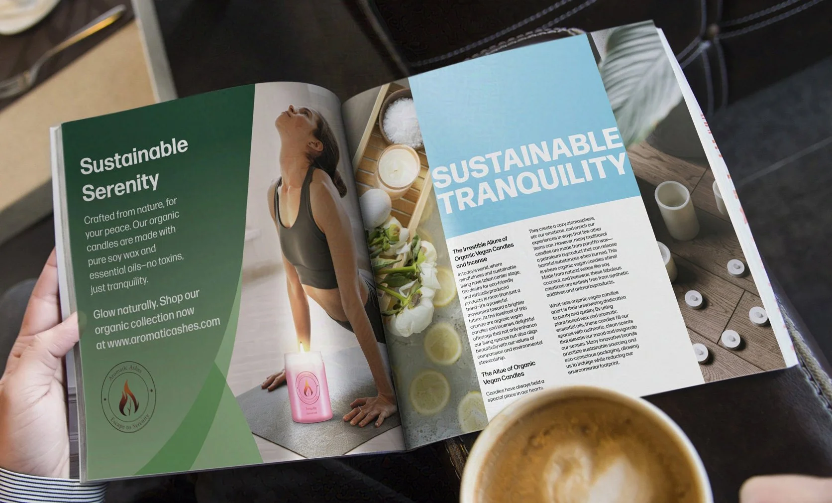
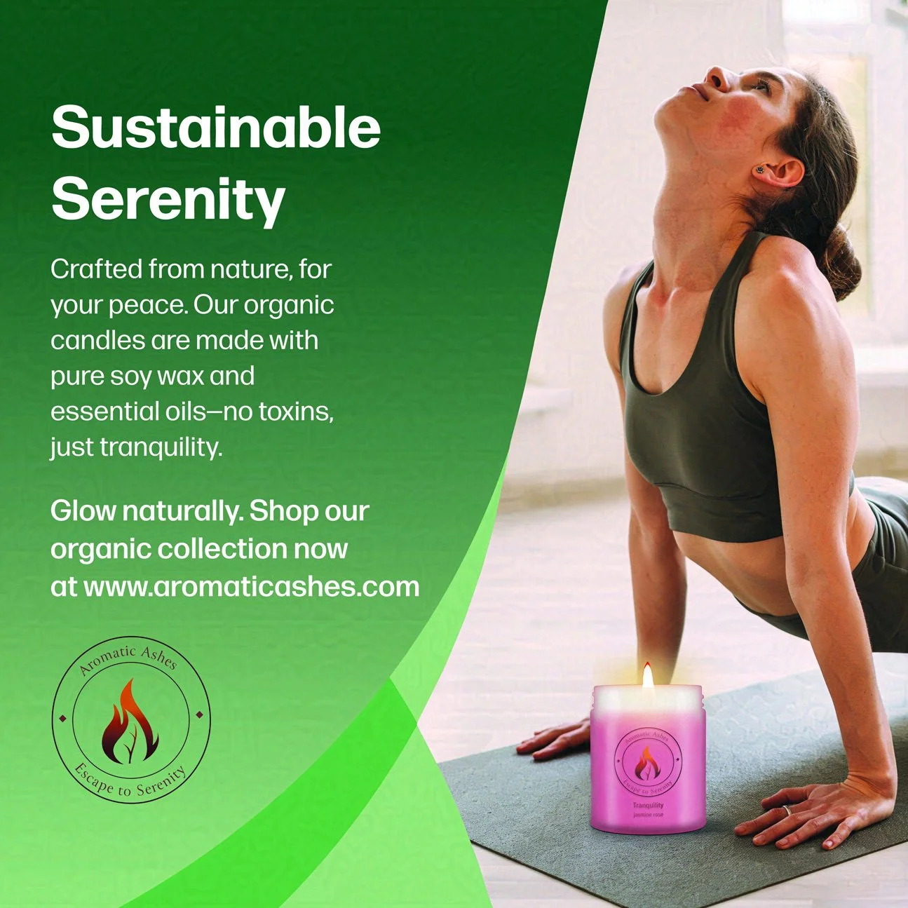
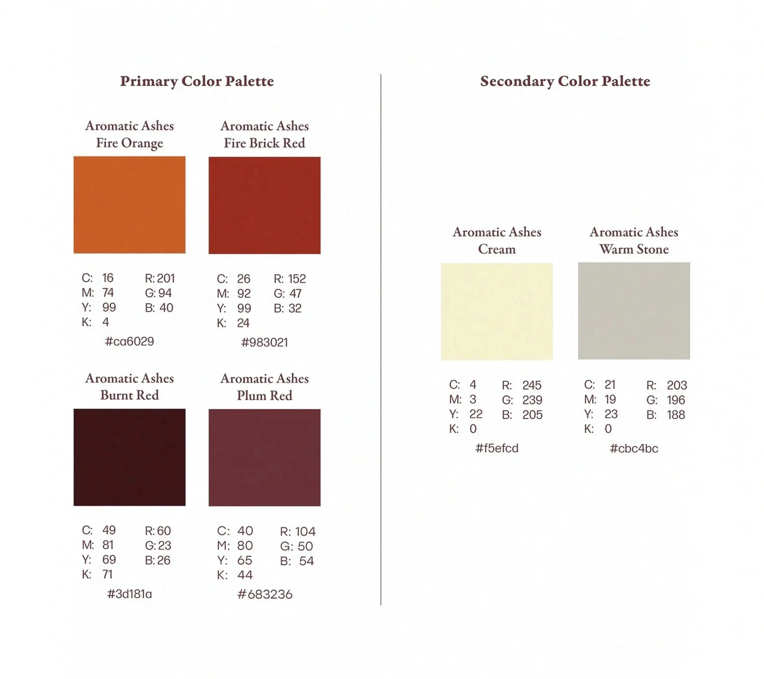
I focused on balancing natural elegance and simplicity in constructing the brand identity for my candle and incense company concept, Aromatic Ashes. I wanted the logo’s central symbol, the leaf nested inside a candle flame, to evoke the company’s mission of always using the finest botanical ingredients in their candles and incense in customers’ minds. For a color palette, I chose a warm medley of fiery reds, oranges, and purples to conjure a warm candle flame. Combining the icon with a catchy tagline creates a logo that is not just a design but the start of a memorable brand identity.


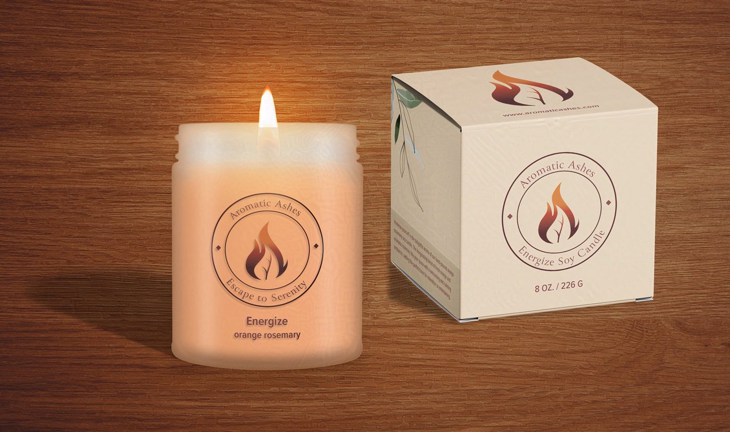
Candle Packaging and Product Design
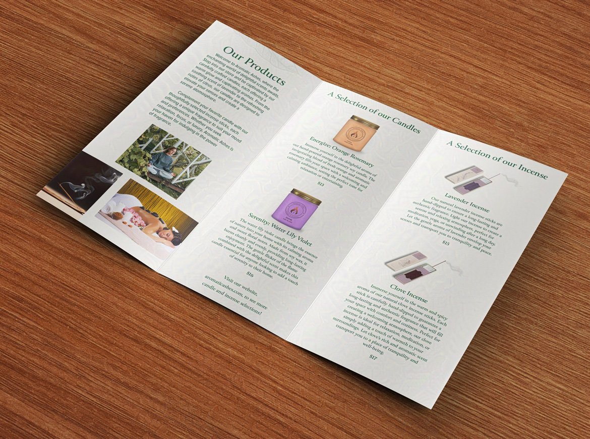
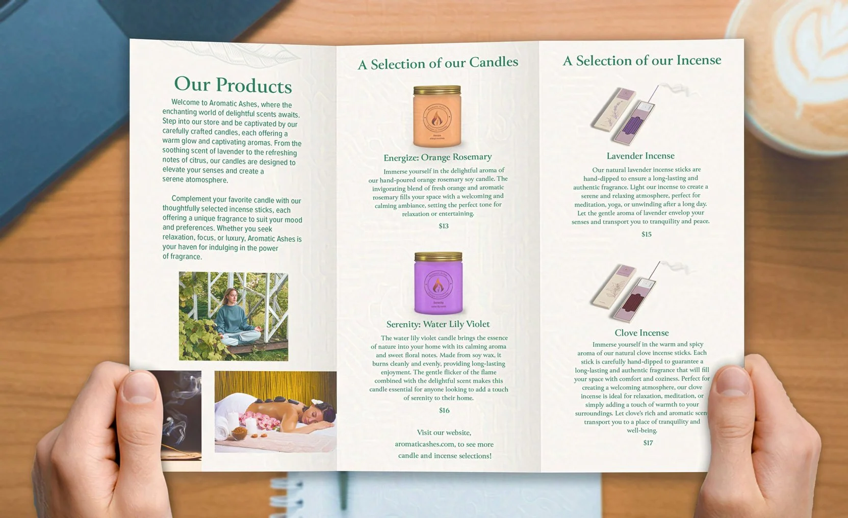
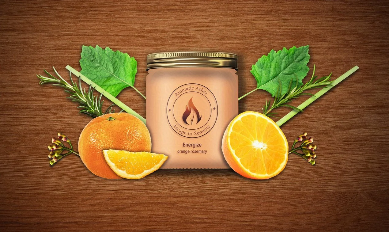
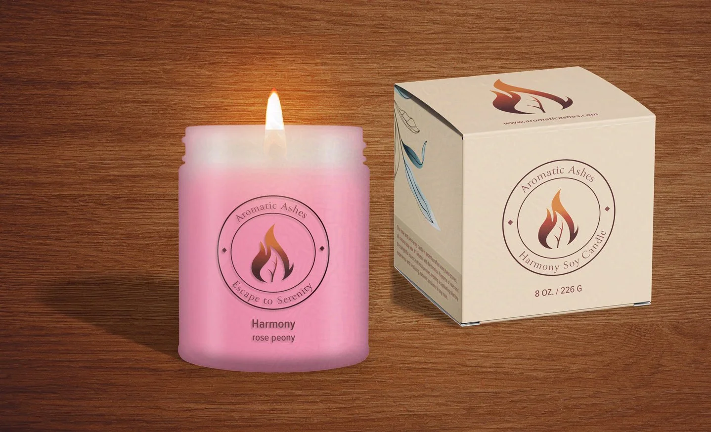
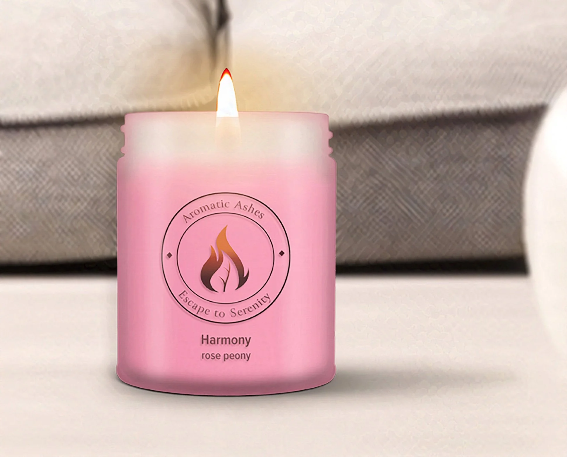
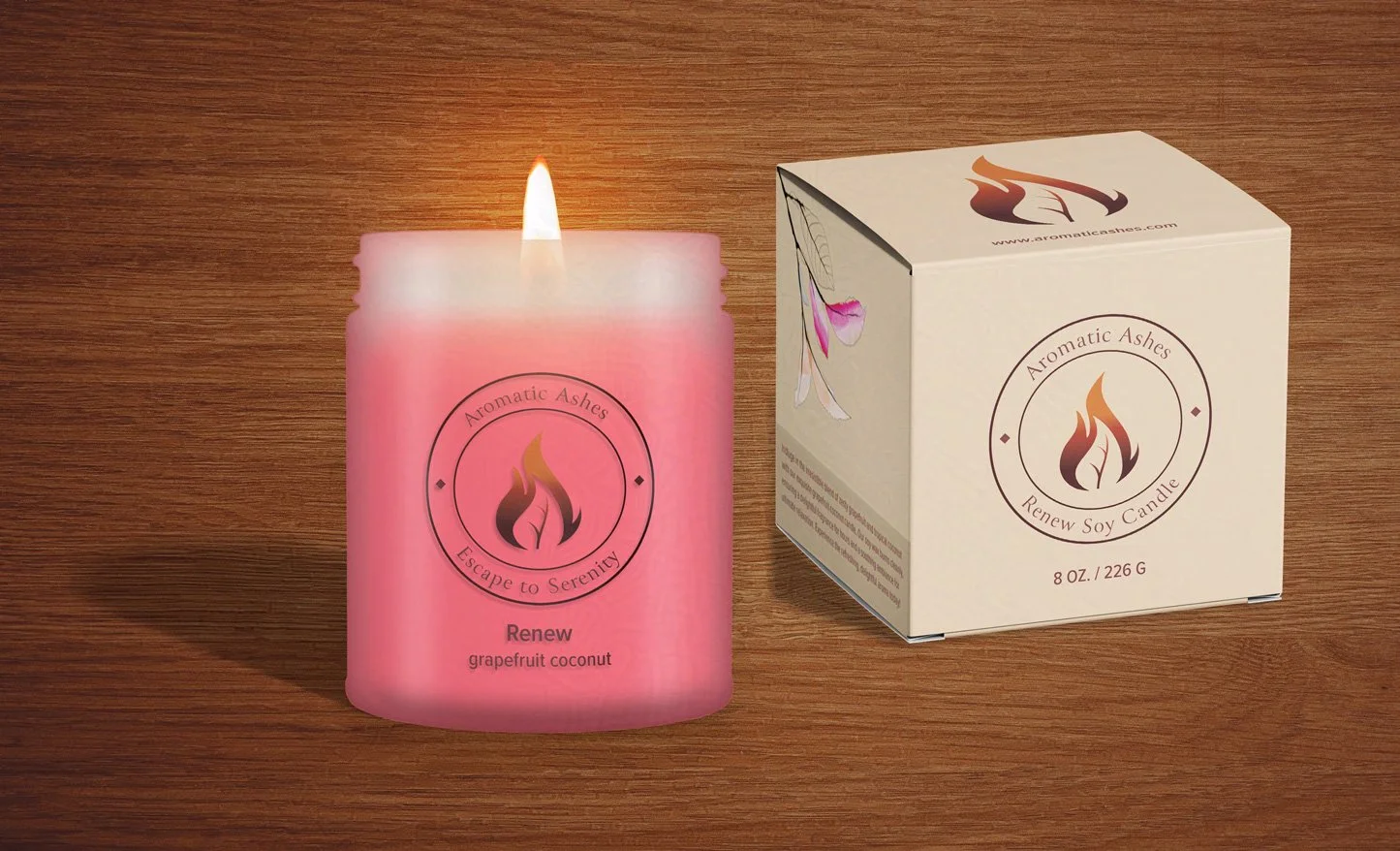
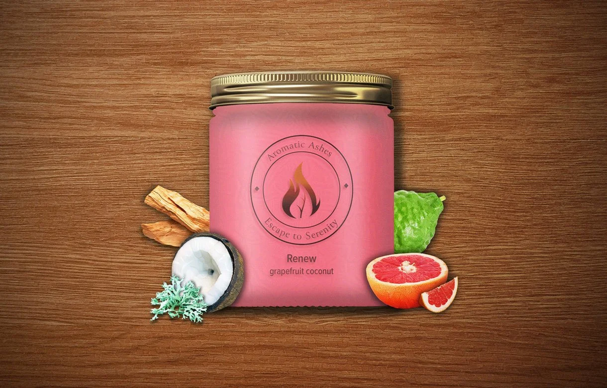
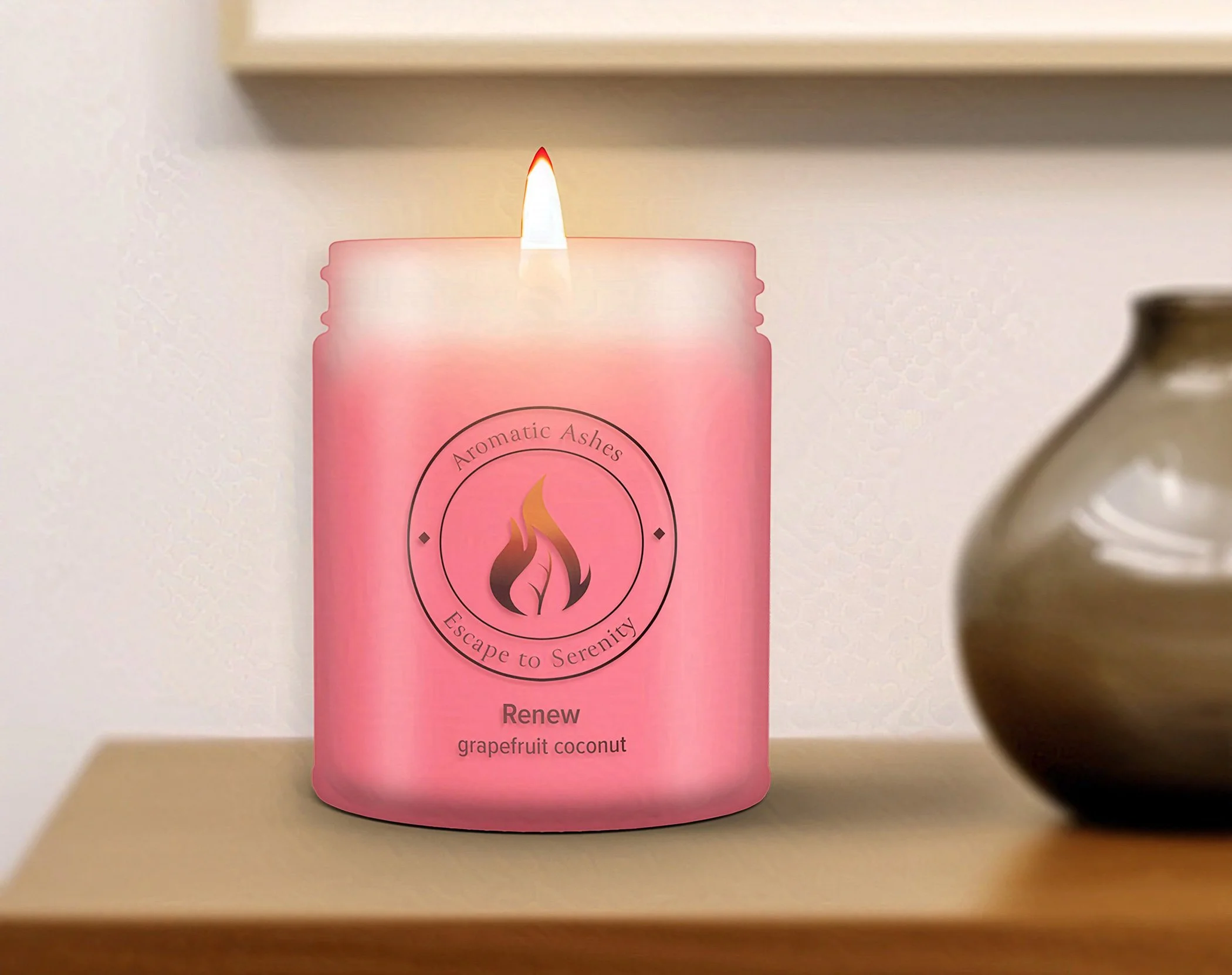
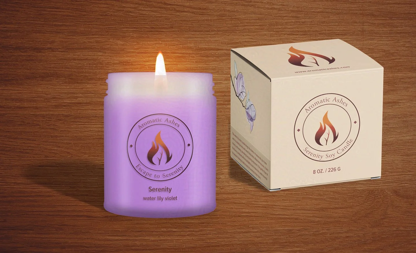
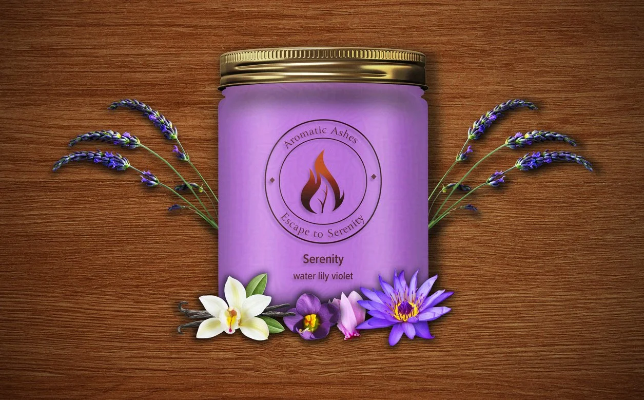
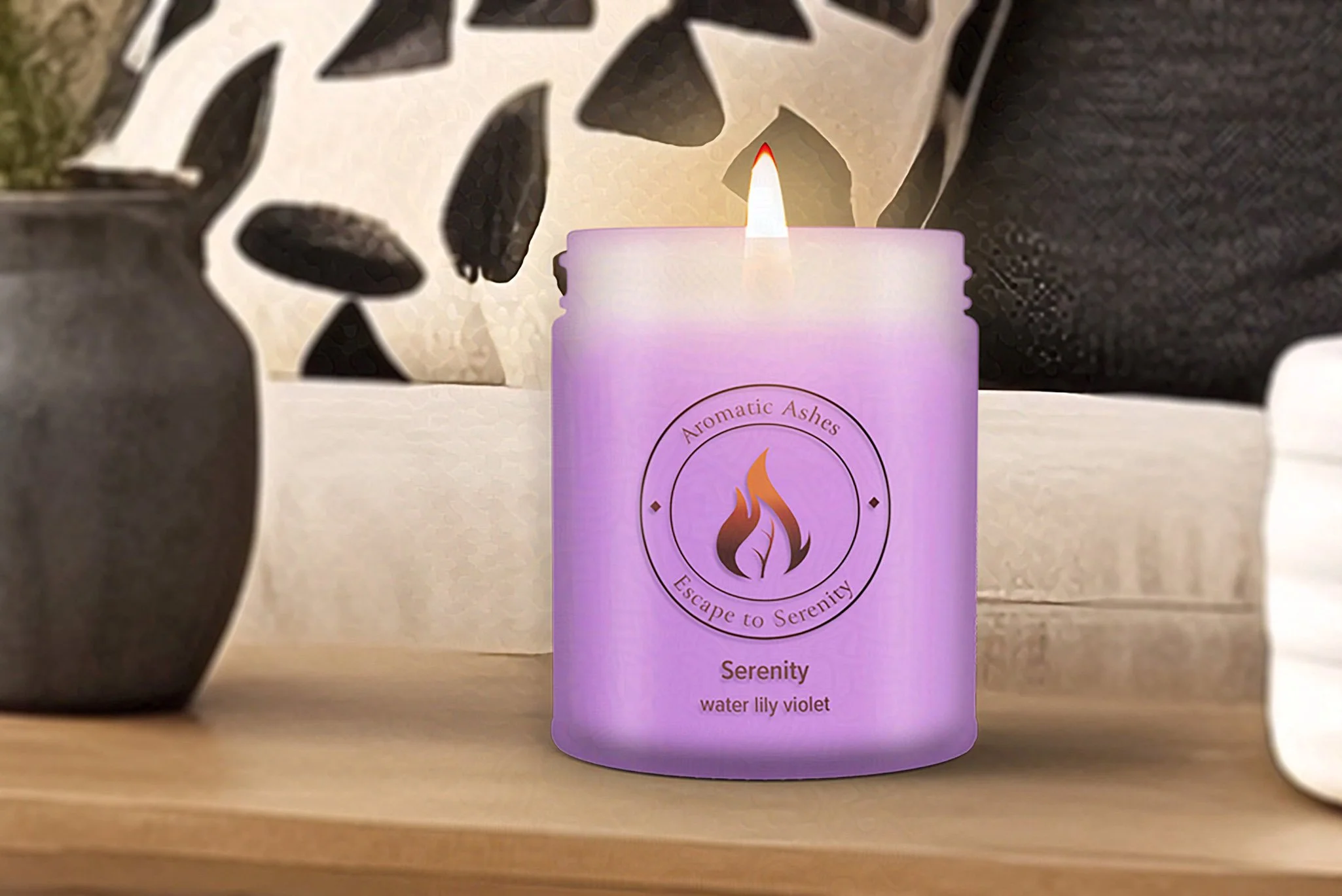
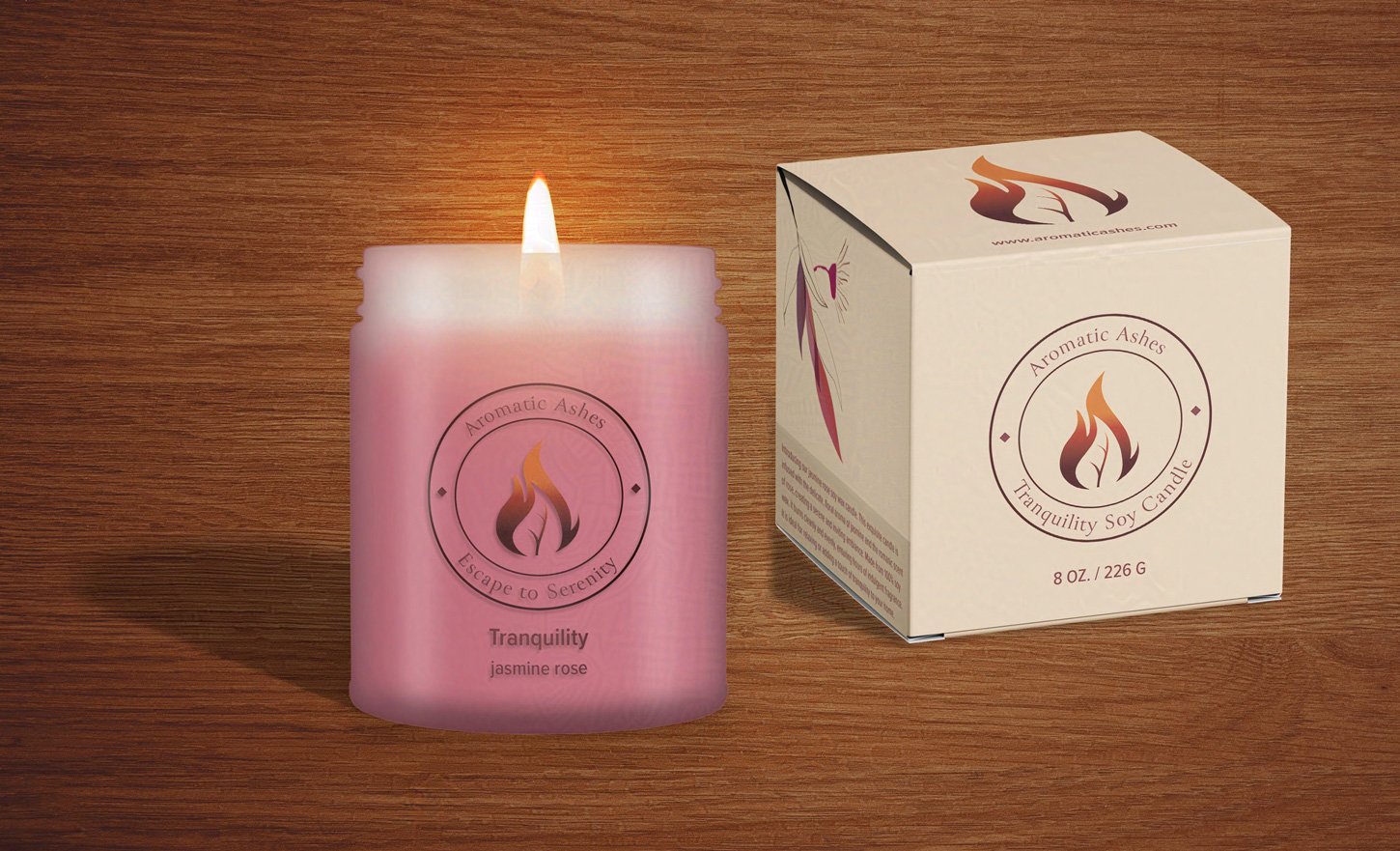
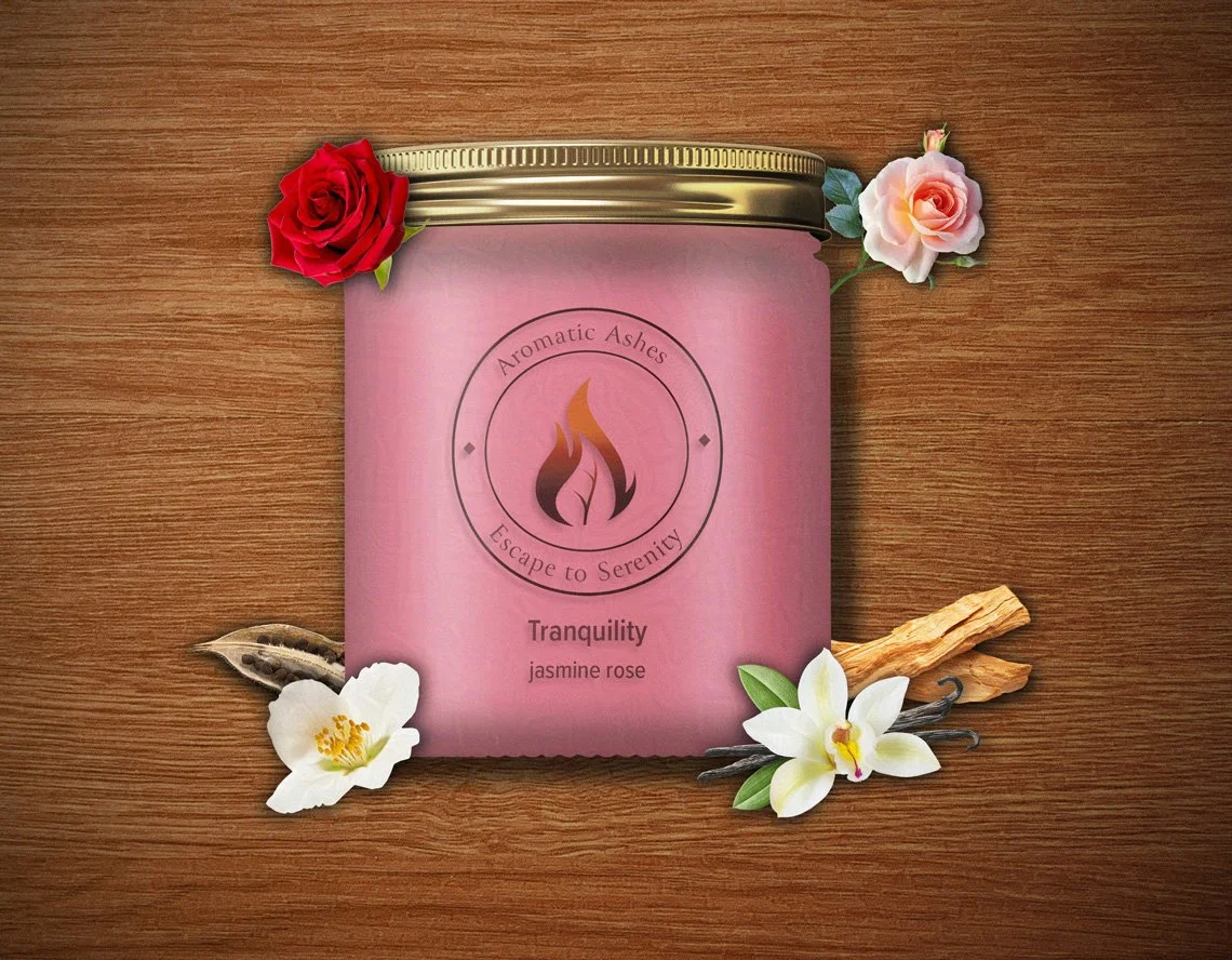
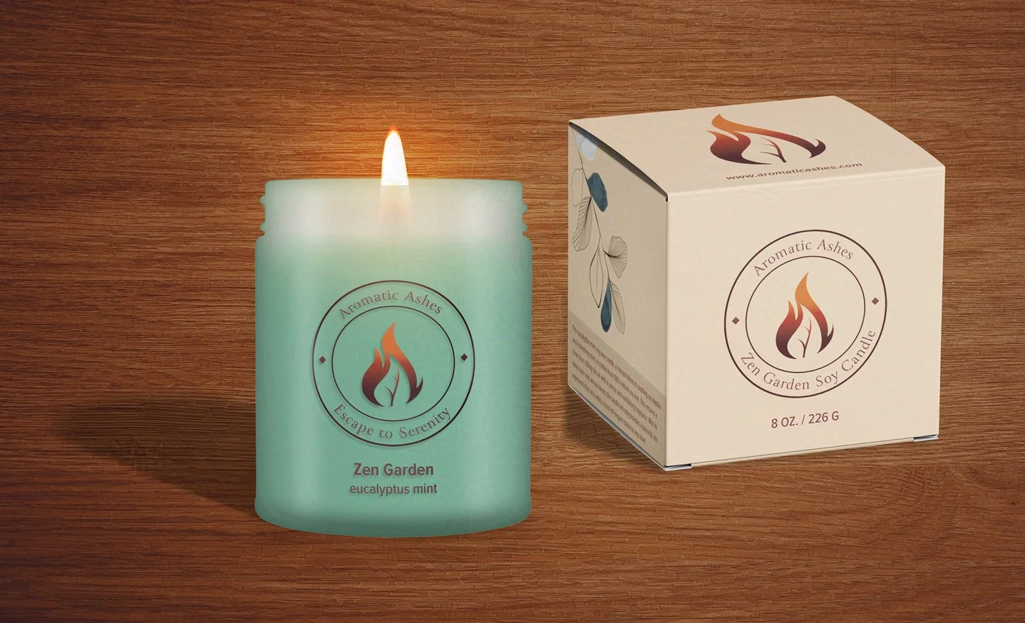
For my candle packaging, I drew inspiration from nature’s beautiful, organic forms. I kept the candle’s packaging simple, with a clear label showing the logo and candle name, allowing the beautifully colored wax to take center stage. I decided to produce the box in an understated, warm beige to contrast with the logo's fiery colors. For visual interest and another pop of color, I added an abstract botanical design to the side of the box in colors that coordinated with the candle.
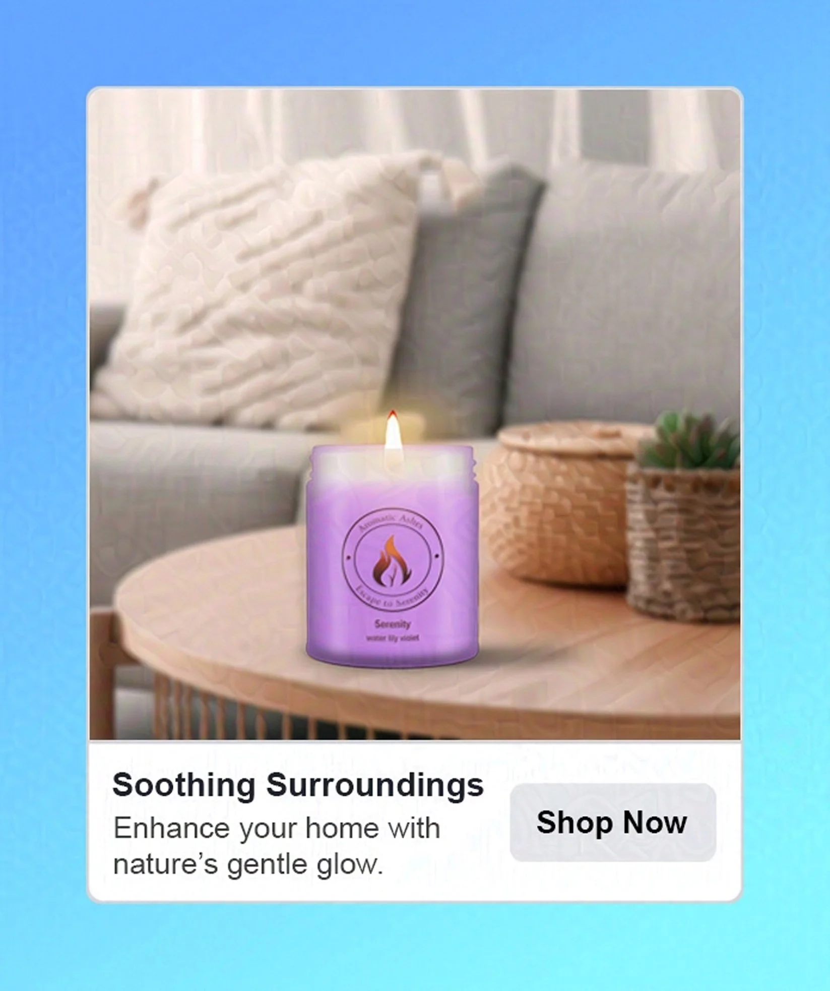
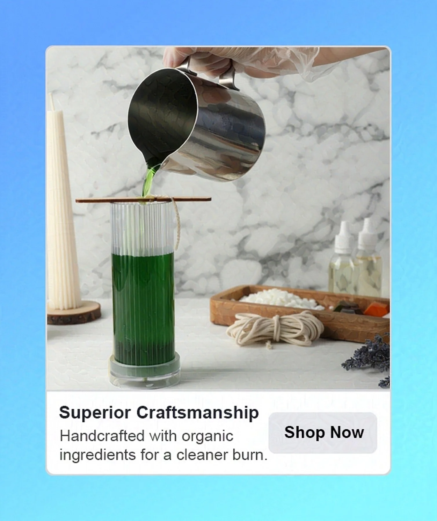
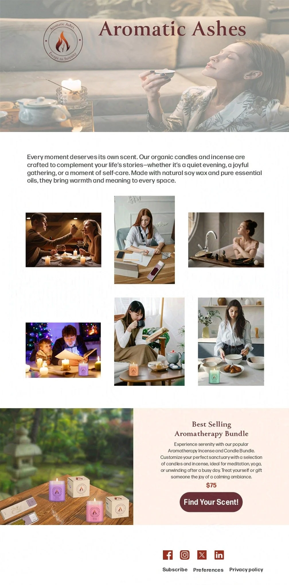
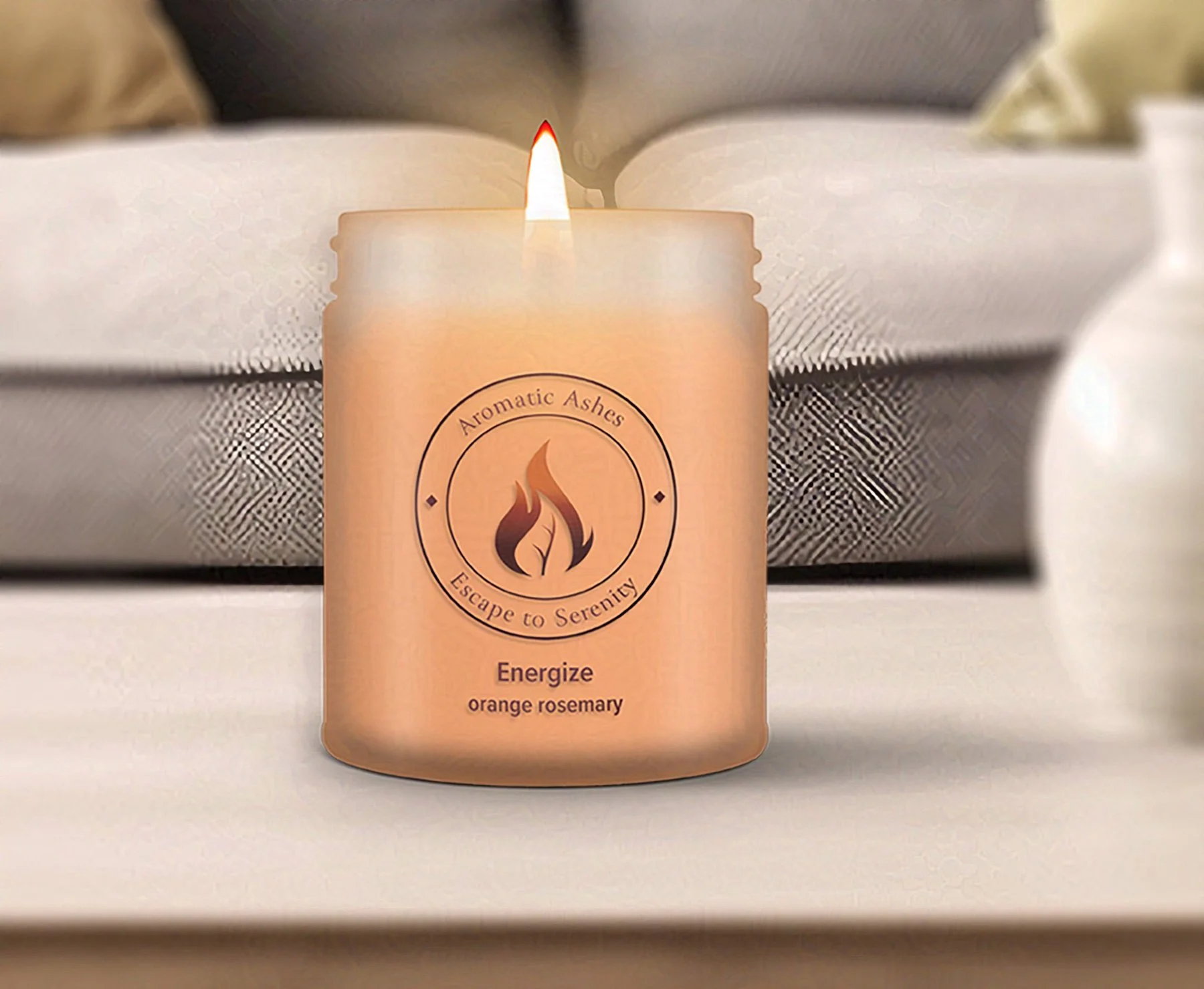
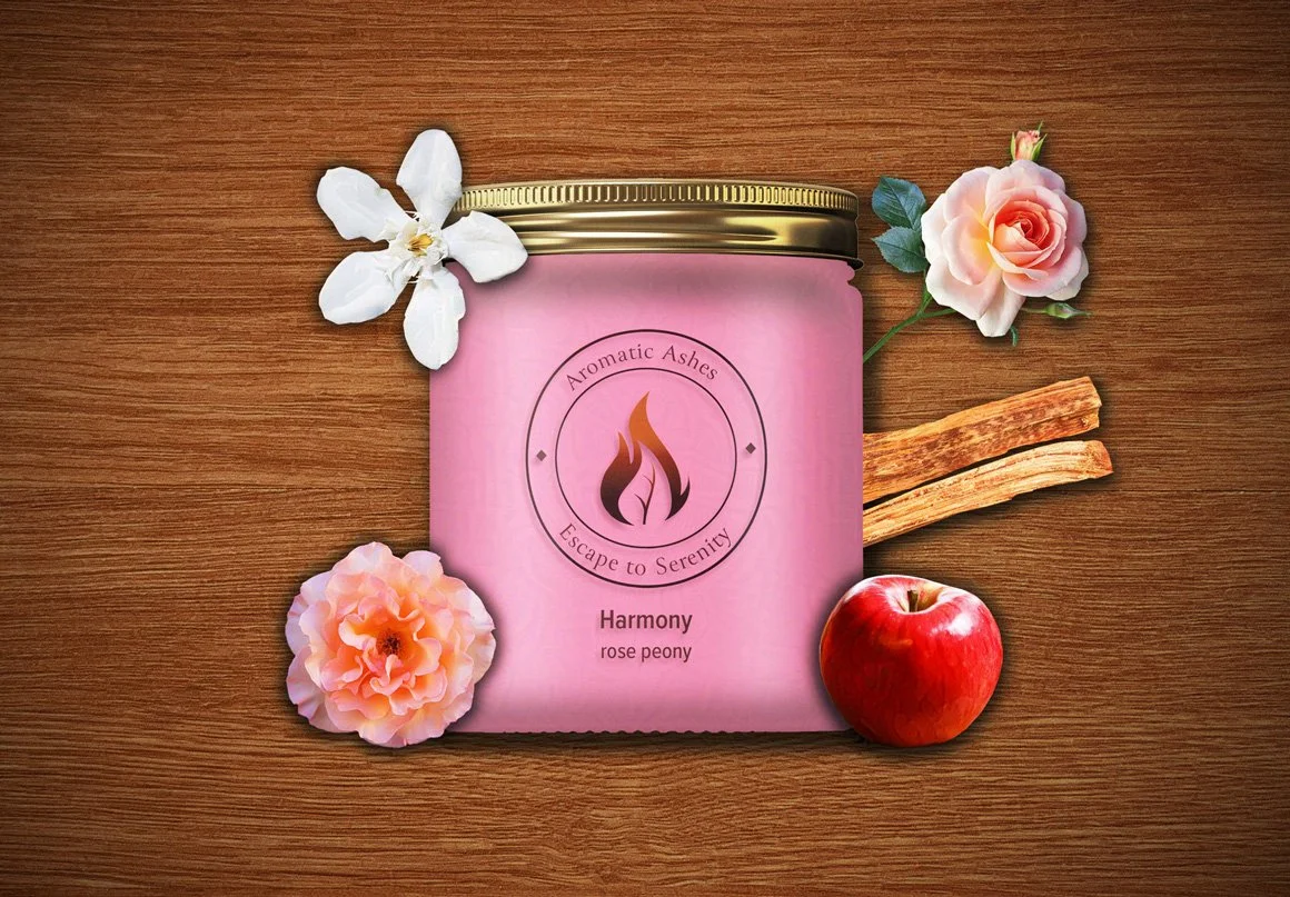
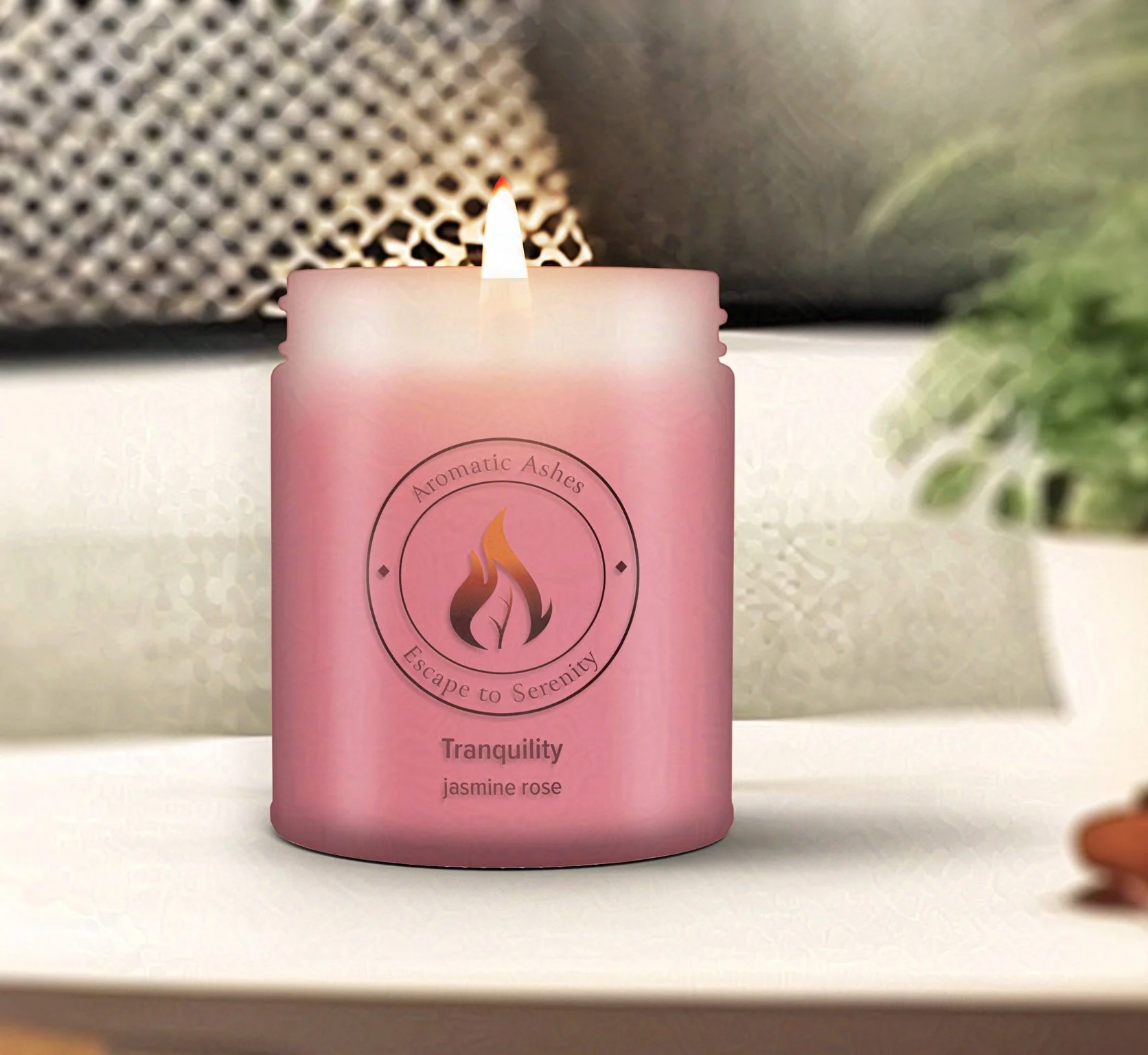
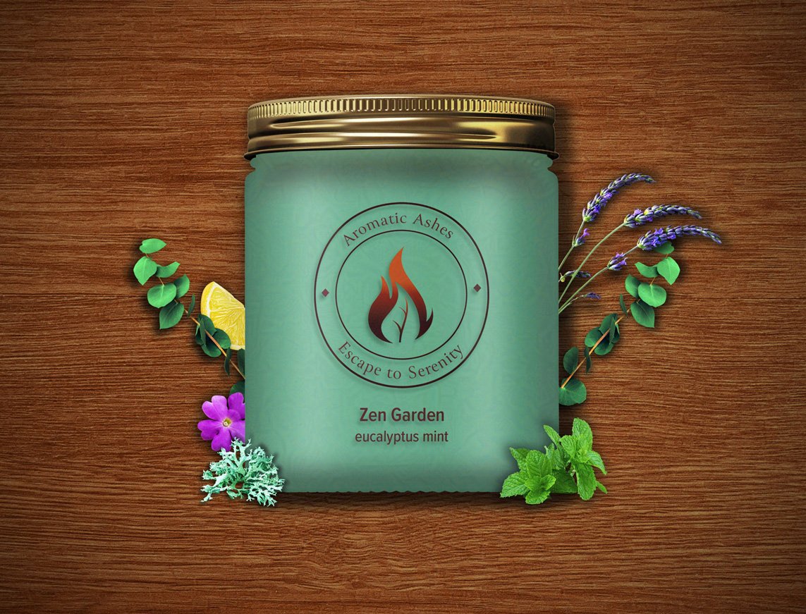
I created two visually appealing series of product images for each candle variety, ensuring they matched the packaging perfectly. The first series highlights the beautiful candles while showcasing the calming ingredients they contain. The second series shows how the candles would look in various areas of the home. Both collections create an enticing appeal that attracts loyal customers and new candle enthusiasts alike, inviting them to indulge in the relaxing experience these candles offer.

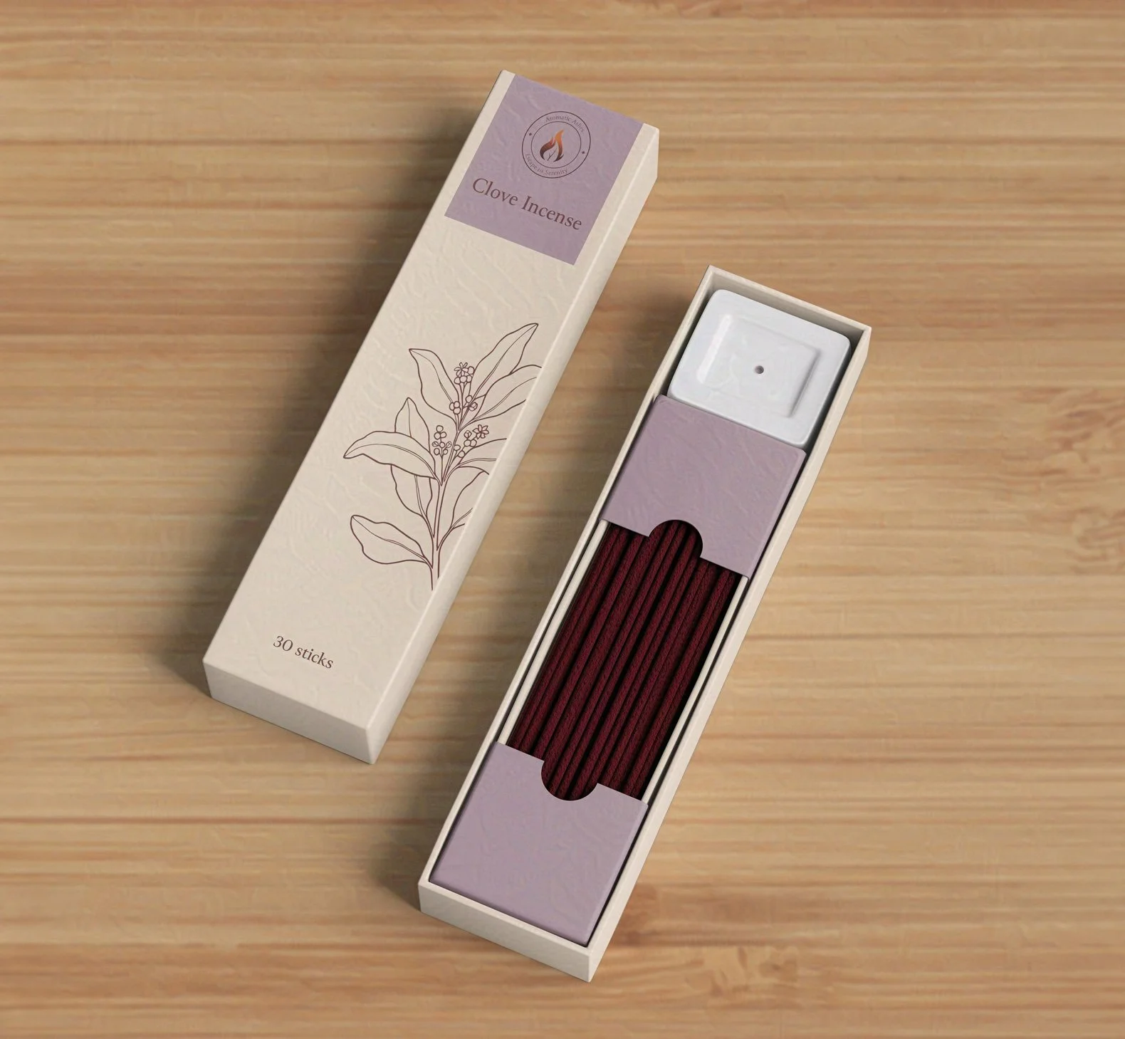
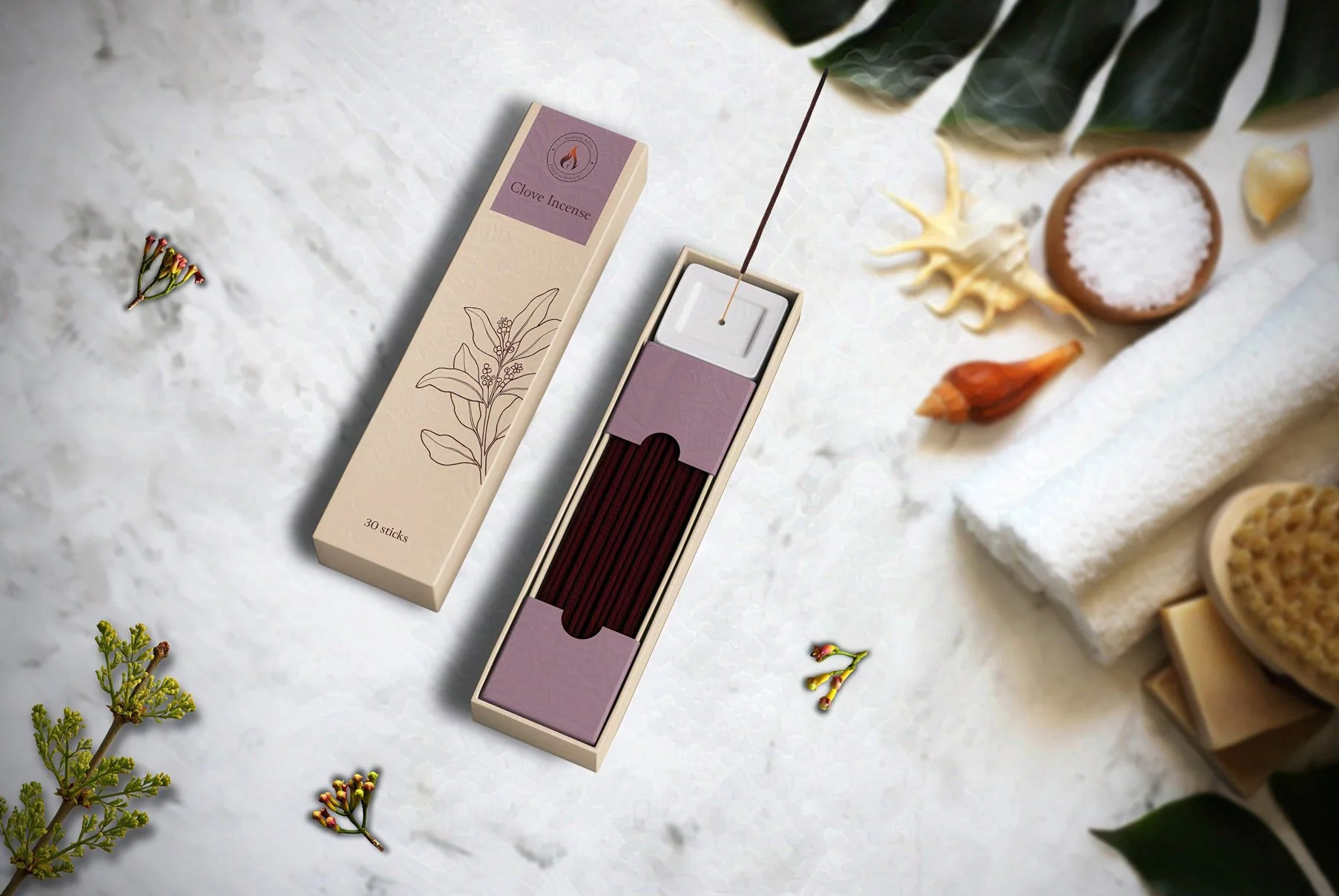
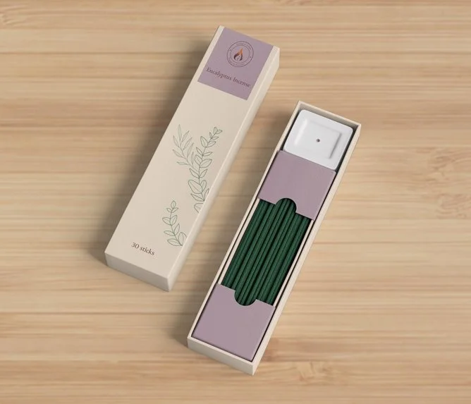
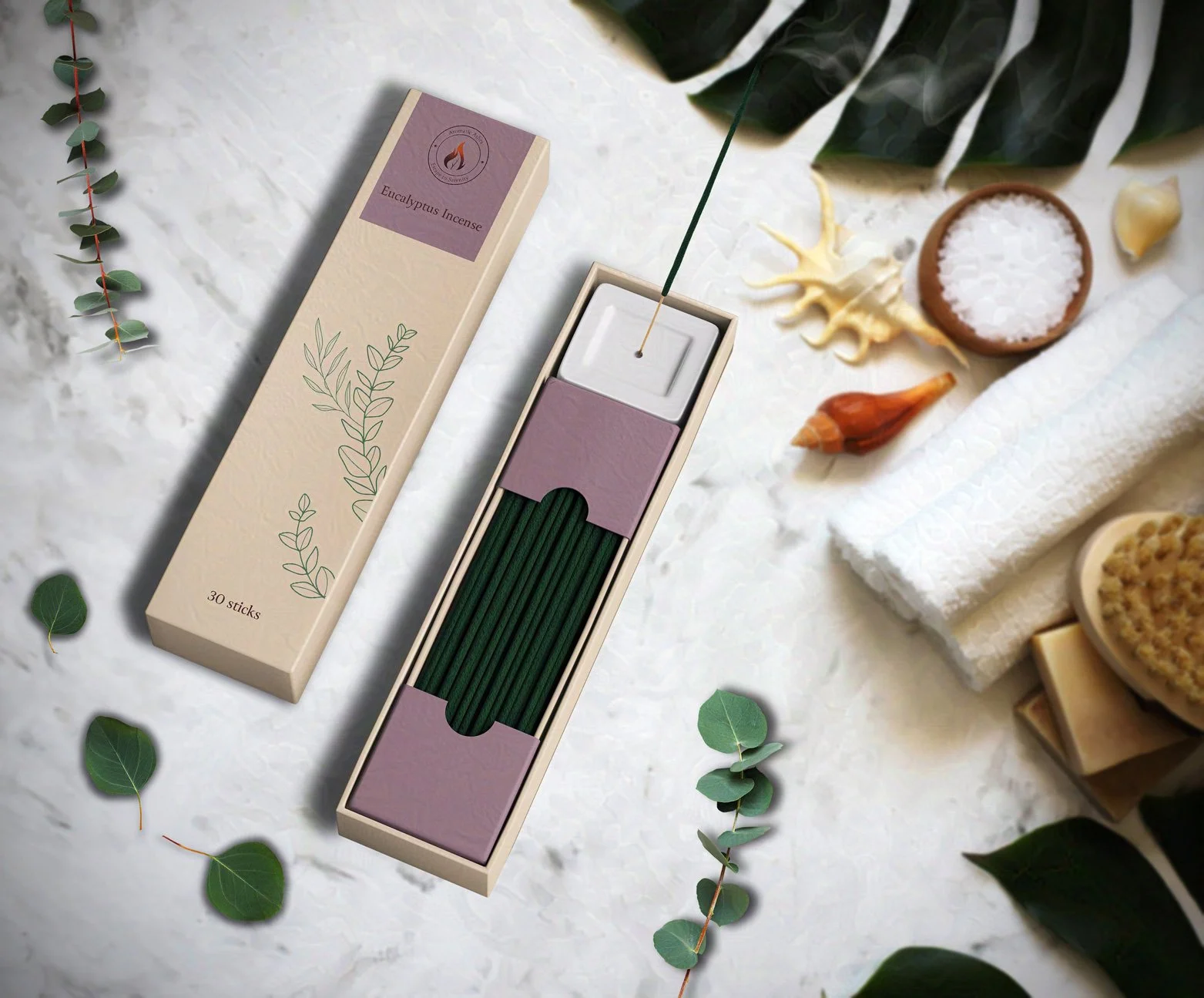
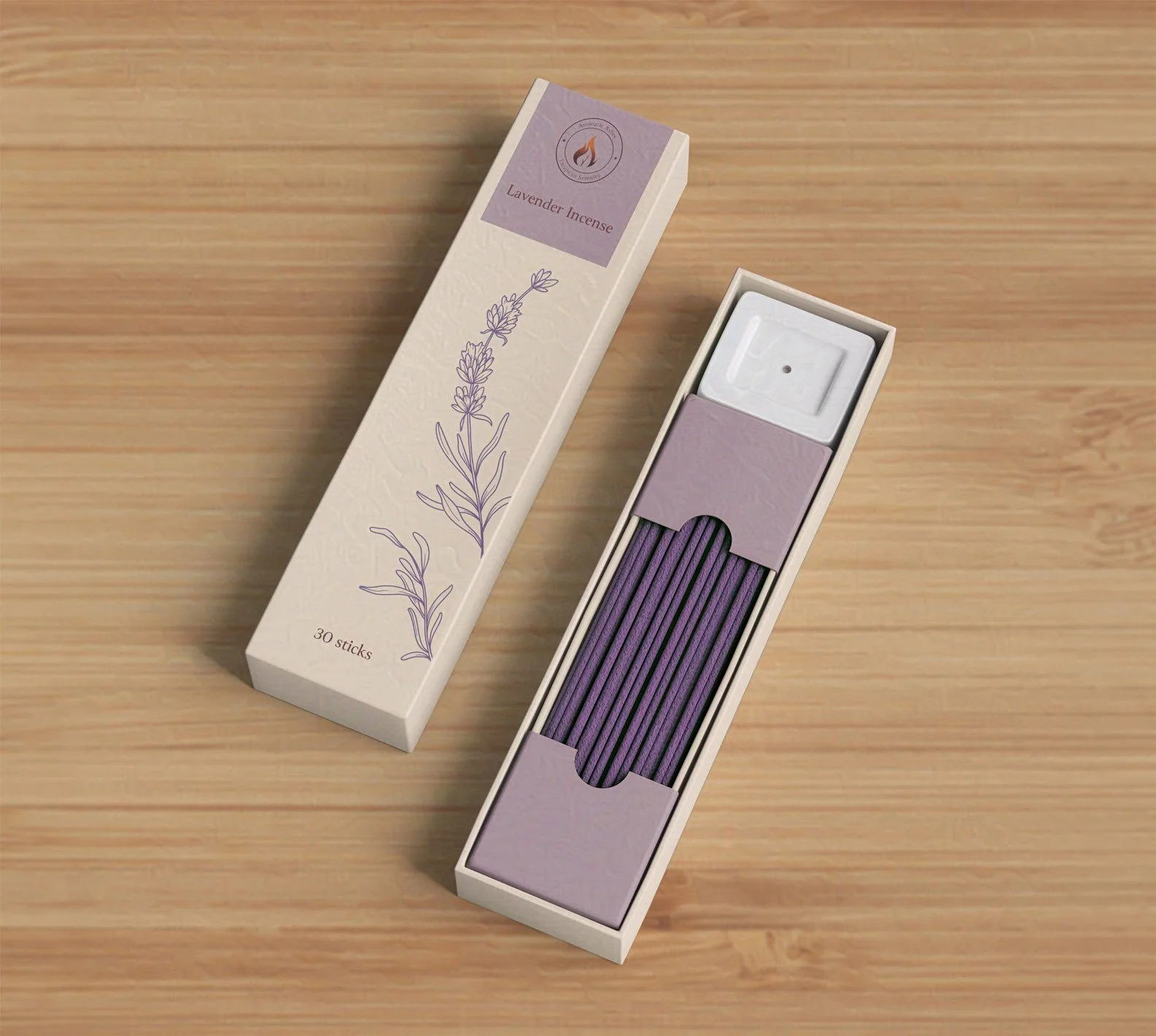
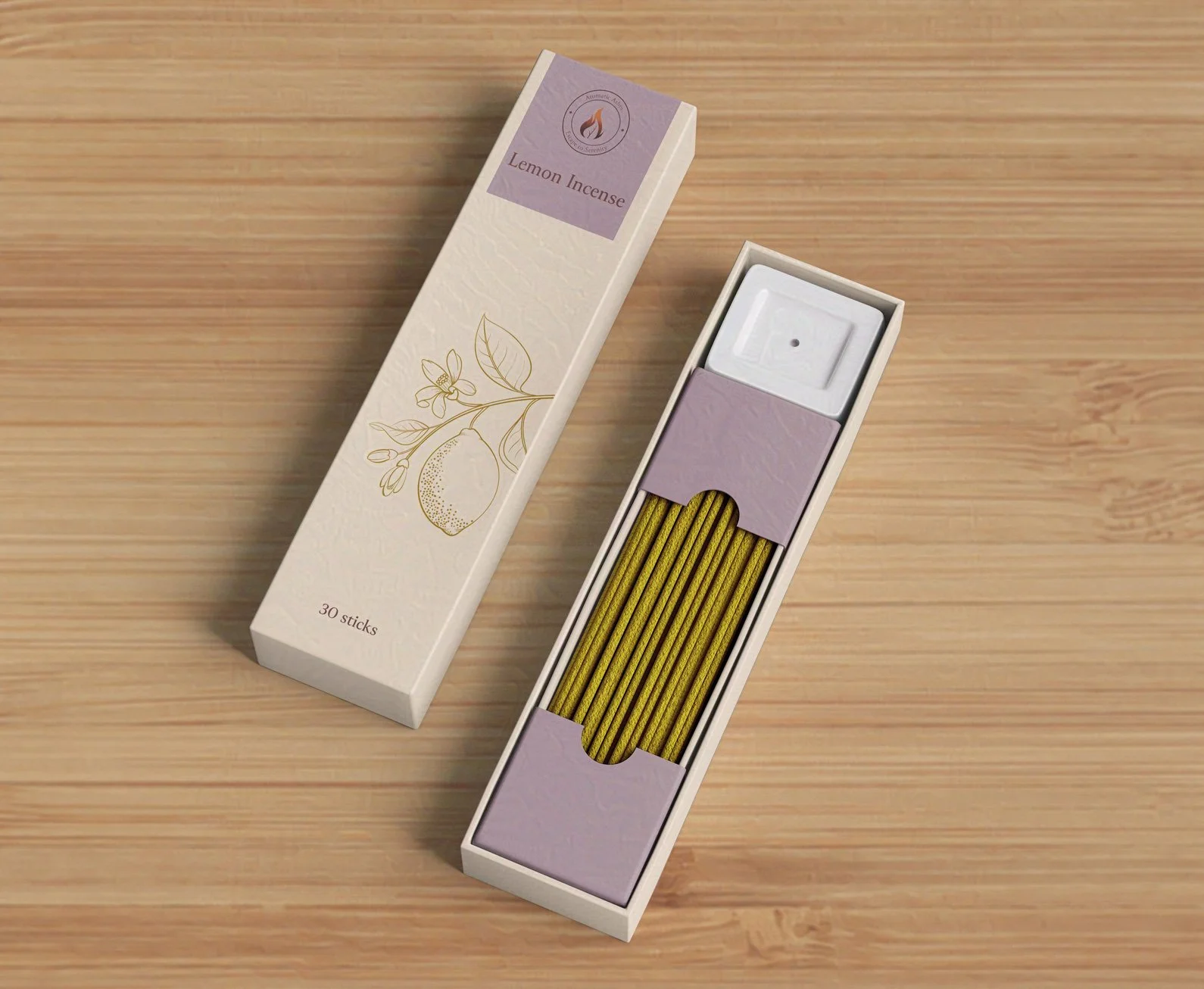
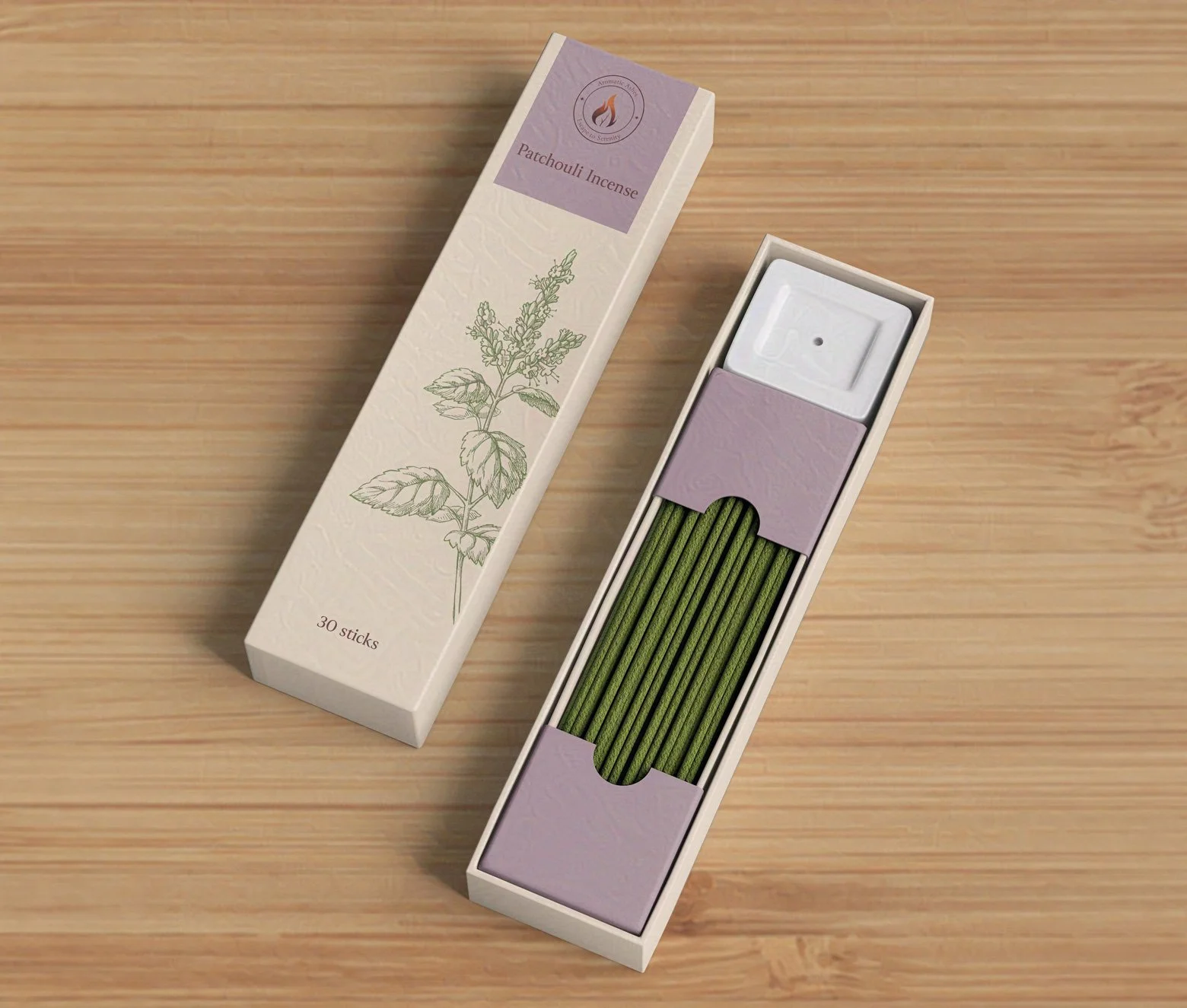
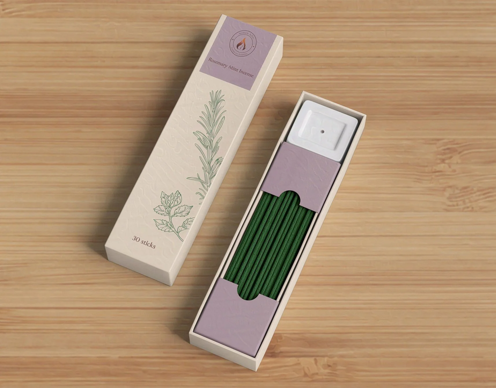
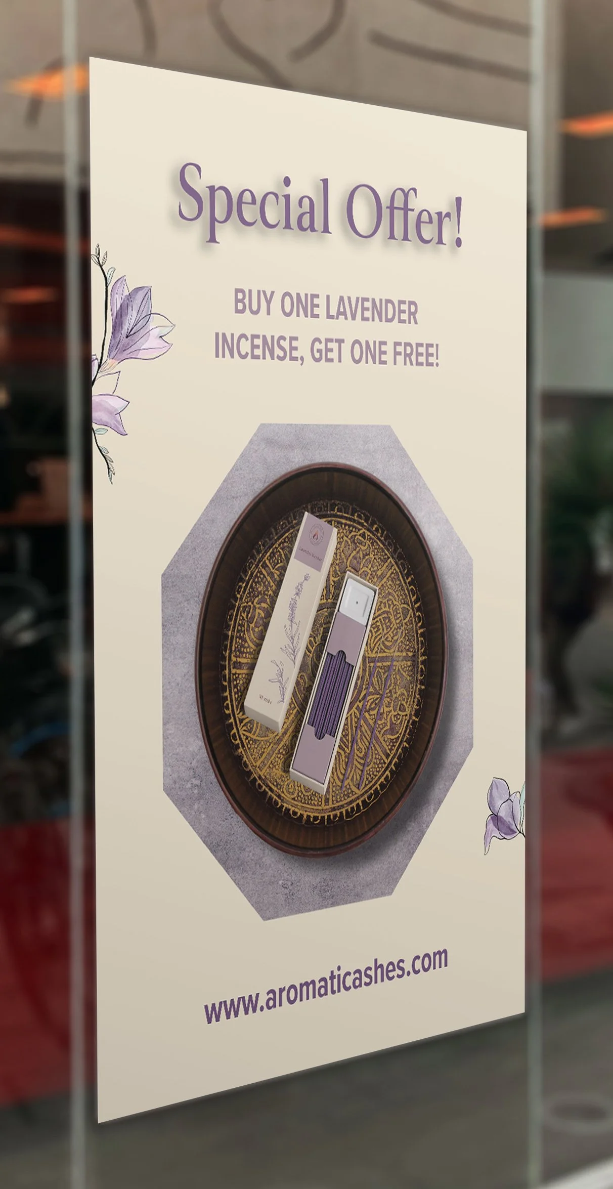
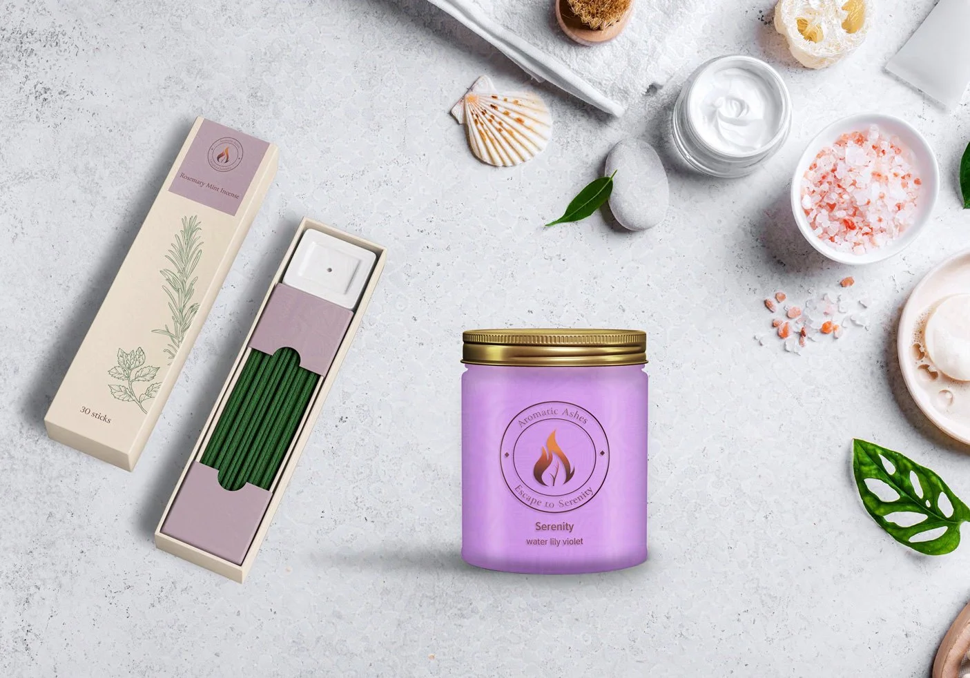
Incense Packaging and Product Design
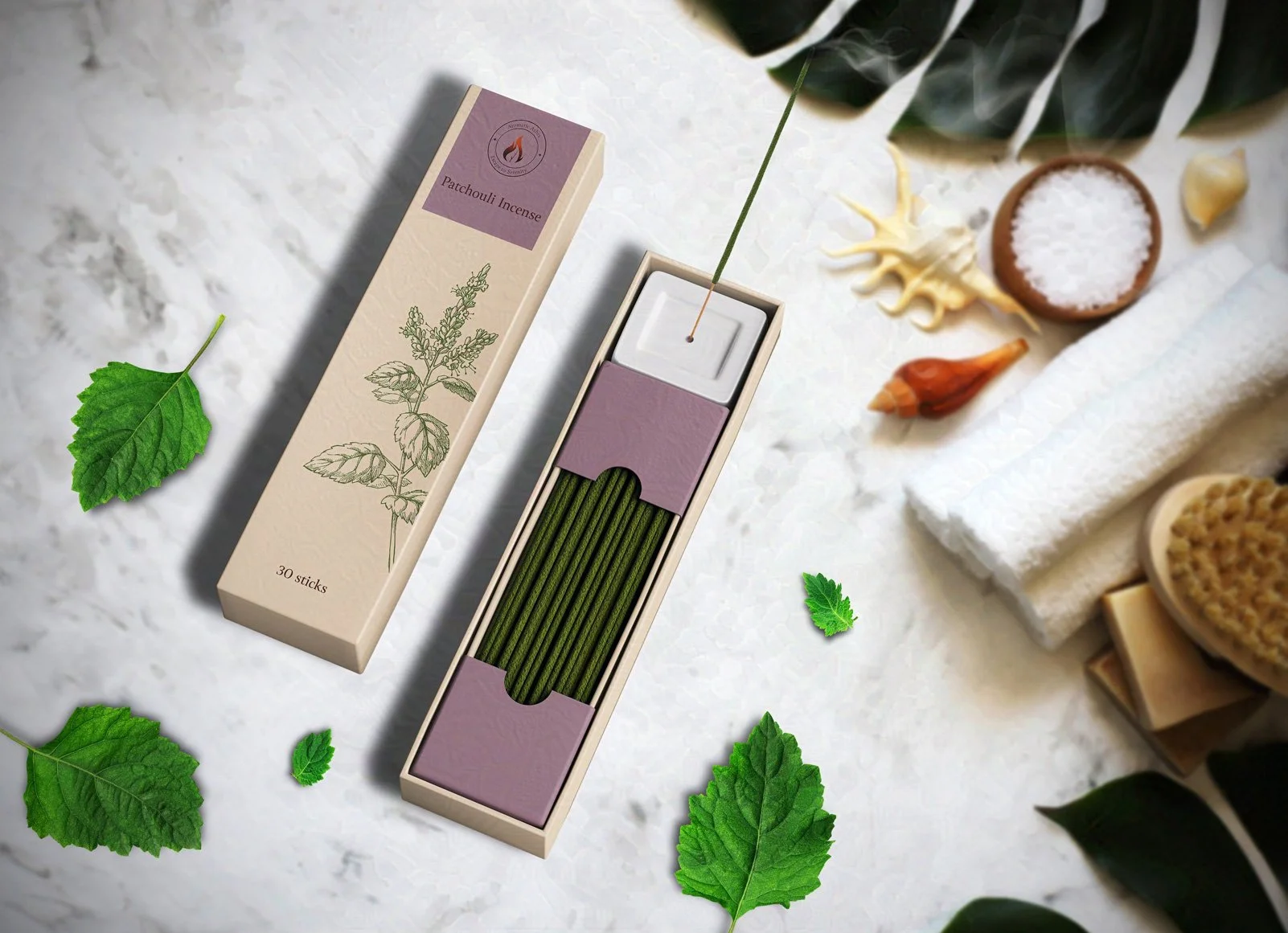
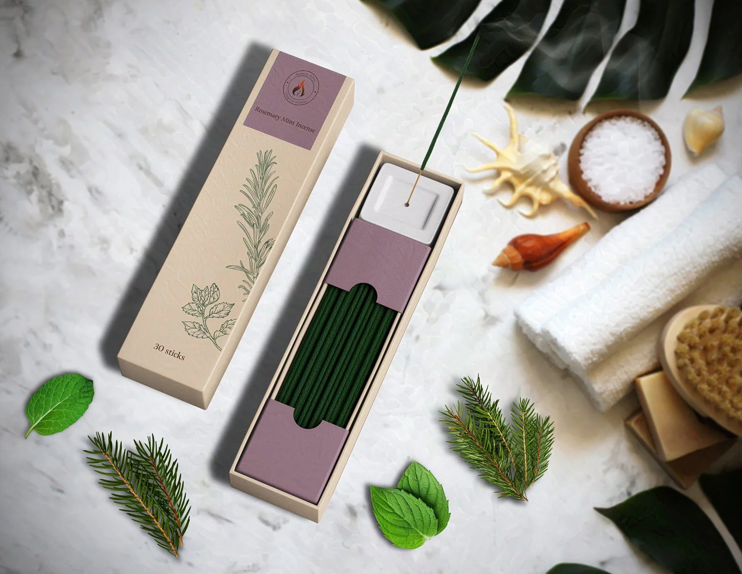
I drew inspiration from botanical designs when creating my incense packaging. Like my candle packaging, I chose the same warm beige as a box color. To add to the calm, soothing feeling evoked by the incense, I decide to make the inner box a warm lavender, in contrast to the beige of the outer box. I kept the packaging modern and clean, allowing the incense ingredients to take center stage on the front of the box. The illustrations changed color according to the type of incense.
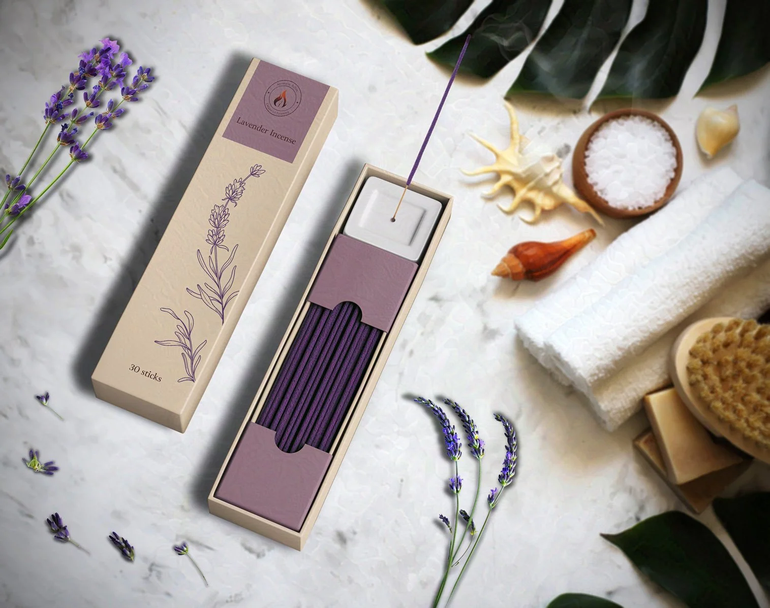
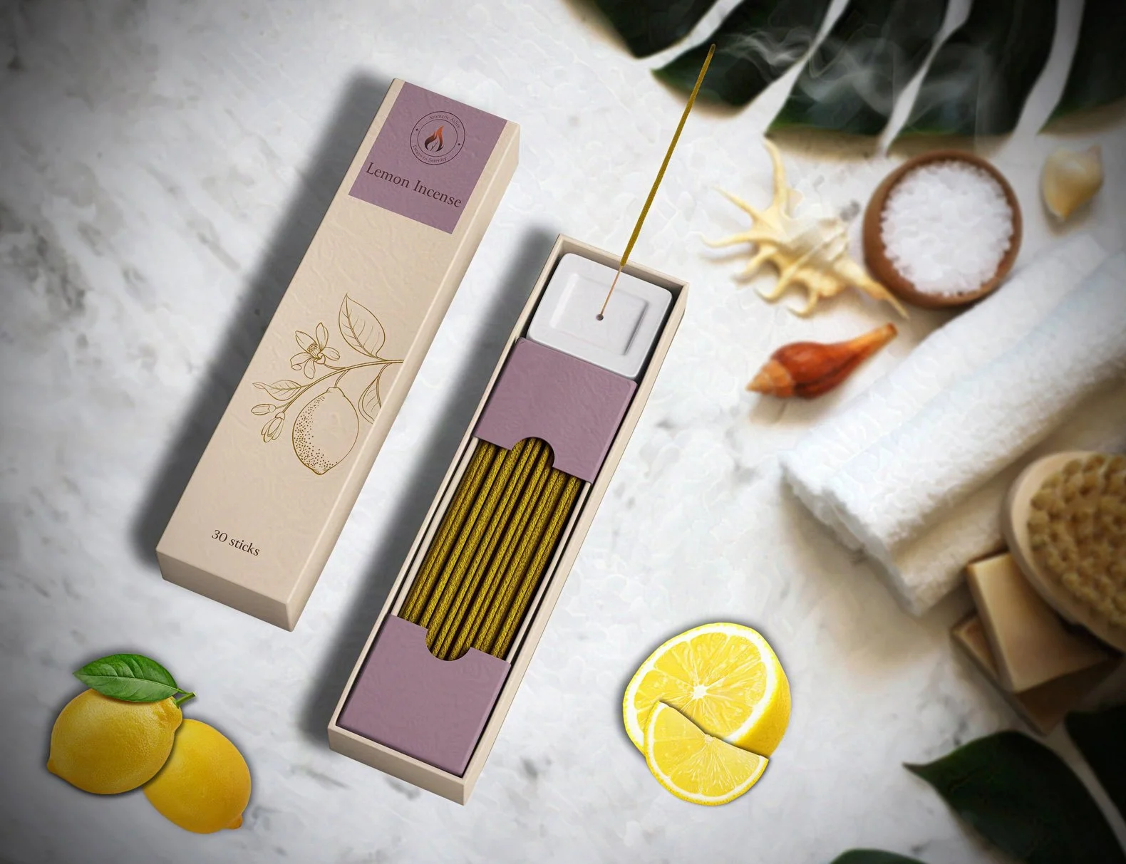
I created a series of visually appealing product images for each incense variety, ensuring they aligned perfectly with the packaging. Each image not only showcases the delightful incense sticks but also highlights the relaxing ingredients, making them more enticing. This approach attracts both loyal customers and new enthusiasts to indulge in the soothing experience these incense sticks offer.