Designing a Sensory Brand Experience that Customers Couldn’t Ignore.
Aromatic Ashes Candle and Incense Company Branding Identity
Overview
A concept for a visionary vegan candle and incense brand based in Seattle, Washington, is dedicated to eco-conscious consumers seeking beauty and sustainable living in their homes. The brand was in danger of fading in relevance with its core audience despite strong name recognition. I wanted to create a new brand and visual identity that was innovative while honoring the organic roots of the company.
The services I offered were:
Logo development
Color palette creation
Typography formation
Packaging production
Marketing collateral conception
Social media strategy
Exterior signage creation
Logo Development
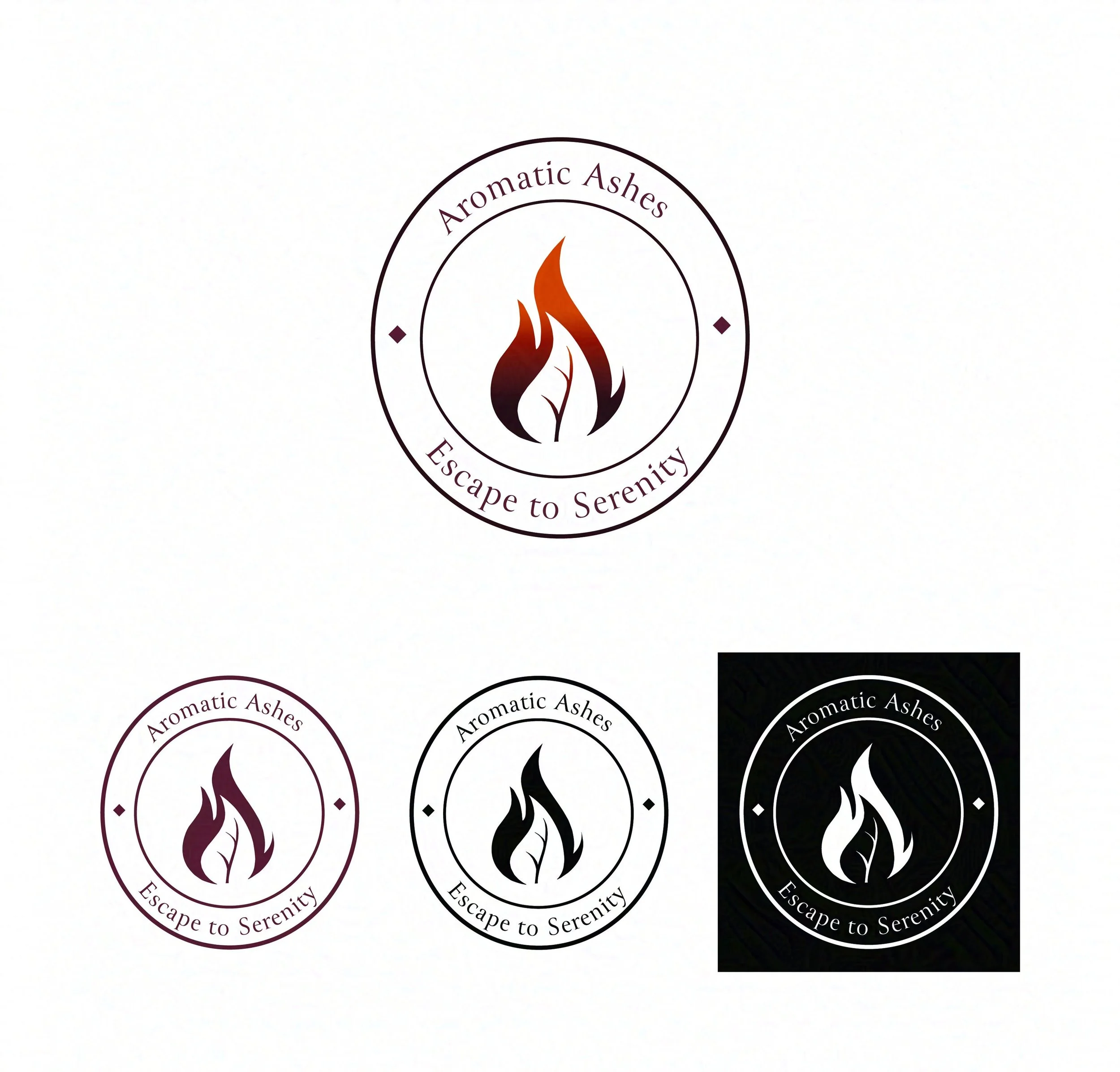
The brand's commitment to botanical purity and eco-conscious living is embodied in the logo I designed. Premium plant-based ingredients are symbolized by the leaf within a candle flame. The logo and slogan position the company as a leader in vegan home fragrance, encouraging customers to embrace beauty, sustainable living, and conscious living.

Color Palette Creation
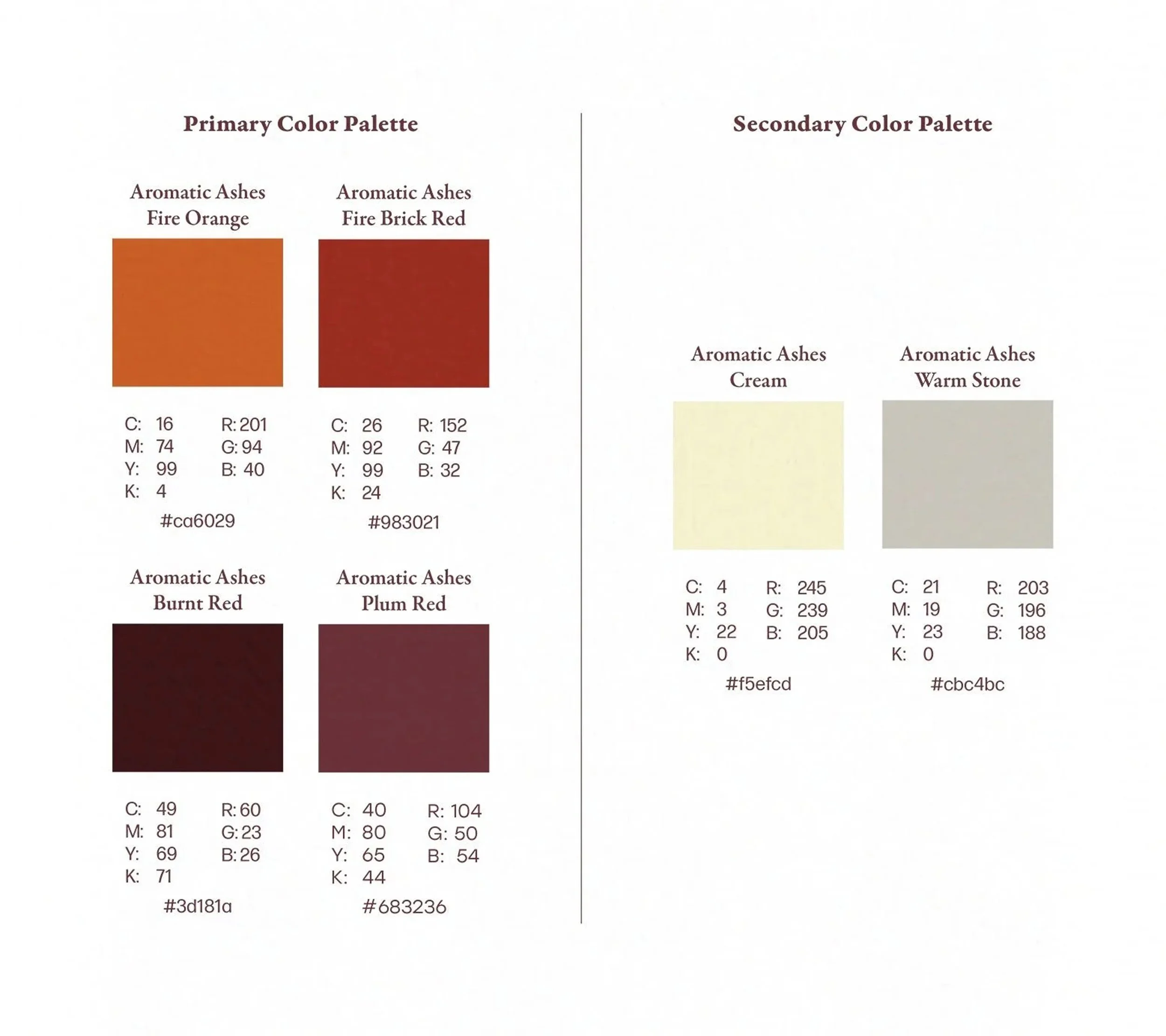
I chose vibrant reds, oranges, and purples to represent the heat, energy, and appeal of a glowing candle flame for the main logo. I added creamy yellow and warm stone tones to balance out the colors, bringing harmony and a hint of elegance. The colors make it stand out, highlighting its focus on botanical purity, eco-friendly luxury, and sensory enjoyment.
Typography Formation
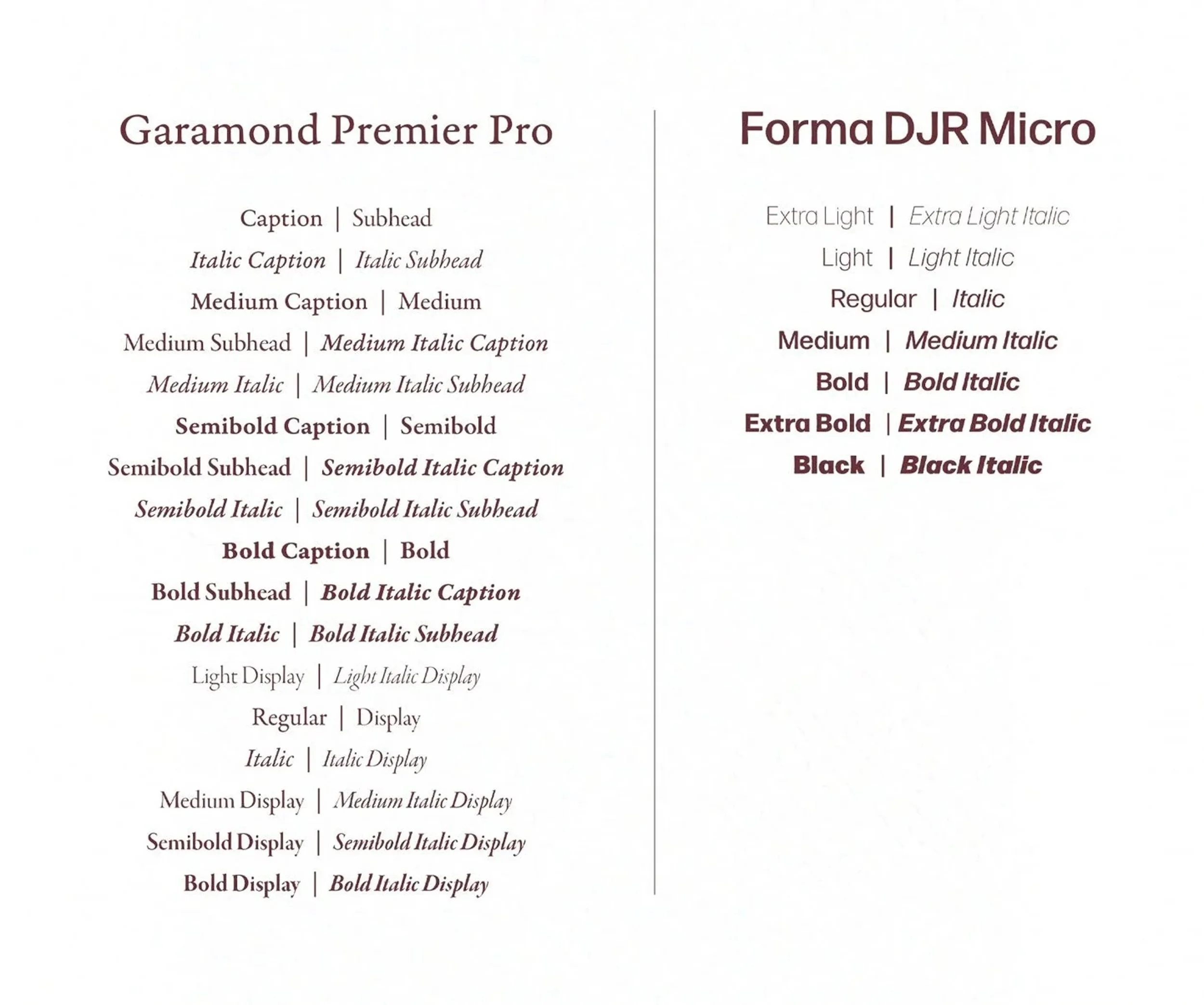
The Garamond Premier Pro and Forma DJR Micro are ideal for modern applications. The clean lines of Forma DJR Micro convey freshness and approachability, while Garamond Premier Pro adds sophistication and a sense of heritage. Both luxurious and innovative in the vegan, eco-conscious home fragrance market, Aromatic Ashes is showcased by them together.
Packaging Production
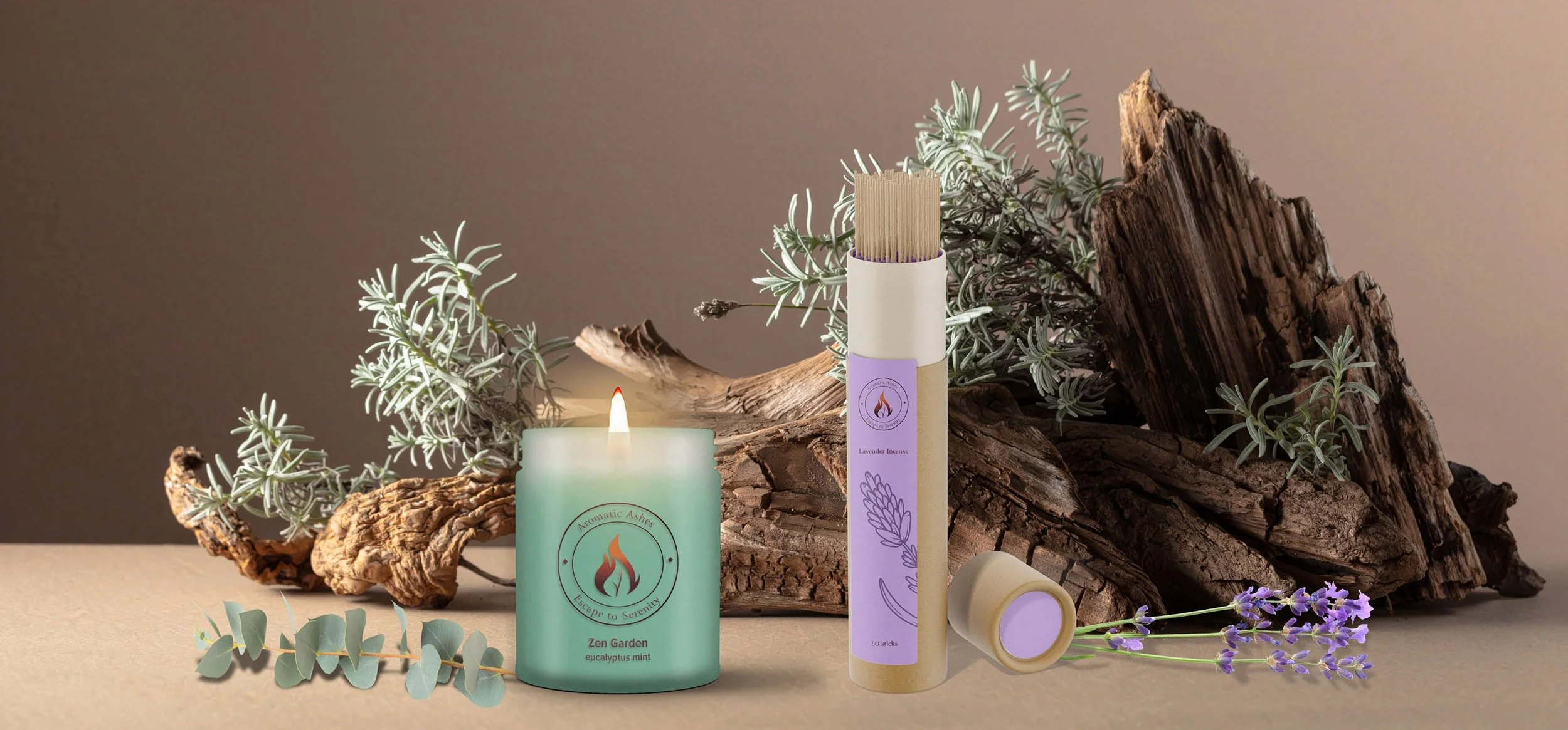
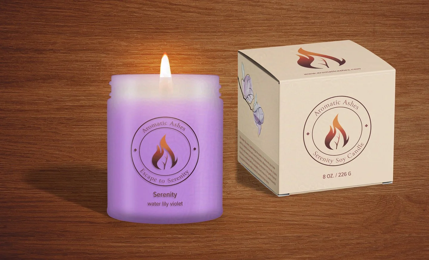
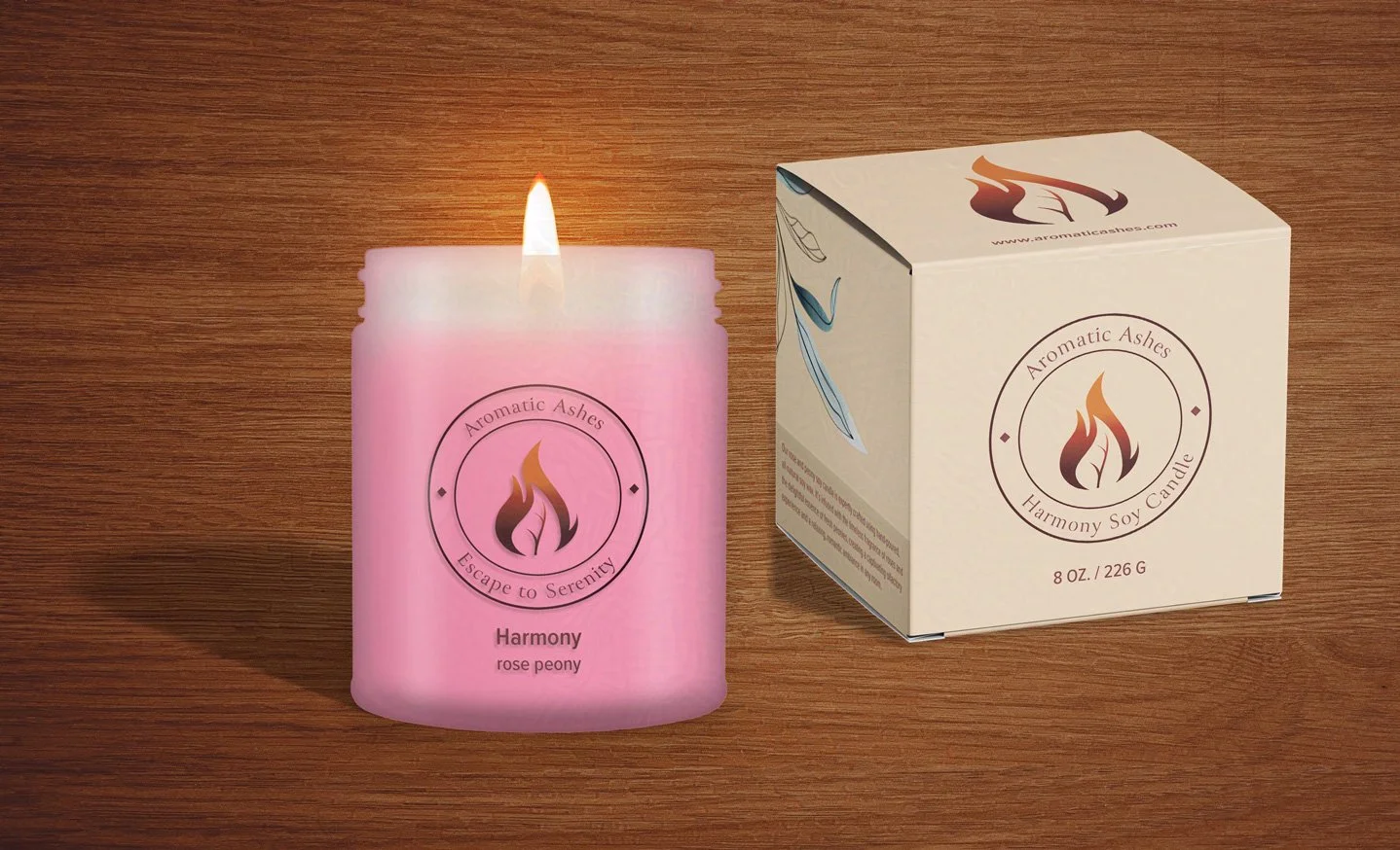
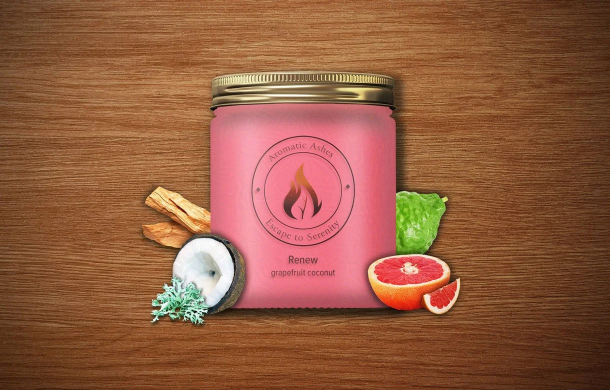
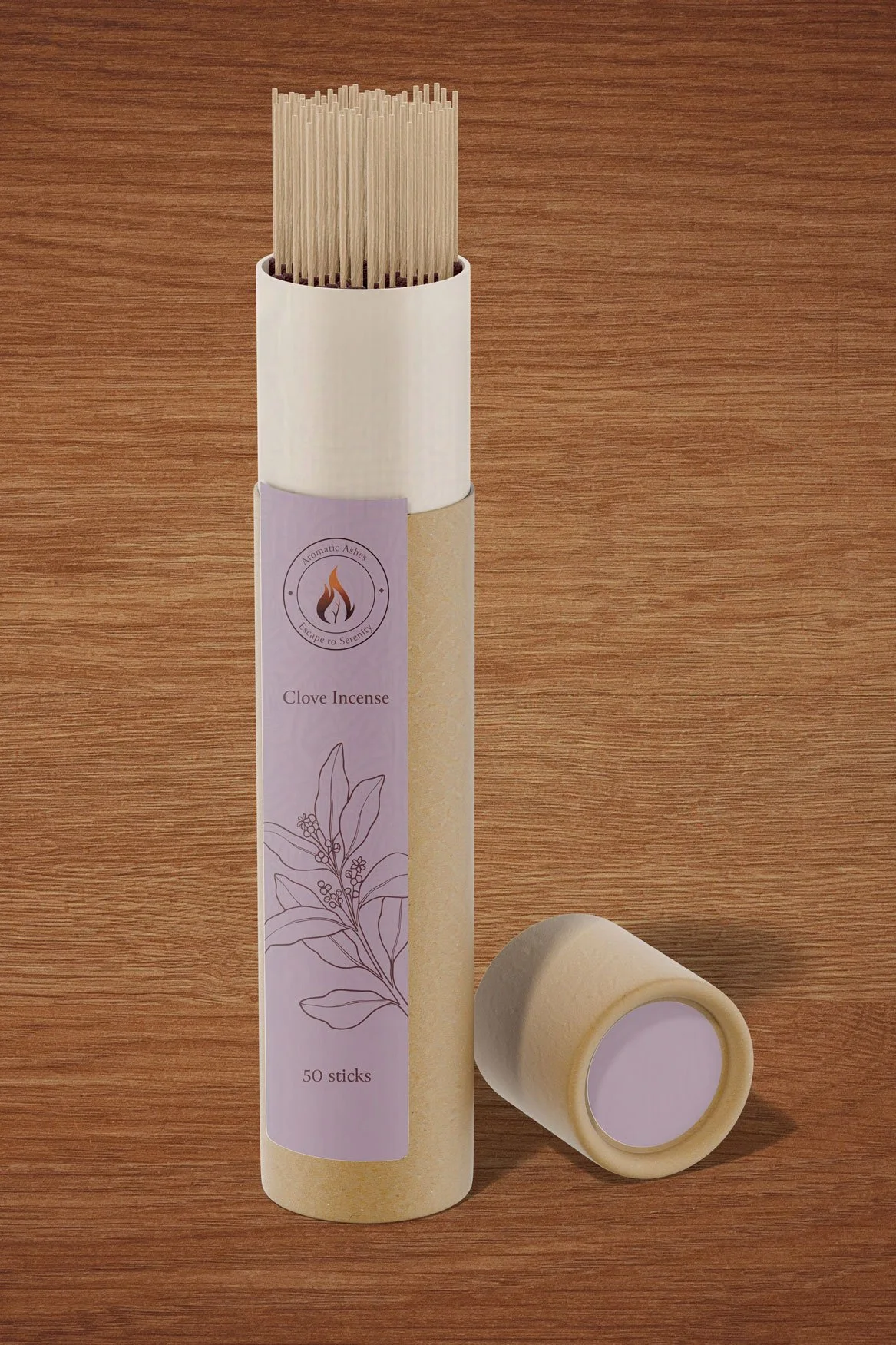
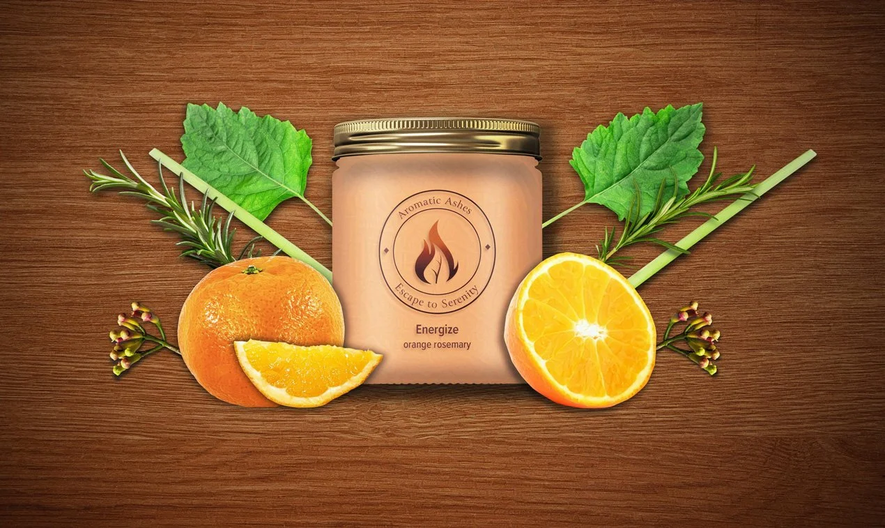
I used simple, eco-inspired designs to let the colorful wax and bold logo shine in the candles. The incense packaging is made from recycled cardboard tubes and has vibrant botanical illustrations that vary by variety. The packaging designs reinforce the image of a leader in vegan, eco-friendly home fragrance, uniting botanical beauty, sustainable living, and luxurious, mindful living into a single clear brand identity.
Marketing Collateral Conception
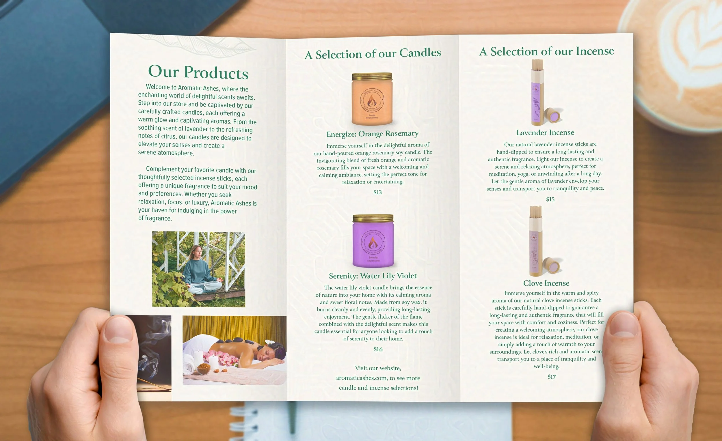
The print ad and brochure make a strong impact with their signature leaf-and-flame logo, vibrant product photos, and bold colors. The materials clearly communicate the brand's ethical focus. This polished presentation attracts new customers and builds loyalty, reinforcing the reputation as a leader in eco-friendly, high-quality home fragrance.
Social Media Strategy
The brand stays connected with Seattle’s candle and incense community through Instagram, Facebook, and TikTok by sharing photos, behind-the-scenes stories, and interactive posts to showcase its vegan, environmentally friendly products. By staying active on social media and focusing on ethical, plant-based homewares, the company is recognized as a leader in sustainable luxury living.
Exterior Signage Creation
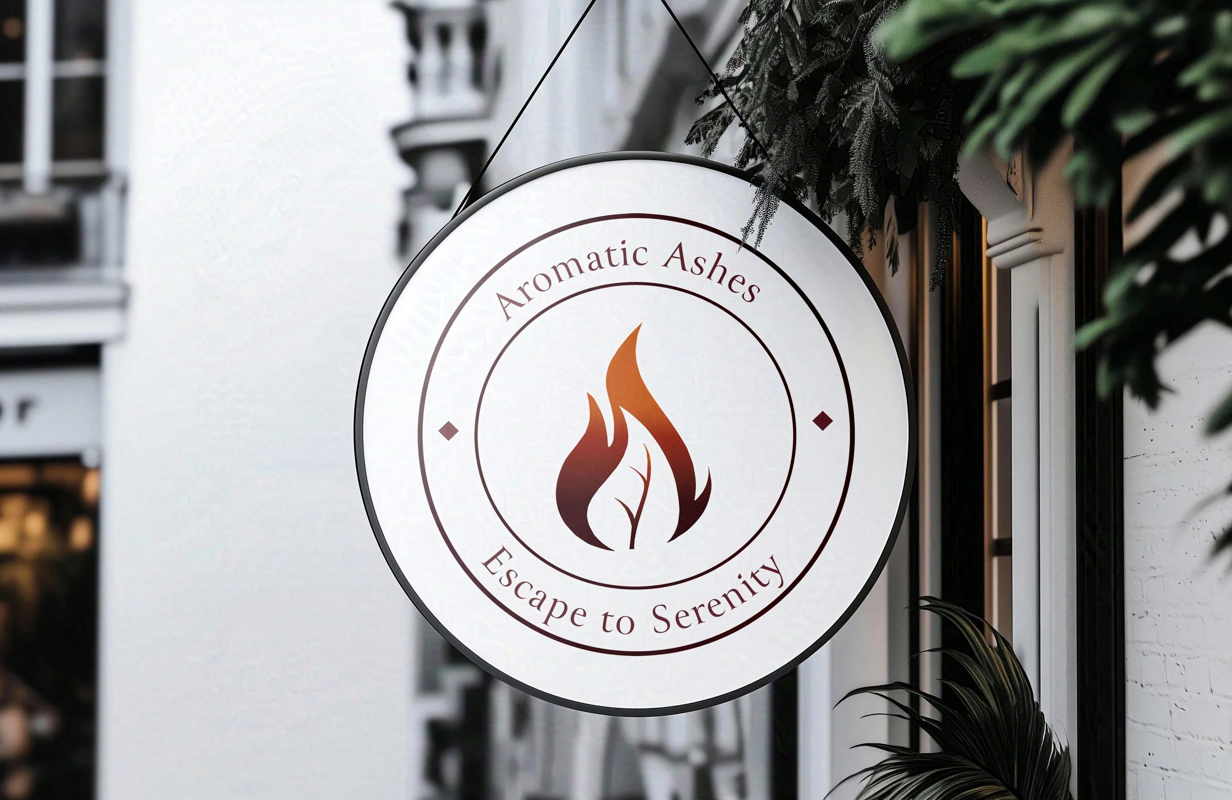
The brand's dedication to eco-friendly, artisanal living is broadcast on the exterior sign. The leaf-and-flame logo and rich red colors signal unique, ethically crafted scents inside. This contemporary sign reinforces Seattle's identity as a destination for luxurious, eco-friendly home fragrance.